The brand looked great when you launched. It might still look great now. But something is off, and you can’t quite name it.
This is the most common version of the conversation we have with founders and brand leads. The business has moved on, the offer has matured, the audience has shifted, and the identity has not kept up. There is no obvious crisis. The logo is fine. The colours are fine. The website still works. And yet the whole thing feels small, dated, or no longer reflective of what the company has become.
That feeling is usually right.
What outgrowing a brand actually looks like
Outgrowing a brand identity is rarely about a single broken element. It tends to show up in a handful of quieter signals, all happening at once.
The brand starts to feel uneven across applications. The logo feels right on the website but wrong on the deck. The colour palette works in print but undermines the product UI. The tone in marketing copy is on-brand, but the tone in customer-facing emails is from a previous era of the business. Each piece in isolation is acceptable. Together, they have stopped feeling like one brand.
The team starts working around the brand rather than with it. People build their own templates because the official ones are too rigid or too vague. Different departments interpret the brand differently. New starters ask whether there is a current version of the guidelines, and the honest answer is that there are three, and none of them are quite right.
Pitches and proposals start losing their edge. The brand was designed for an earlier version of the business: smaller, less specialised, less senior. The work the company is now winning, or trying to win, is different in kind. The brand makes the company feel slightly less credible than it actually is.
The market has moved. New competitors look sharper. The category has matured. The shorthand of the original brand, which felt distinctive at launch, now reads as conventional, because the convention caught up.
If you’re nodding along to any of these, the brand is probably no longer doing its job.
Why most rebrands fail
The reason rebrands fail is rarely the work itself. The work is usually fine. They fail because the business waited too long, or did the project for the wrong reasons.
Waiting too long. A brand that should have been refreshed two years ago becomes a much harder project today. The business has built layers of accumulated assets, sub-brands, regional variants, and partner-facing material on top of the original identity. The cost of changing direction has compounded. By the time the work feels urgent, it has also become more disruptive than it needed to be.
Doing it for the wrong reasons. Some rebrands are commissioned because a new senior hire wants to make their mark, or because a board meeting demanded a refresh, or because a competitor moved first. None of these are bad starting points on their own. They become bad starting points when they replace the more important question: what has actually changed about the business that the brand needs to express?
When that question gets answered honestly, the rebrand has a clear job to do. When it doesn’t, the work tends to look new without feeling necessary.
What we do about it
We treat brand identity work as strategic before it is visual. The first phase of every project is understanding what has shifted in the business, the category, and the audience, and what the identity needs to express now that it did not need to express before.
That sometimes leads to a full rebuild. Often it leads to something more surgical: a stronger position, a tightened visual system, a more deliberate voice, a clearer set of rules for how the brand applies across the things it now needs to apply to. The right answer is whatever moves the business forward without throwing away the parts of the brand that are still earning their place.
A few examples from recent work.
Equals Even was a ground-up build. The founders, twin doctors Kathryn and Helen, came to us with a clear thesis about teen skincare and not yet a brand. We worked across name, identity, packaging, and e-commerce together, so the brand existed as one coherent thing from launch.
Pelorus Insights needed an identity that matched the seriousness of what they do. The work was not loud or attention-seeking, but it gave the consultancy a first impression that opens doors in their market.
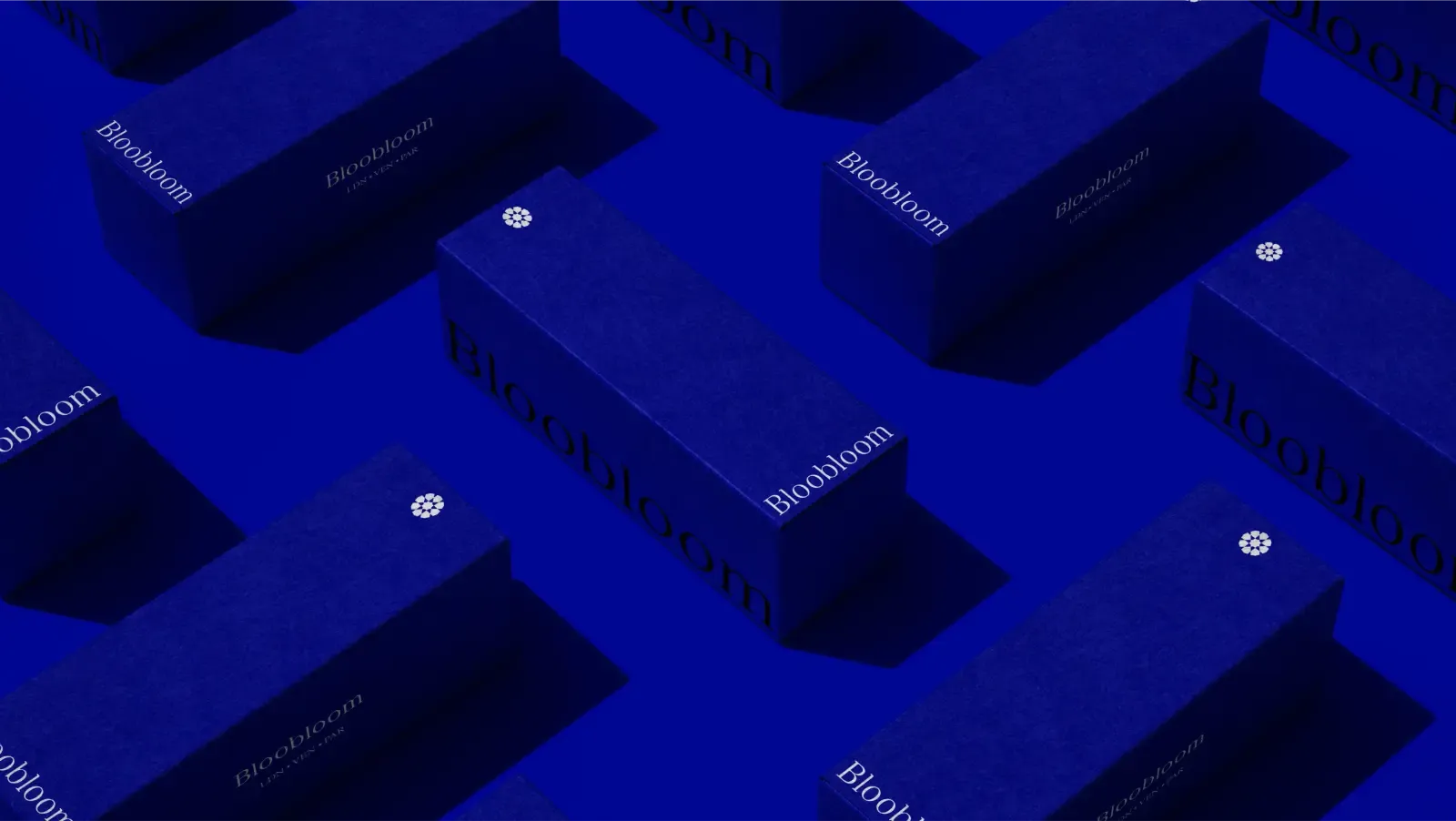
Bloobloom needed a brand with enough character to compete in a category dominated by cautious, look-alike competitors. The identity gave the business a confident point of view, and a system that could carry it across e-commerce, packaging, and retail.
Three quite different problems, and three different scopes. The starting question was the same every time: what does the business actually need this brand to do, and what is no longer working?
How to tell whether it is time
A short test we use with clients.
If you delivered a great pitch tomorrow and the prospect went to your website immediately afterwards, would the website strengthen the impression you just made, or weaken it?
If the honest answer is weaken, the identity is probably the place to start.
If you’d like a second opinion before committing to anything, tell us what you are working with. We’ll be honest about whether you need a full rebrand or something smaller. Most of the time it’s smaller than people fear, and more deliberate than they expect.