How do you design a report about a world that refuses to sit still?
Every year, Bodkin works with AlixPartners on the design of its annual Disruption Index, bringing together editorial design, data visualisation, and print production within one coherent system. The 2026 edition is the seventh report in the series, drawing on responses from more than 3,200 senior executives across 11 countries and 10 industries. Our role was to transform that substantial body of research into a publication that could be navigated, understood, and remembered.
Not simply a document containing information, but a clear editorial experience that reveals the story within it.

What the project involved
- Editorial and annual research report design
- Information hierarchy and page architecture
- Data visualisation and chart design
- Art direction and image development
- Digital report preparation
Designing an annual report for a global consultancy
We have worked with AlixPartners on the Disruption Index over several years. That continuity is valuable. Each edition needs to feel recognisably part of the same body of work while reflecting a different moment in the world. It cannot be completely reinvented every year, but it cannot feel like last year’s report with a few numbers replaced either.
The process is one of evolution.
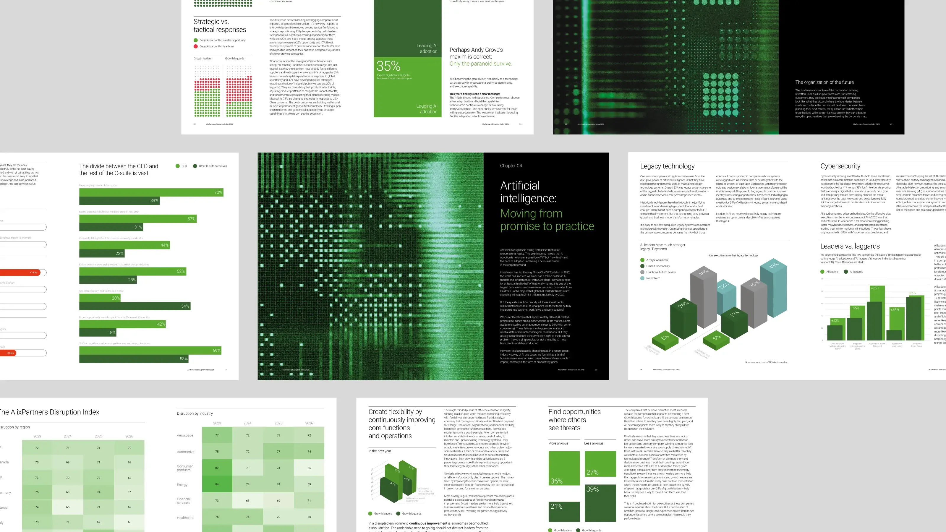
We retain the foundations that make the Index recognisable, then introduce a new visual idea capable of expressing the particular character of that year’s findings. Typography, page architecture, charts, imagery, and chapter structures all need to work together as one flexible editorial system. For 2026, that system had to carry nearly 100 pages of analysis covering geopolitical instability, artificial intelligence, energy, trade, organisational change, and the growing difference between how CEOs and the wider C-suite experience disruption.
Developing the visual language
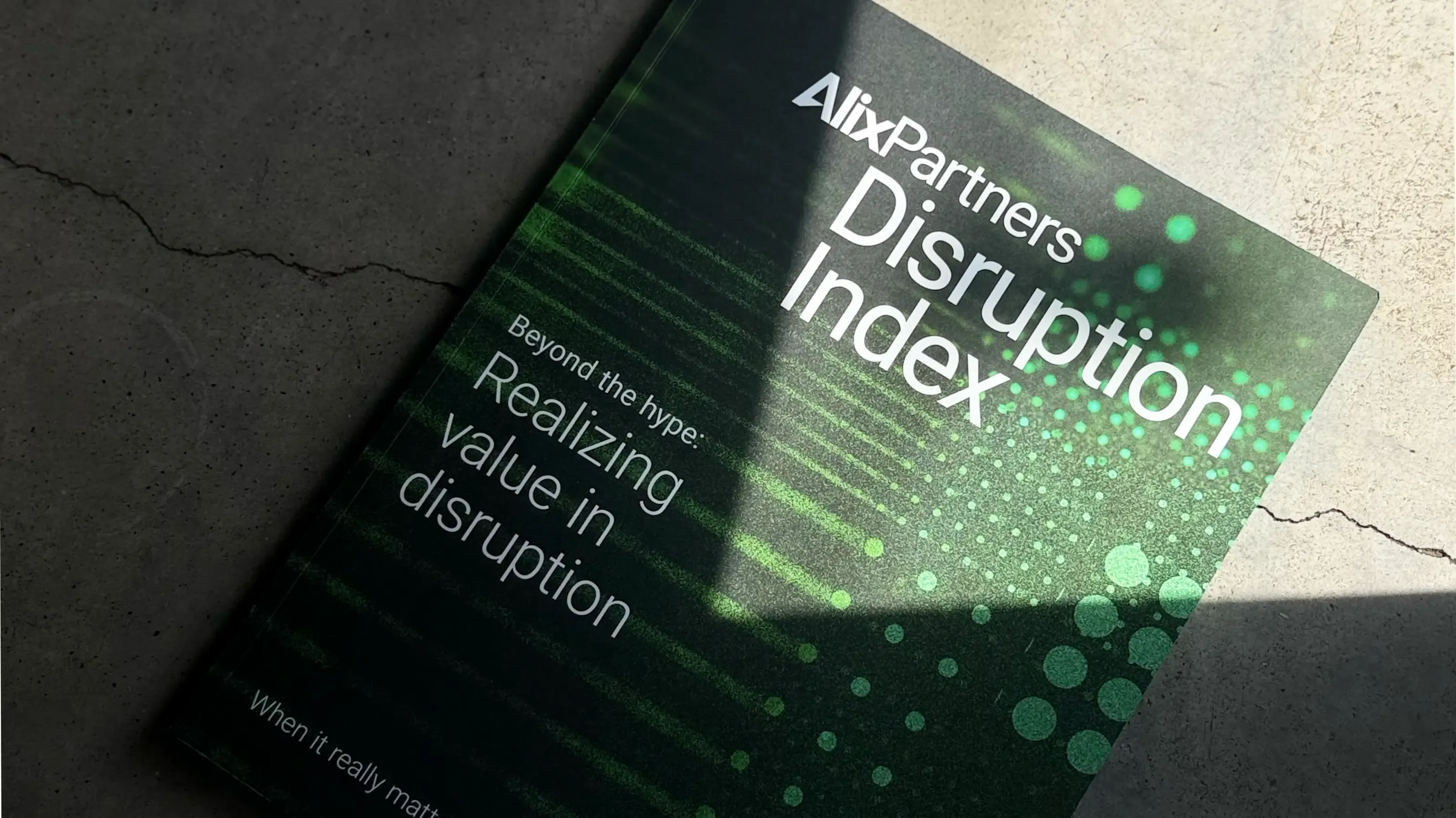
This year’s visual language grew from the idea of information passing through interference. Lines become waves. Ordered grids dissolve into particles. Dense fields of data stretch, collide, and reform. At times the imagery feels technological and precise. Elsewhere it becomes more physical, imperfect, and unpredictable.
The images sit somewhere between data visualisation, transmission scans, and microscopic structures. They suggest systems operating under pressure, but also moments of clarity emerging from within that pressure.
That reading was deliberate. Artificial intelligence runs through the 2026 findings, and the imagery draws on the way machines make sense of the world: signal resolving into pattern, order emerging from noise, and meaning pulled from fields of data too dense to read at a glance. The pictures that describe disruption also describe how AI works on it, so a single visual idea could carry both the pressure businesses are under and the intelligence now being turned on that pressure. It is a fitting language for a report that argues AI has become the dividing line between the companies pulling ahead and the ones falling behind.
That tension felt important.
Disruption is often visualised as destruction or chaos, but the findings present a more nuanced picture. Although pressures have moderated in some areas, nearly half of the executives surveyed still described their businesses as highly disrupted. Artificial intelligence has meanwhile become a significant dividing force, with 80% of executives expressing optimism while organisations differ substantially in their ability to turn it into value. The visual world therefore needed to express two conditions at once: constant movement and increasing control.
Building an editorial design system for complex research
A report of this scale cannot rely on a few dramatic chapter openers to carry it. The real work happens across dozens of quieter pages: comparisons between countries, shifts across industries, survey responses, maps, timelines, long-form arguments, and complex combinations of quantitative and qualitative information.
We created a modular editorial design system that could accommodate these different forms without forcing everything into the same template. Some pages provide space for sustained reading. Others allow a single statistic to dominate. Dense datasets are broken into visual patterns, while chapter openers introduce moments of intensity and contrast. Restrained typographic pages sit alongside saturated green imagery, allowing the report to change pace as the narrative develops.
The aim was consistency without monotony.
Data visualisation that makes complexity understandable
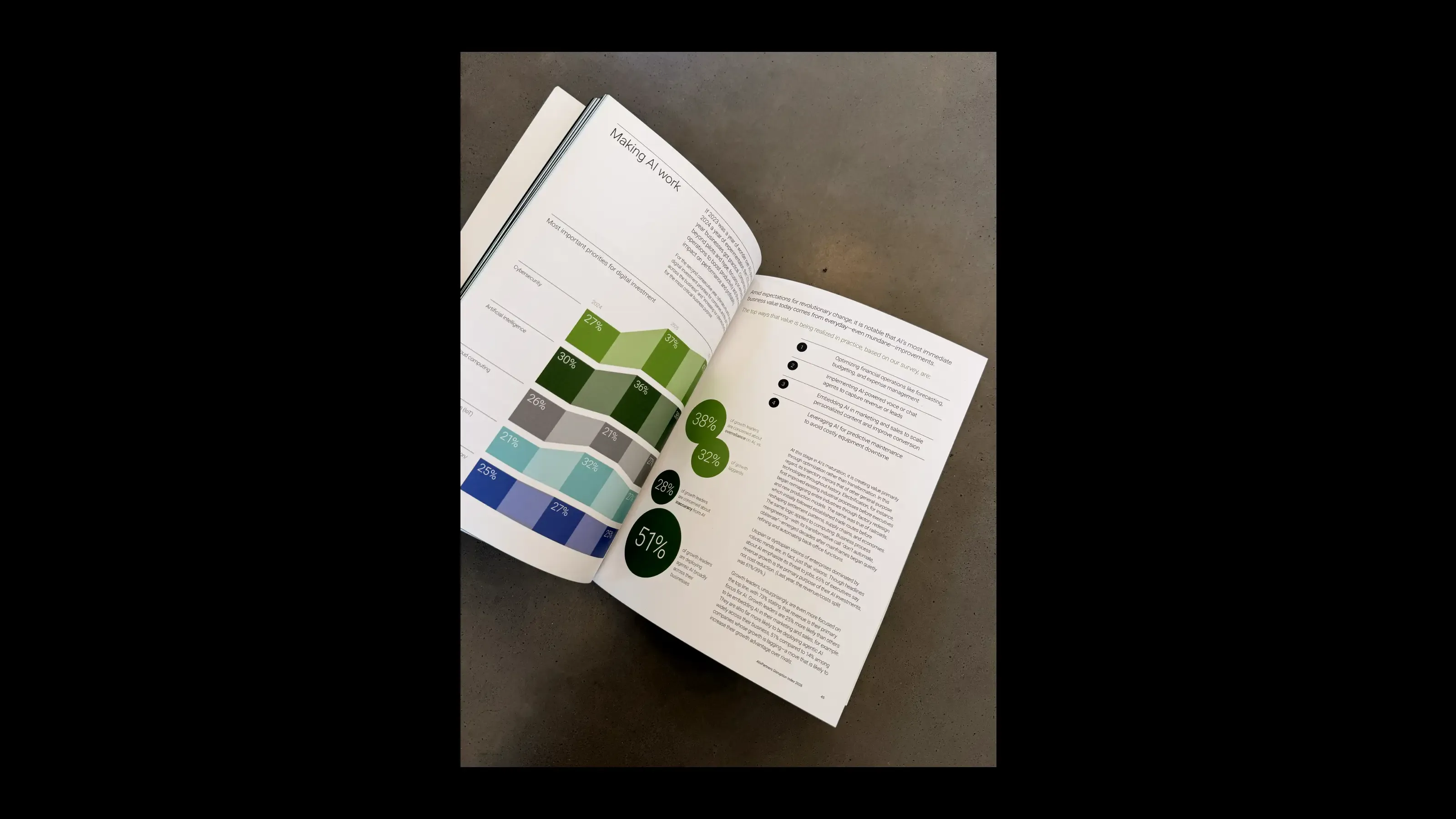
Data visualisation was treated as part of the wider visual language rather than a separate layer applied at the end. Colours, shapes, scale, and spatial relationships help readers recognise comparisons and patterns before they have examined every number. Charts needed to communicate accurately, but they also needed to belong unmistakably to the same publication.
The challenge was finding the right balance between clarity and character. Too little structure and the information becomes difficult to interpret. Too much structure and a report about disruption begins to feel rigid and repetitive. By combining a consistent underlying system with a varied visual rhythm, we could give each finding the form it needed while preserving the coherence of the report as a whole.

Designing the report for print and digital
Although the report lives digitally, producing it as a physical object remained an important part of the process. Print exposes decisions that are easy to overlook on screen. Type can suddenly feel too small. Fine rules disappear. Pale colours lose their distinction. Dark imagery can close up, while subtle textures become unexpectedly prominent.
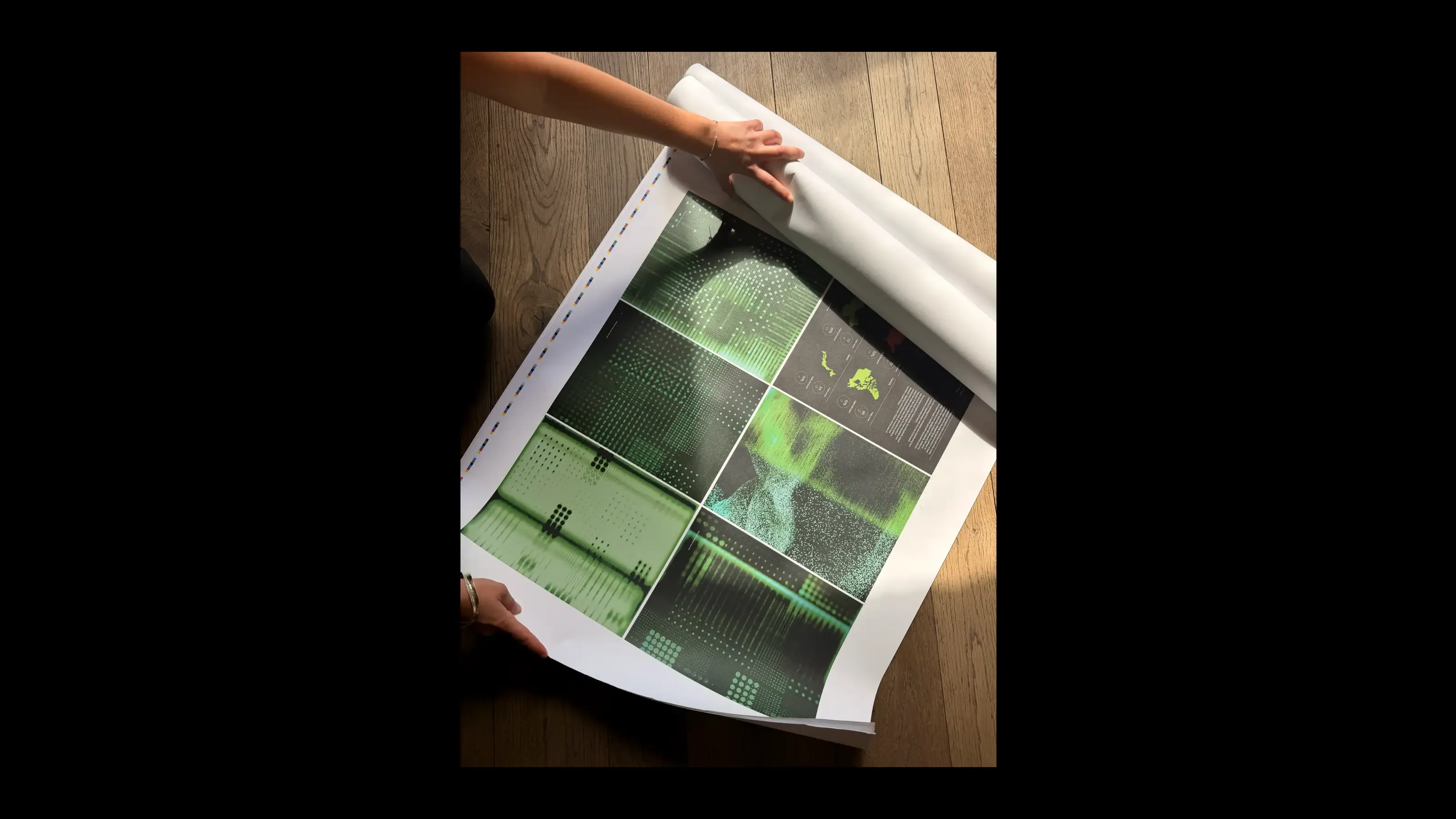
Large-format proofs allowed us to examine imagery, colour relationships, and data graphics at their final scale. Bound copies revealed how spreads behaved across the gutter, and how the rhythm of the document felt when experienced page by page rather than as individual frames on a screen. Those details matter, because the finished report has to work in very different settings: viewed online, downloaded as a PDF, presented in a meeting, or placed directly into someone’s hands.
A long-term report design partnership
Working on the Disruption Index each year means building on a visual history rather than starting again. It gives us the opportunity to refine what works, question what has become familiar, and develop a design language that can evolve alongside the research.
The subject changes. The data changes. The pressures facing businesses change. The underlying purpose remains consistent: to make an exceptionally complex body of research clear, engaging, and useful.
The result is a report that moves between detail and scale, analysis and atmosphere, order and disruption. A piece of communication designed not only to present what is happening, but to help readers recognise the patterns forming within it.
Because when the world is full of noise, clarity becomes one of the most valuable things design can provide.
Looking for an annual report design agency?
As an annual report design agency, we help organisations turn complex research, data, and ideas into clear, compelling publications. Our work covers annual report and editorial design, data visualisation, information design, art direction, print production, and digital delivery.
Talk to Bodkin about an annual report, research publication, or thought leadership report. james@bodkin.studio