Hutton
Hutton is a content creation studio with an appetite for making things that matter. We worked together to build an identity with a strong sense of character and an equally strong ability to adapt. Rooted in generations of family history, the result is a rich and versatile visual world that takes inspiration from the past while making plenty of room for what’s next.
- Client
- Hutton
- Year
- 2026
- Role
- Brand IdentityBespoke TypographyArt DirectionPrintMotionDigital
Something worth keeping
Content moves fast. New formats, new platforms, new trends. But good work has a way of sticking around.
For a studio creating content across different brands, audiences and mediums, the challenge was to develop an identity that felt unmistakably Hutton without dominating the work it was there to support. Something with personality and conviction, but enough flexibility to constantly reinvent itself.
We found our starting point in a rather unexpected place: the founder’s family history.
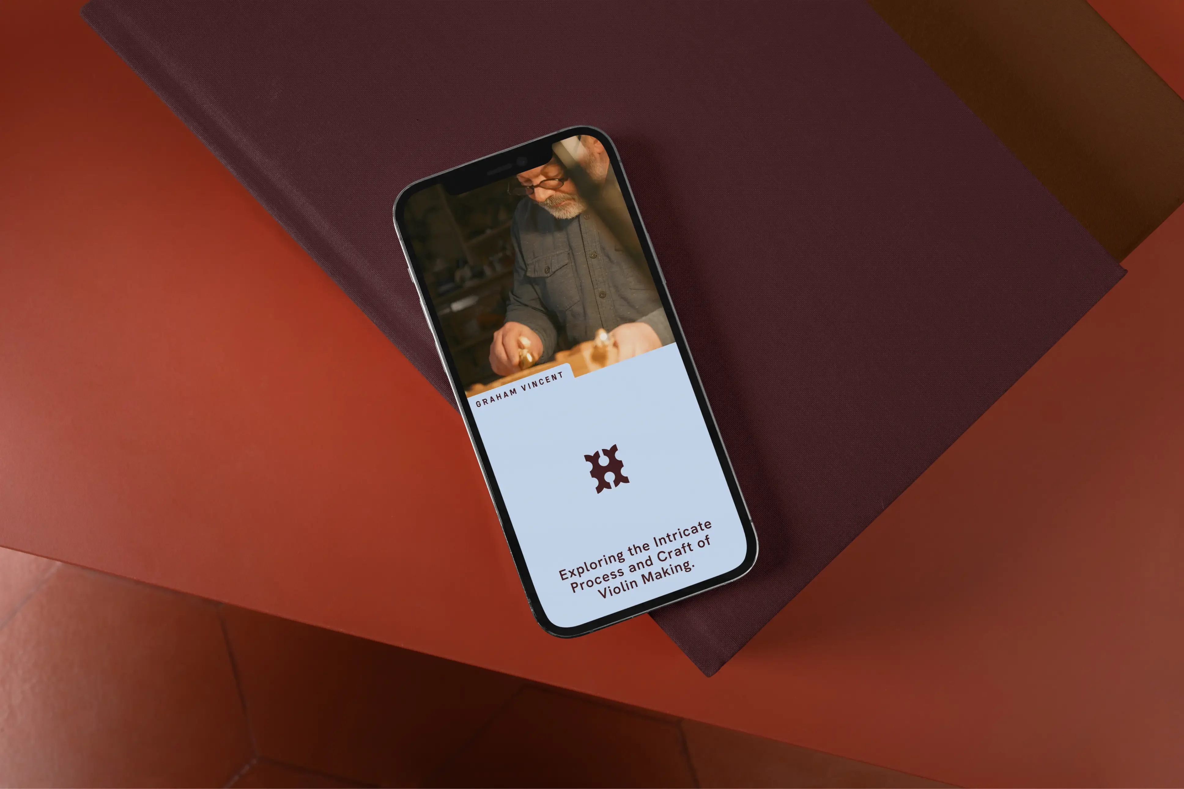
Where ancestry inspires creativity
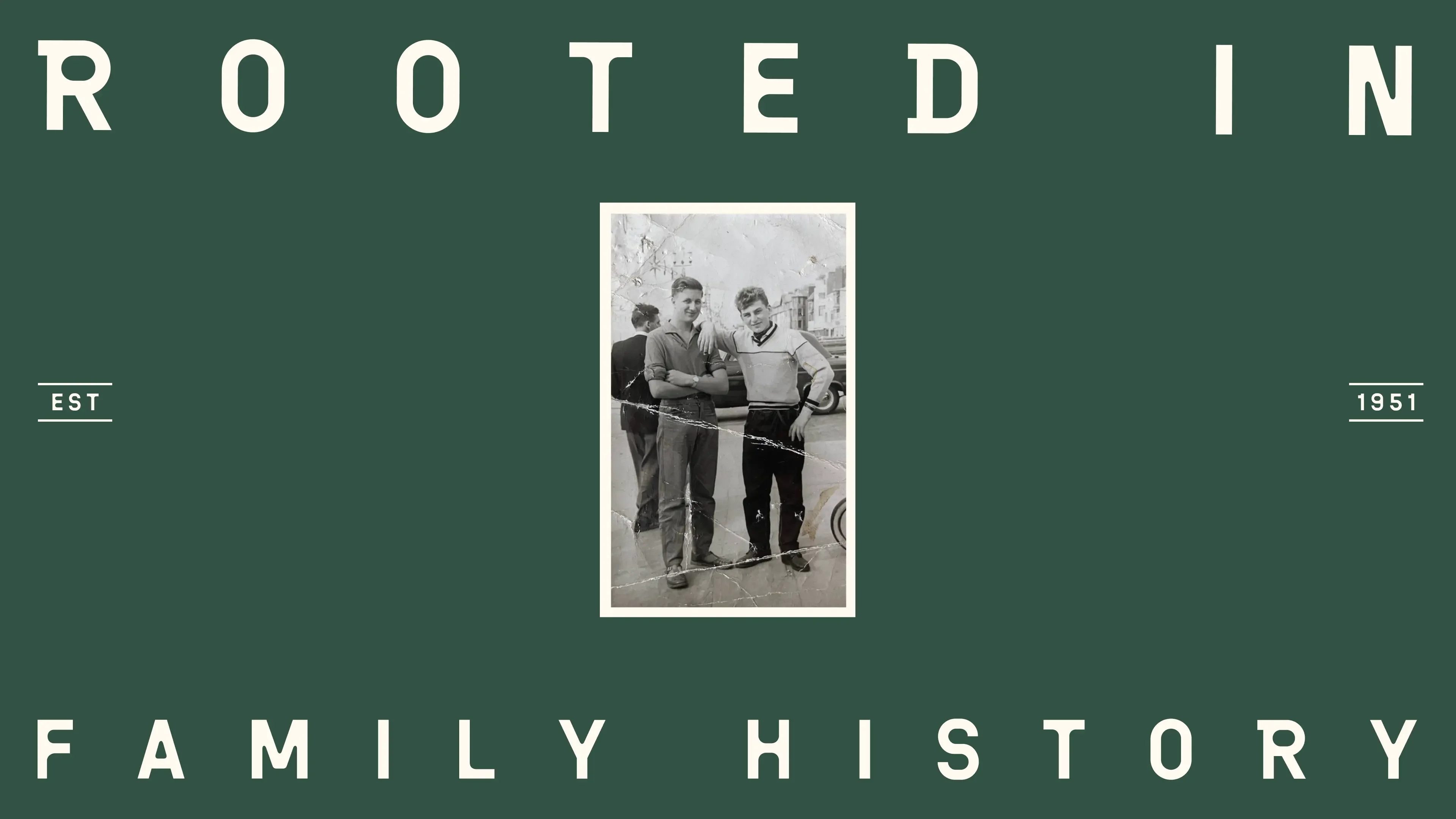
Old family photographs, handwritten records and stories of a tobacco shop in Yorkshire gave us an unusually personal foundation to work from.
Our research led us through traditional English trades, Victorian curiosities and the visual language of historic businesses. But the intention was never to create something that simply looked old.
What interested us was the spirit behind these references. The pride of a craftsperson, the determination to do a job properly and the character of things made to last.
We gradually moved towards a more industrial aesthetic. Less ornamentation and more workshop floor. Drawing on the Industrial Revolution, manufacturing, letterpress and mechanical signage, we began developing a visual language shaped by the beauty of functional things.
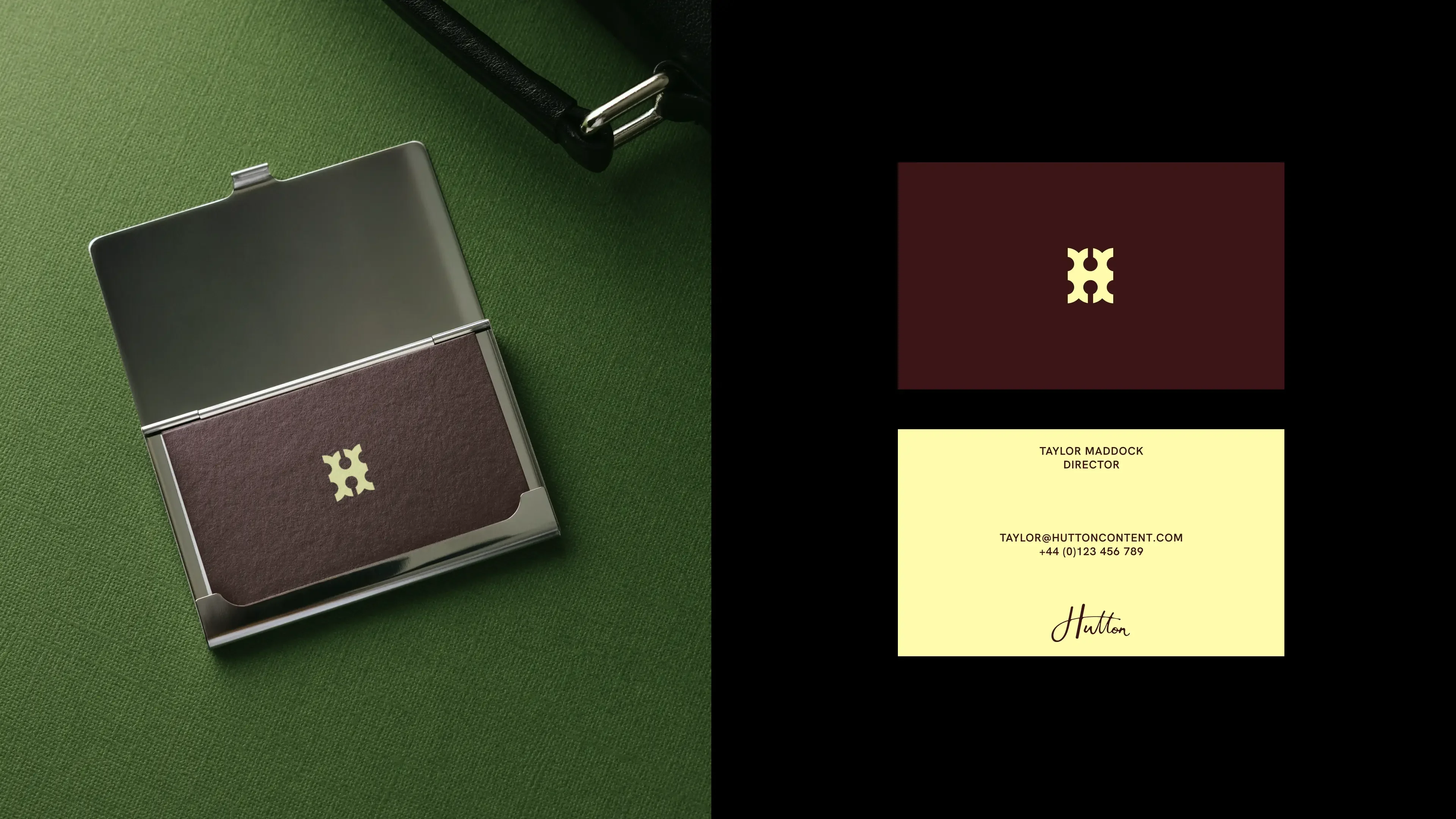
A handwritten Hutton signature brought a human counterpoint to this more structured world. A personal mark of authorship, connecting generations of family history with the work being made today.
Perfectly imperfect
Typography became one of the identity’s defining features.
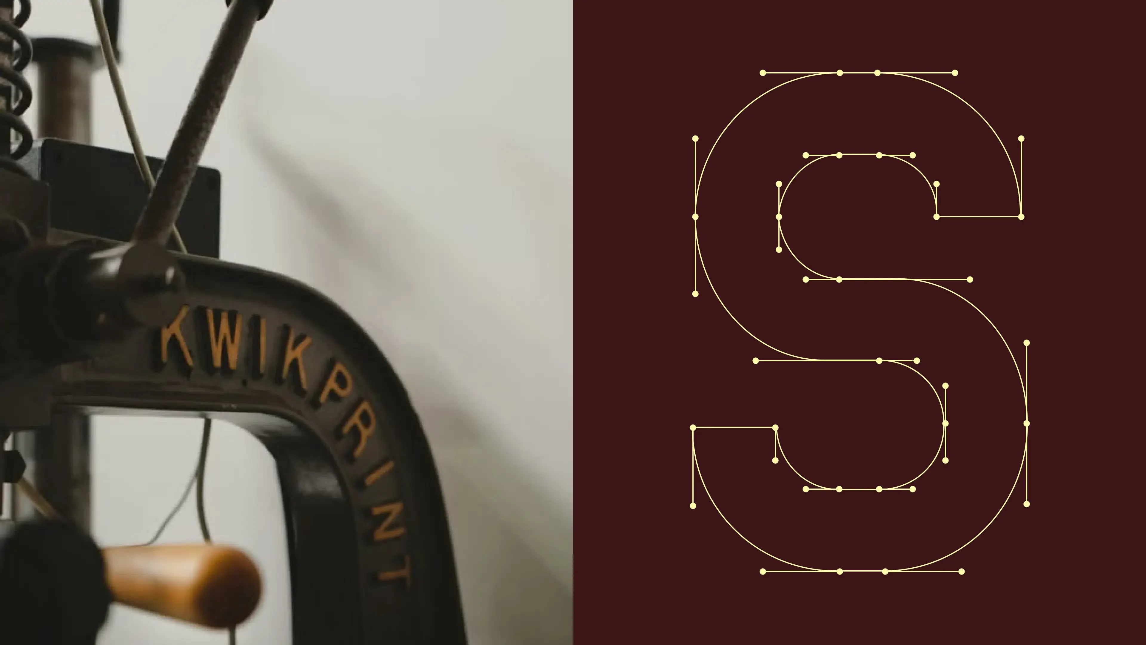
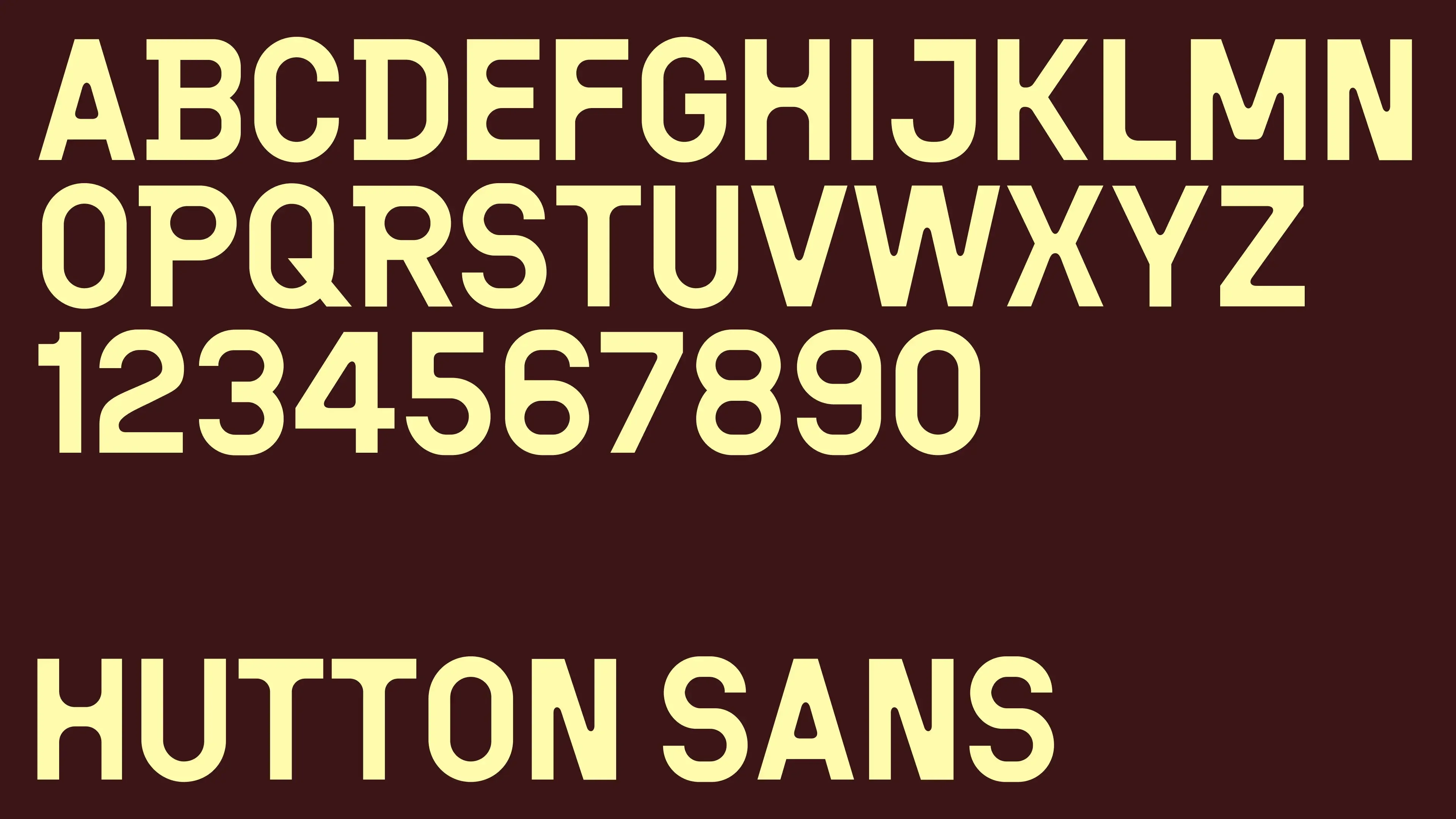
We designed Hutton Sans, a bespoke typeface inspired by the rounded, imperfect letterforms found on old machinery stamps, cast-metal lettering and industrial signage.
Its character lies in the small irregularities. Letters that feel pressed, formed and made rather than mathematically perfected. Heavy and confident, but with an unexpected warmth.
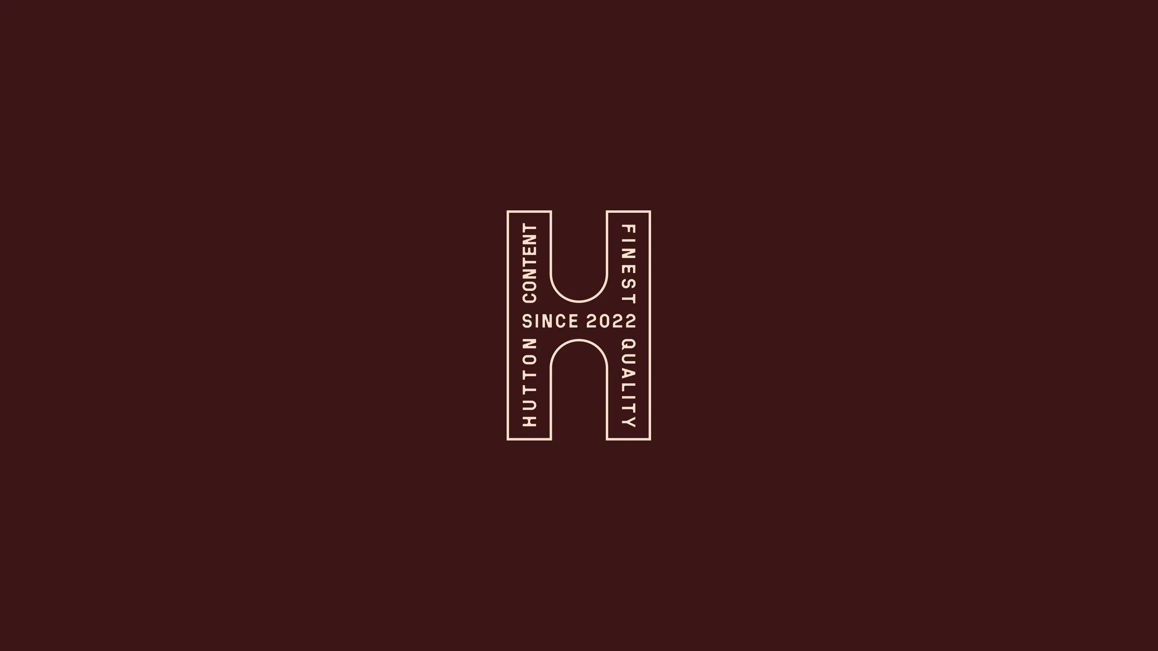
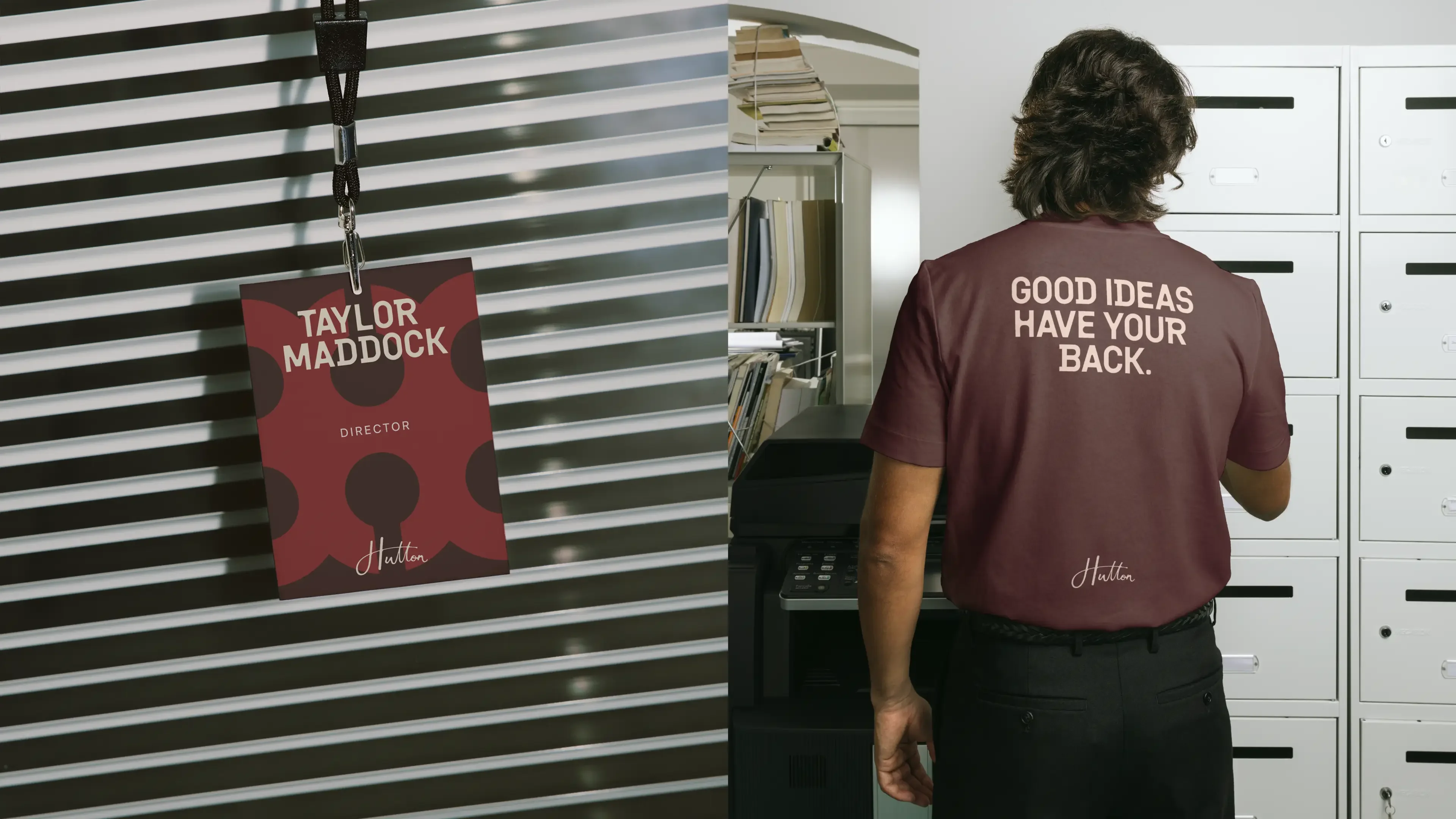
Paired with the handwritten signature, distinctive monogram and a more functional typographic system, these different forms of lettering give Hutton a personality that feels both industrial and distinctly human.
A patchwork of time
Nothing is created in isolation. Every idea, experience and piece of work is informed by something that came before it.
That thinking became central to the wider visual identity.
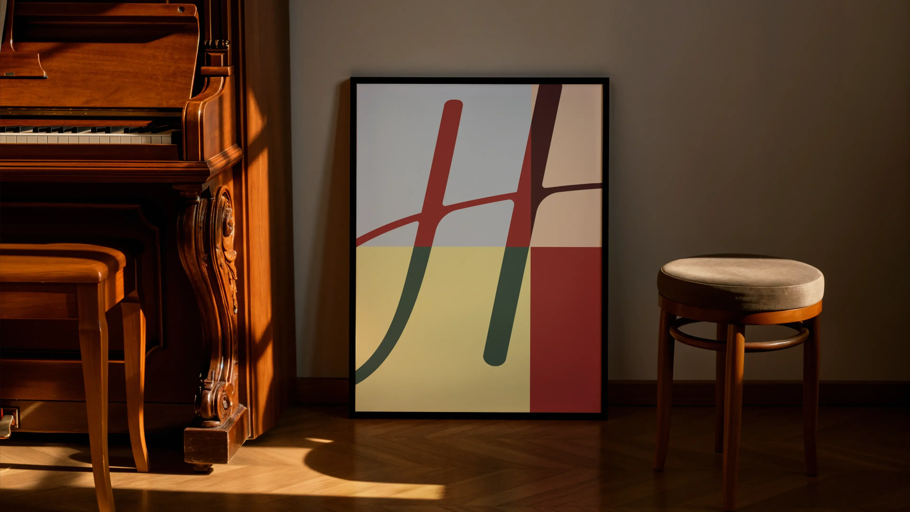
We developed a modular system built around grids, layering and fragments of the Hutton signature. Letterforms can be enlarged, cropped, rearranged and reassembled into entirely different compositions. Archival photography, handwritten details and bold typography overlap, creating the feeling of something collected and built up over time.
The grid provides a sense of order and determination, while the elements within it are free to move, shift and evolve.
Colour gives the system another dimension. Deep burgundies, forest greens, warm creams, rich reds and flashes of pale yellow create an unexpectedly expressive palette. Different combinations bring entirely different moods, yet everything still belongs to the same visual world.
The result is an identity with almost endless variation. At times bold and graphic, at others quiet and considered. Capable of taking on the character of the content it presents without ever losing its own.
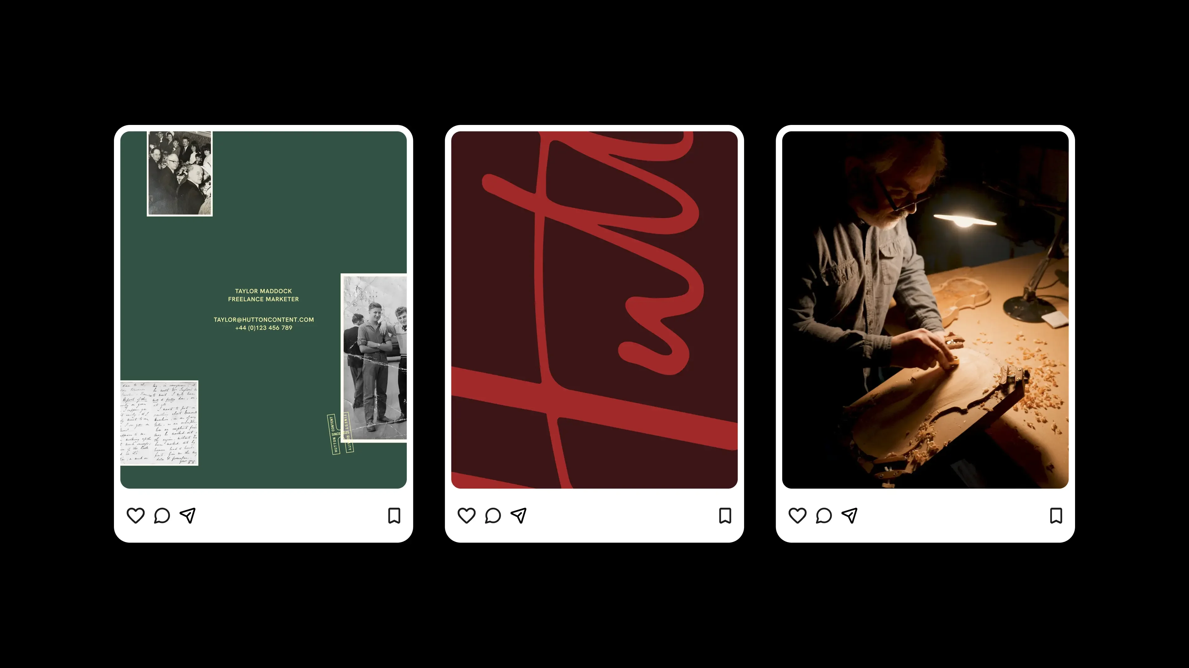
Made to leave a mark
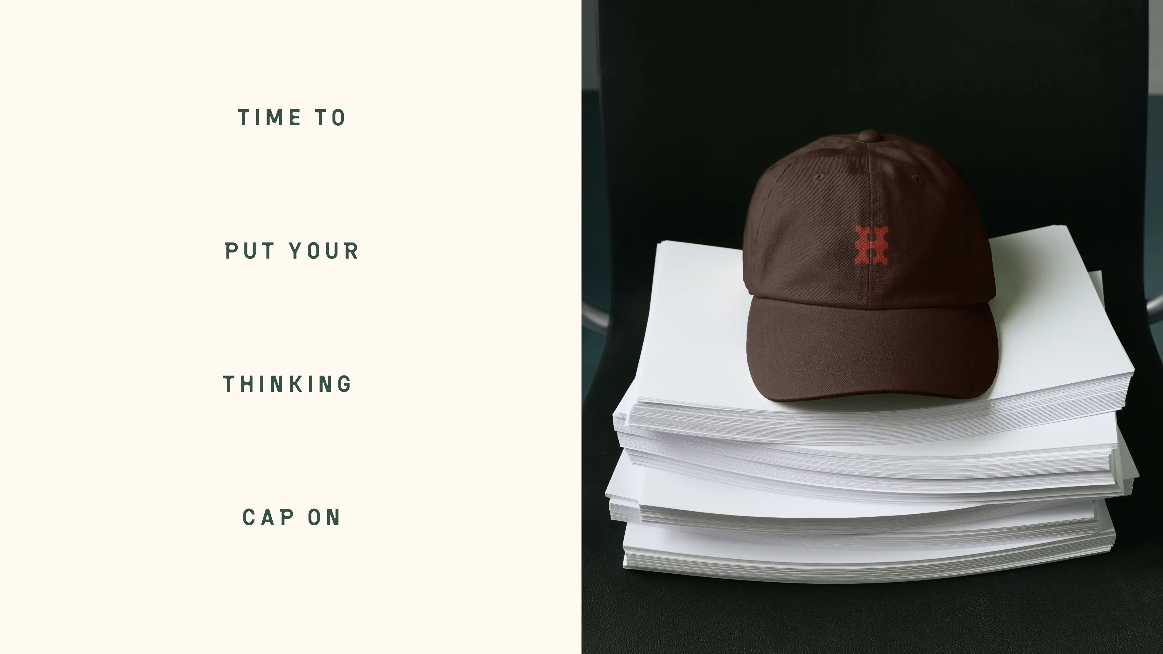
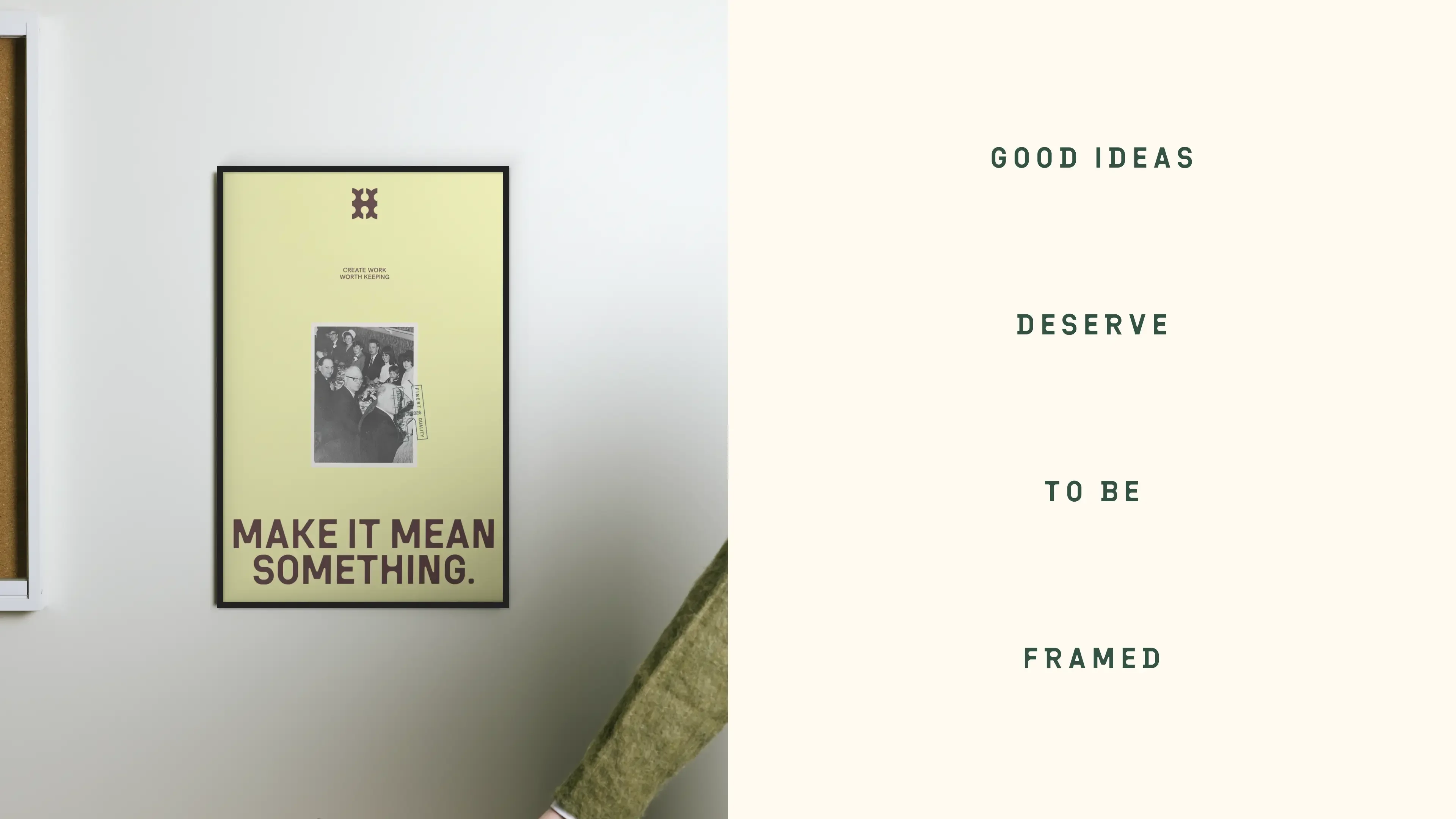
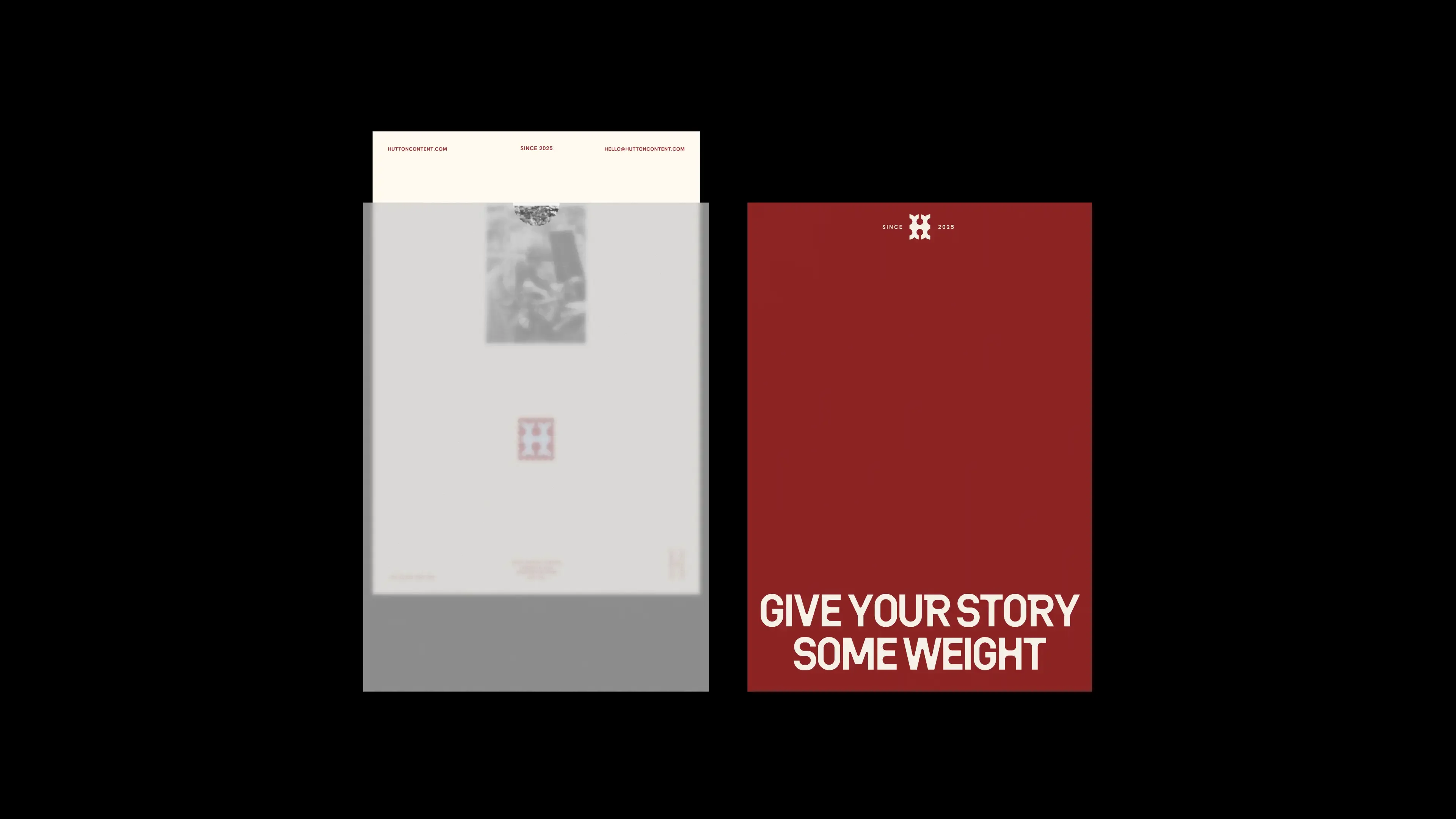
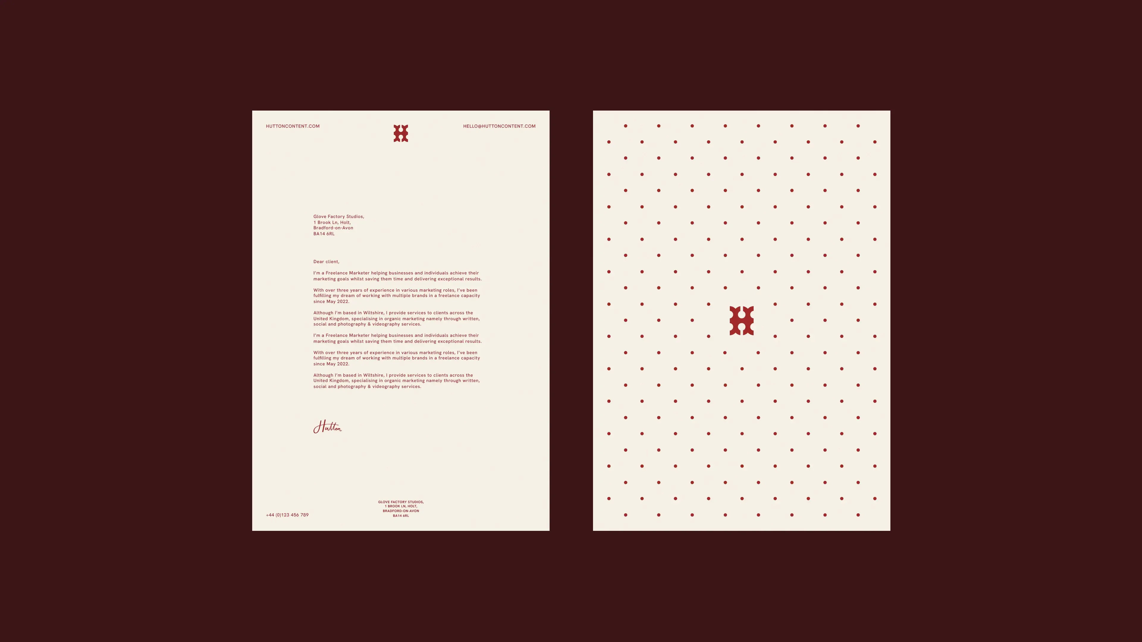
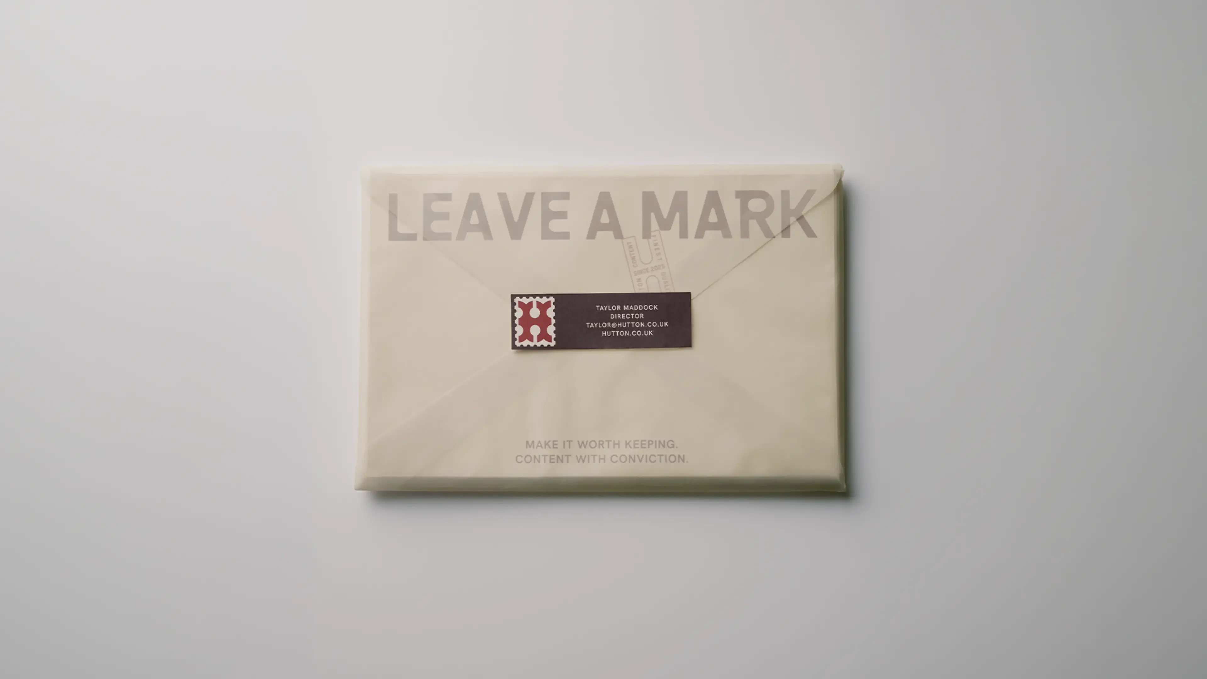
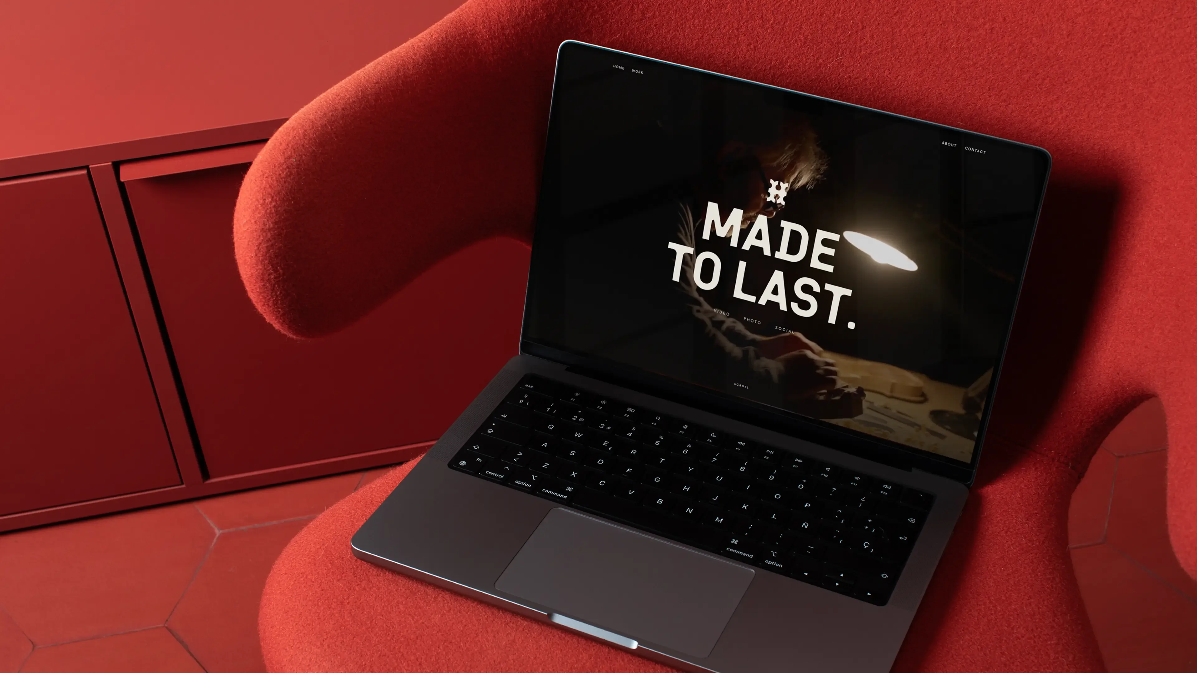
We brought the identity to life across everything from business cards, stationery and printed materials to posters, pitch decks, social content, animation and a new website.
Each application became an opportunity to explore another side of Hutton’s personality. Some embrace the structure and restraint of traditional print, while others play with oversized typography, unexpected crops, vivid colours and layered compositions.
The website carries the same thinking into a deliberately simple digital experience. Rather than relying on unnecessary complexity, layering becomes a way to introduce depth and a sense of time. Elements build upon one another, reflecting how new ideas and work are always informed by what precedes them.
Across print and digital, the system is designed to accommodate change rather than resist it. An important quality for a business whose own work is constantly evolving.
The result is a brand that feels established without being stuck in the past. An identity with history, character and a strong sense of its own personality, but the freedom to keep changing.
Built on what came before. Ready for whatever comes next.