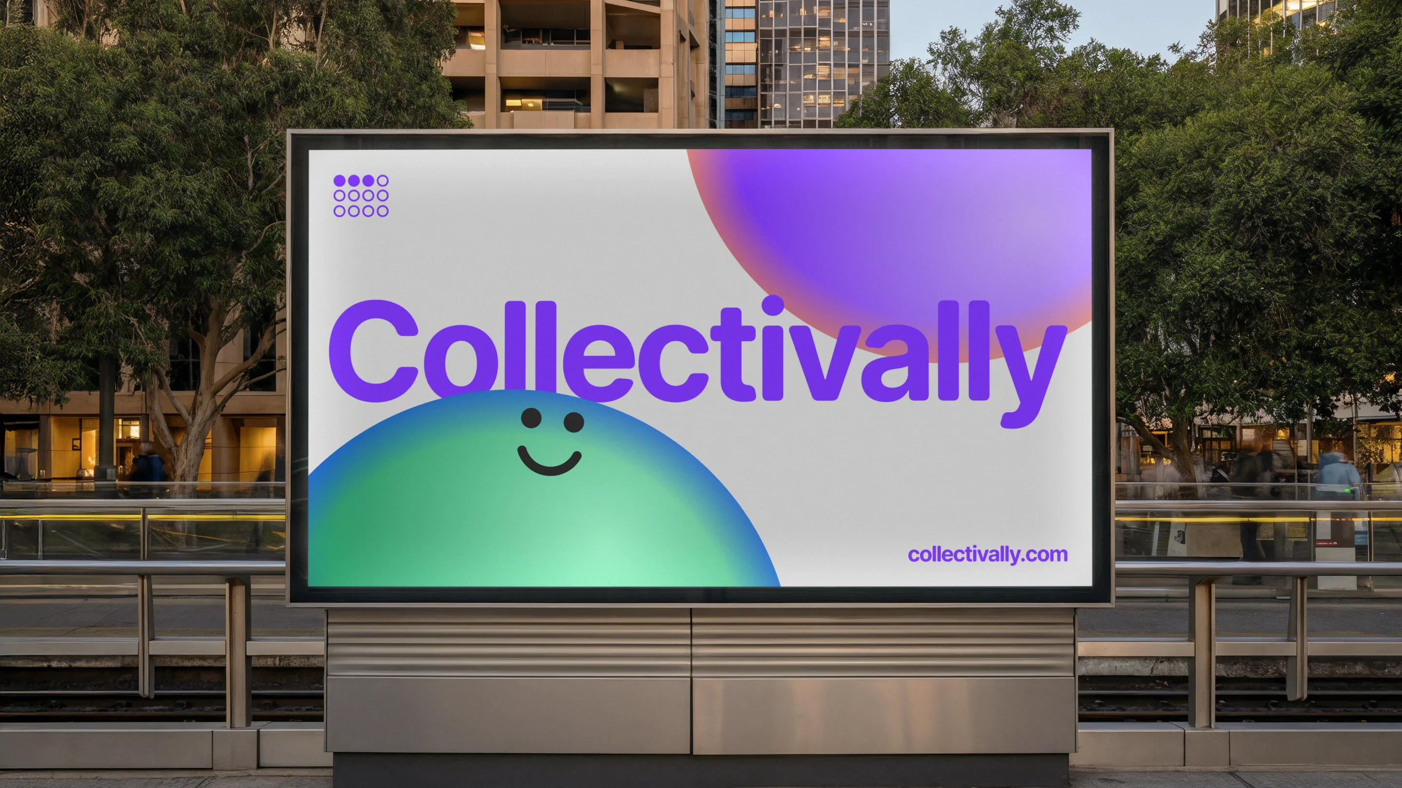
Collectivally
Collectivally helps teams pressure-test digital experiences through different accessibility lenses, using AI personas informed by inclusive research. Created in partnership with Web Usability, it brings together research, design and technology to make inclusive thinking part of everyday decisions.
- Client
- Collectivally
- Year
- 2026
- Role
- Brand IdentityArt DirectionDigital Product DesignWebsite Design and DevelopmentAI Development
A serious subject, approached differently
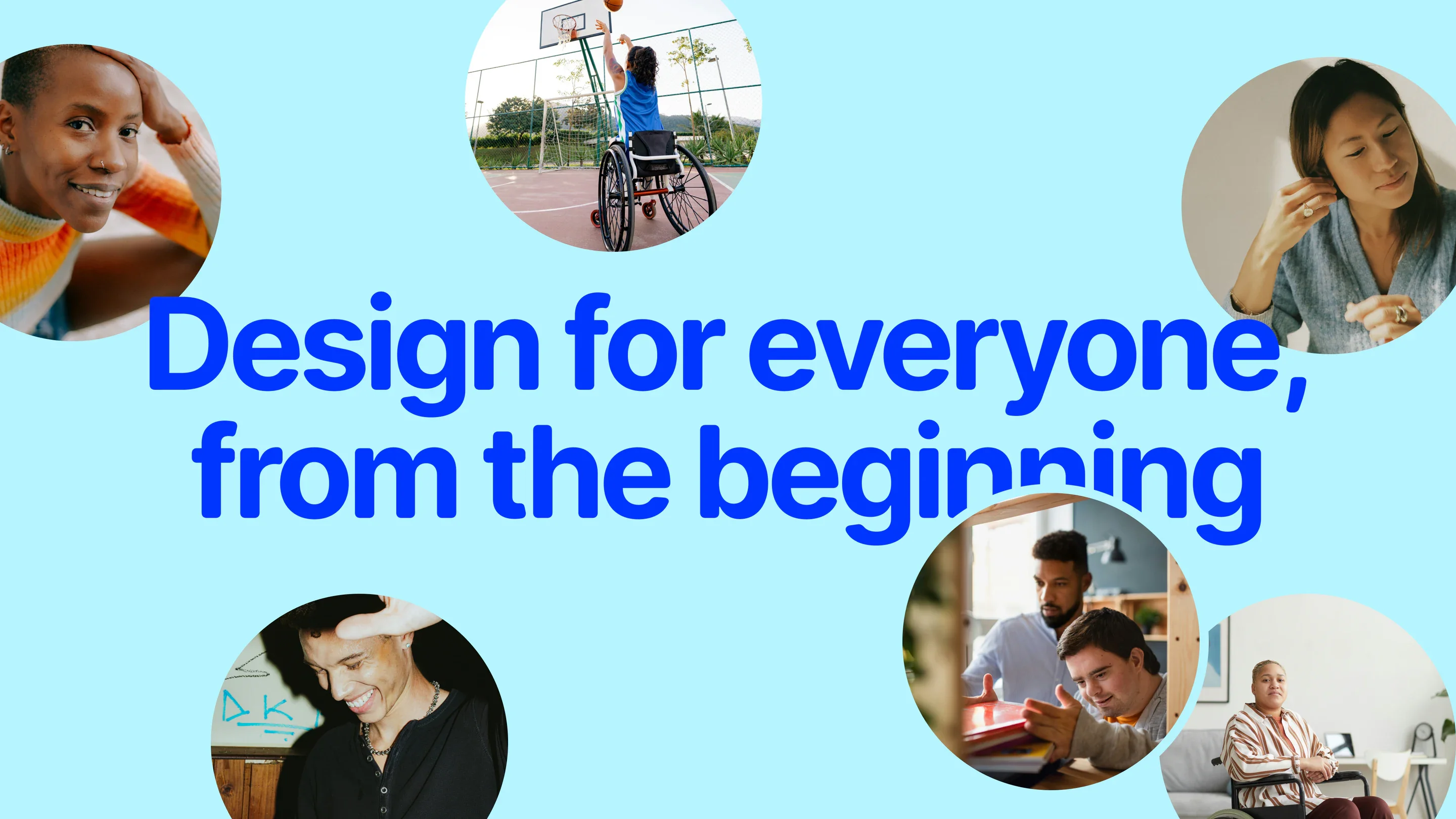
We wanted Collectivally to invite people into accessibility, rather than make them feel they were being tested on it.
That meant resisting a visual language built around warnings, checklists and compliance. The brand needed to feel curious, characterful and engaging: something people would want to explore, rather than another obligation to work through.
The aim was not to make light of the subject. It was to make the subject easier to engage with. Personality could open the door; clear information and useful interactions would give people a reason to stay.
This became the organising principle for the identity and the experience. Instead of leading with what a website had failed, we could begin with who was trying to use it.
Twelve dots, several stories
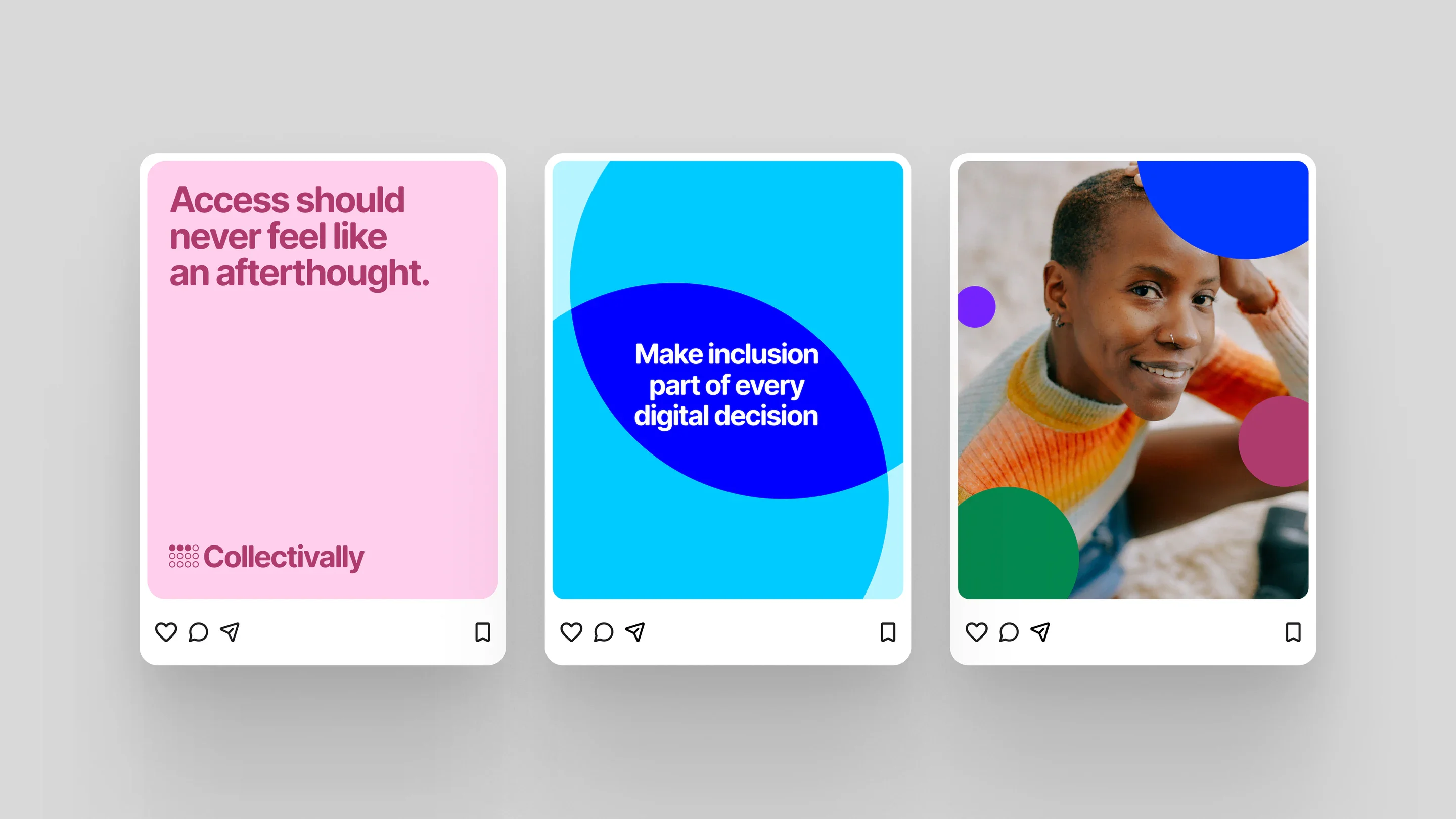
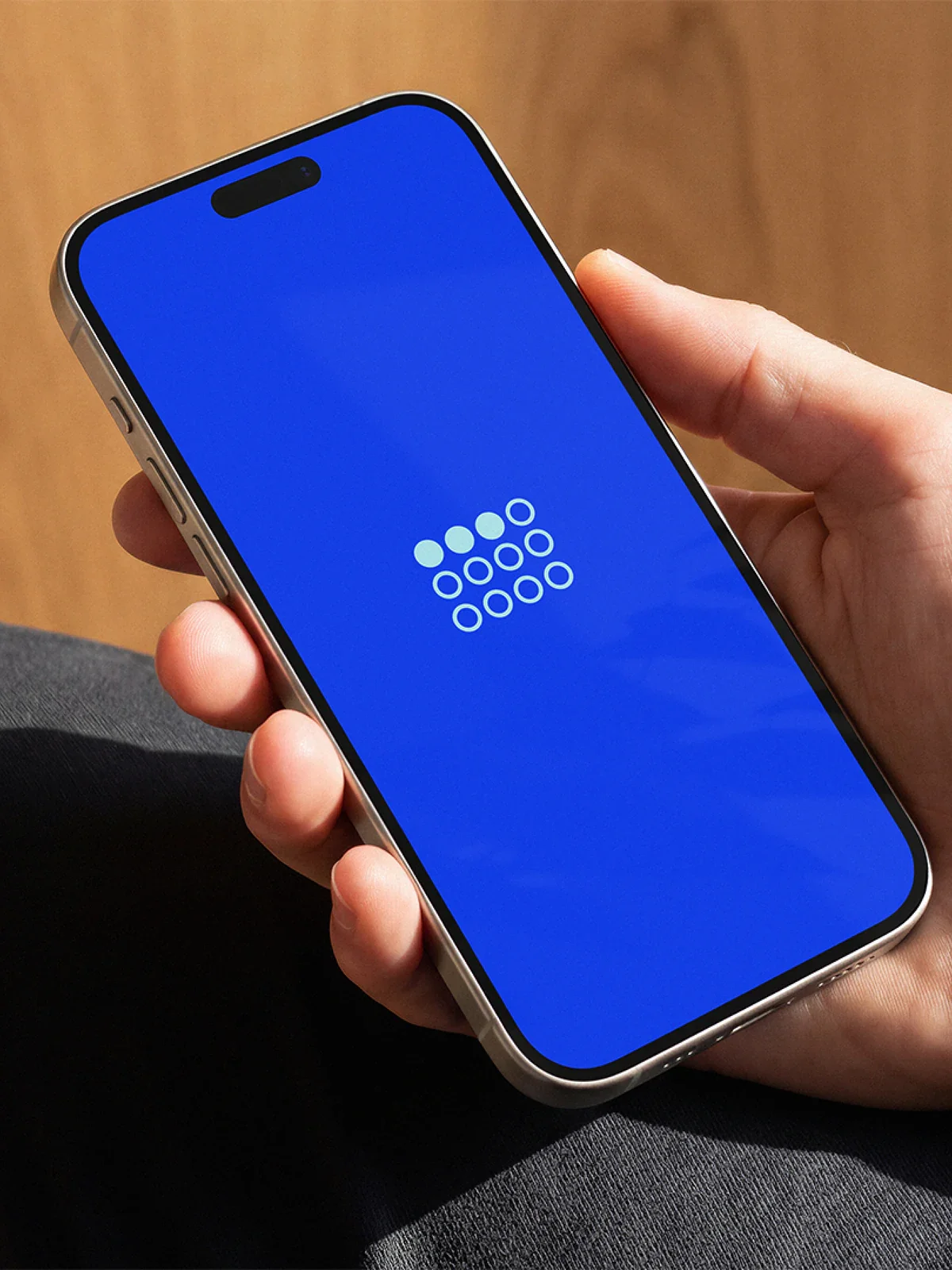
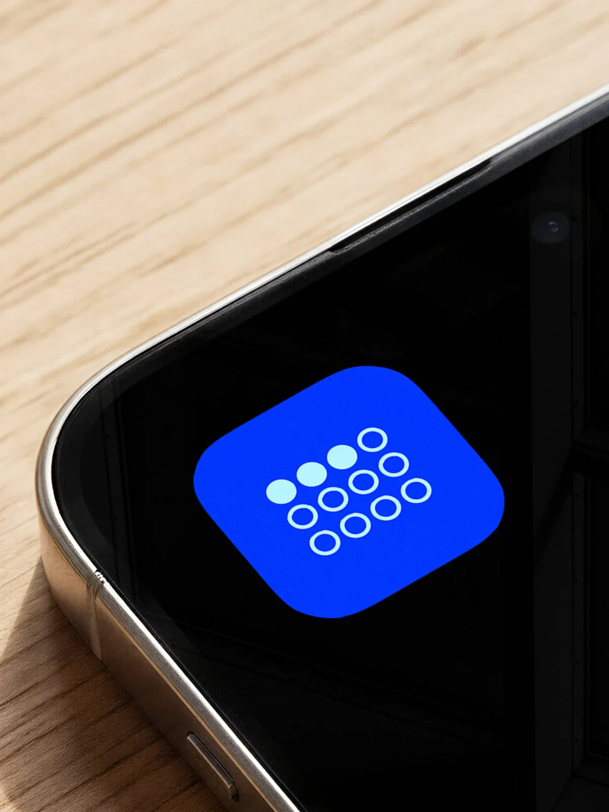
The logo brings the thinking behind Collectivally into a simple grid of twelve dots.
Its arrangement is inspired by the Braille letters C and A, connecting the name to a form of communication designed around a different way of accessing information.
Within the grid, three dots carry a second meaning: three out of twelve, referencing the UK statistic that one in four people has a disability. Those same three dots also represent Collectivally’s three founders.
The result is a compact mark that holds the name, the purpose and the partnership behind the business. It can be recognised as a simple graphic before its layers of meaning are explained.
The grid also gives us a starting point beyond the logo. A collection of individual elements can suggest people, perspectives and relationships, allowing the identity to talk about inclusion without relying on a single, supposedly universal symbol for disability.

Character without caricature
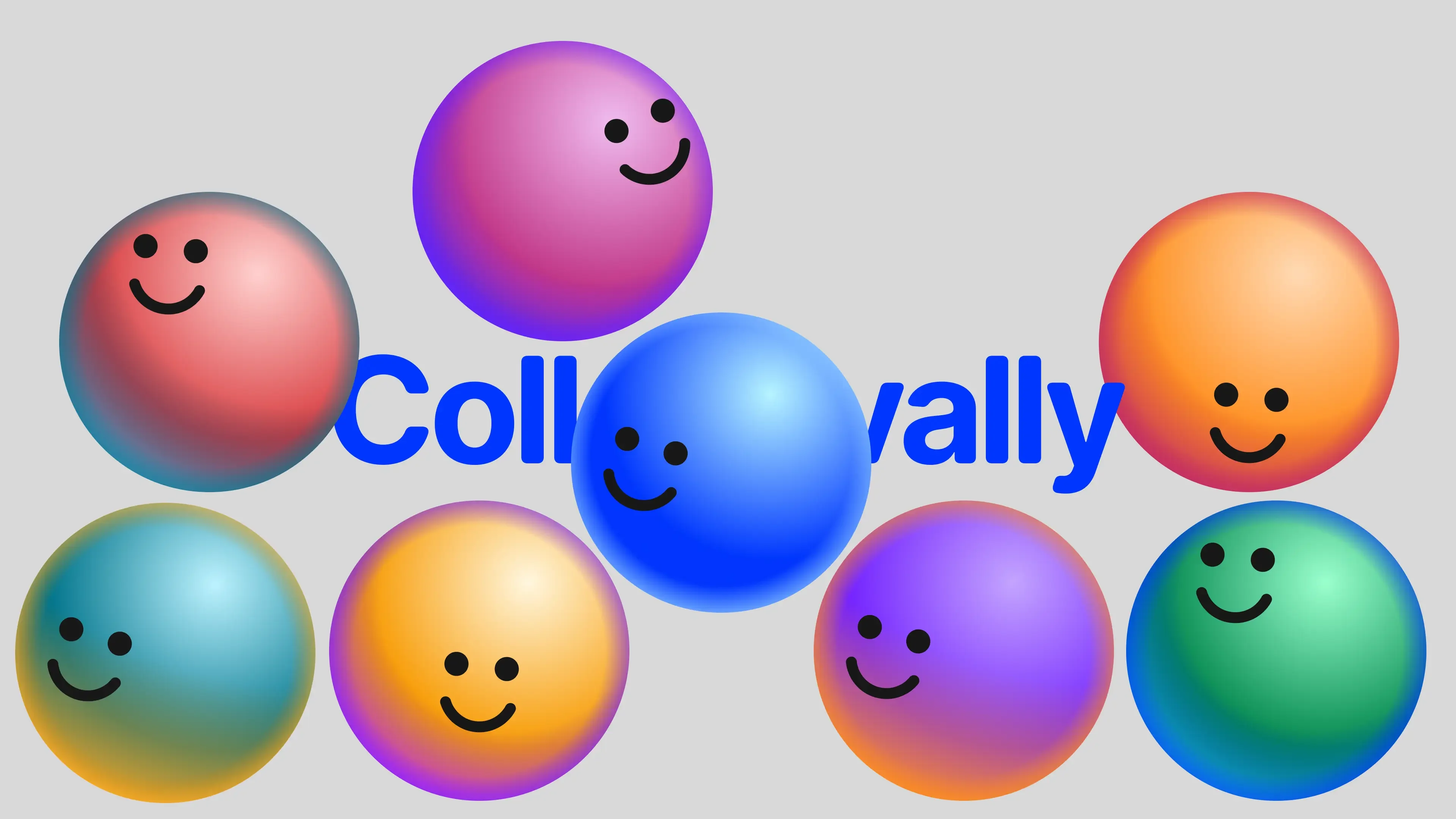
The personas presented a more delicate challenge. They needed to feel familiar enough to engage with, but not look like photographs of research participants or claim to stand in for an entire community.
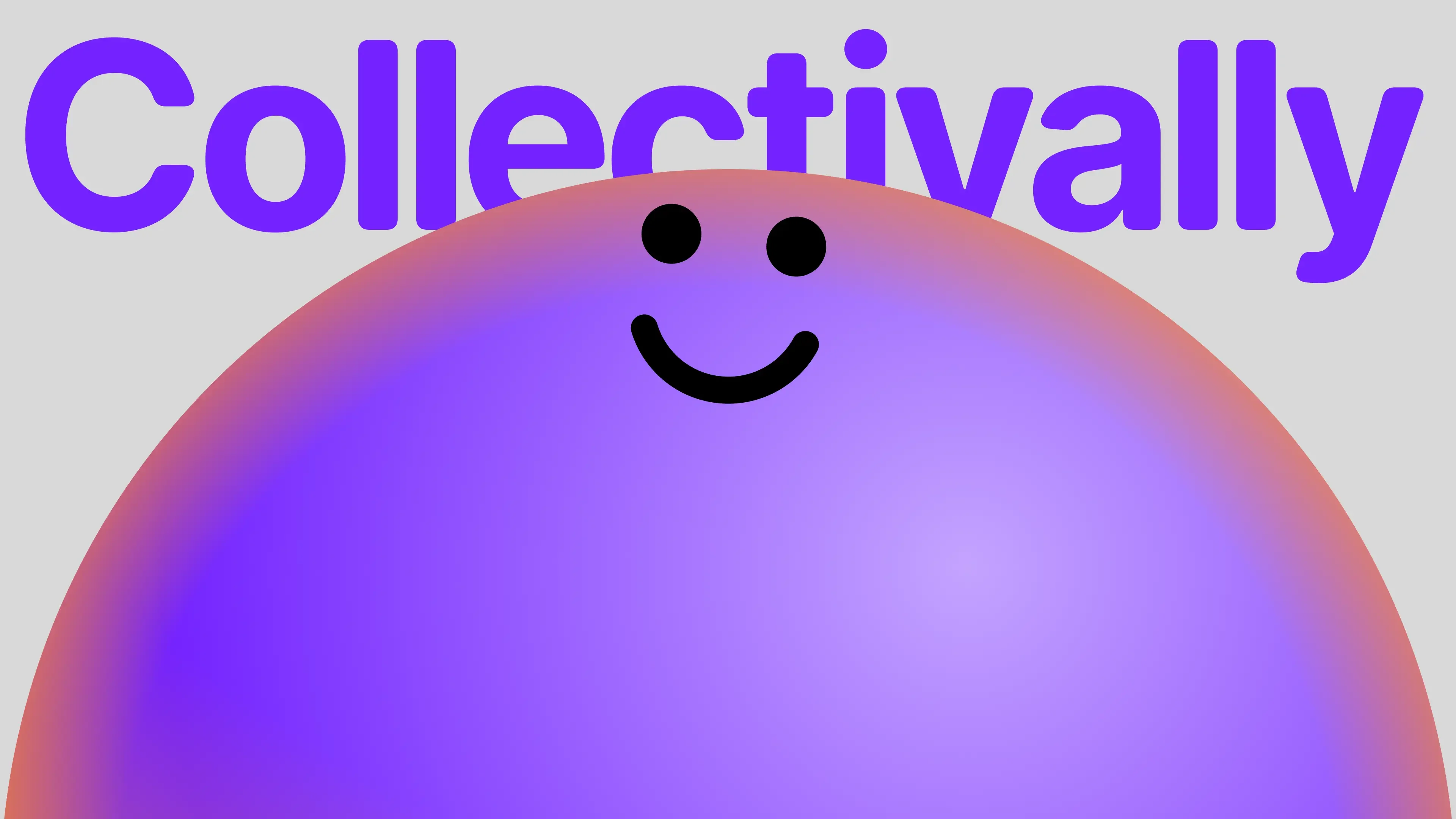
We developed an abstract, human visual language that sits between a symbol and a portrait. Each persona has a recognisable presence, while remaining anonymous. The intention was to make them feel tangible and approachable without the specificity of a realistic likeness.
That balance matters. A generic icon would reduce a persona to a category. A convincing human portrait could suggest a real individual whose experiences the system was reproducing. Abstraction gave us another route: character without impersonation.
It also reflects what the product is. Collectivally’s personas represent patterns of functional needs, informed by inclusive research. They are structured provocations, designed to challenge thinking and help teams ask better questions. When a question needs lived experience, teams can move straight from Collectivally into research with real people through Web Usability.
The design gives those perspectives a human point of connection, while keeping the difference between a persona and a person visible.
Making the unfamiliar feel familiar
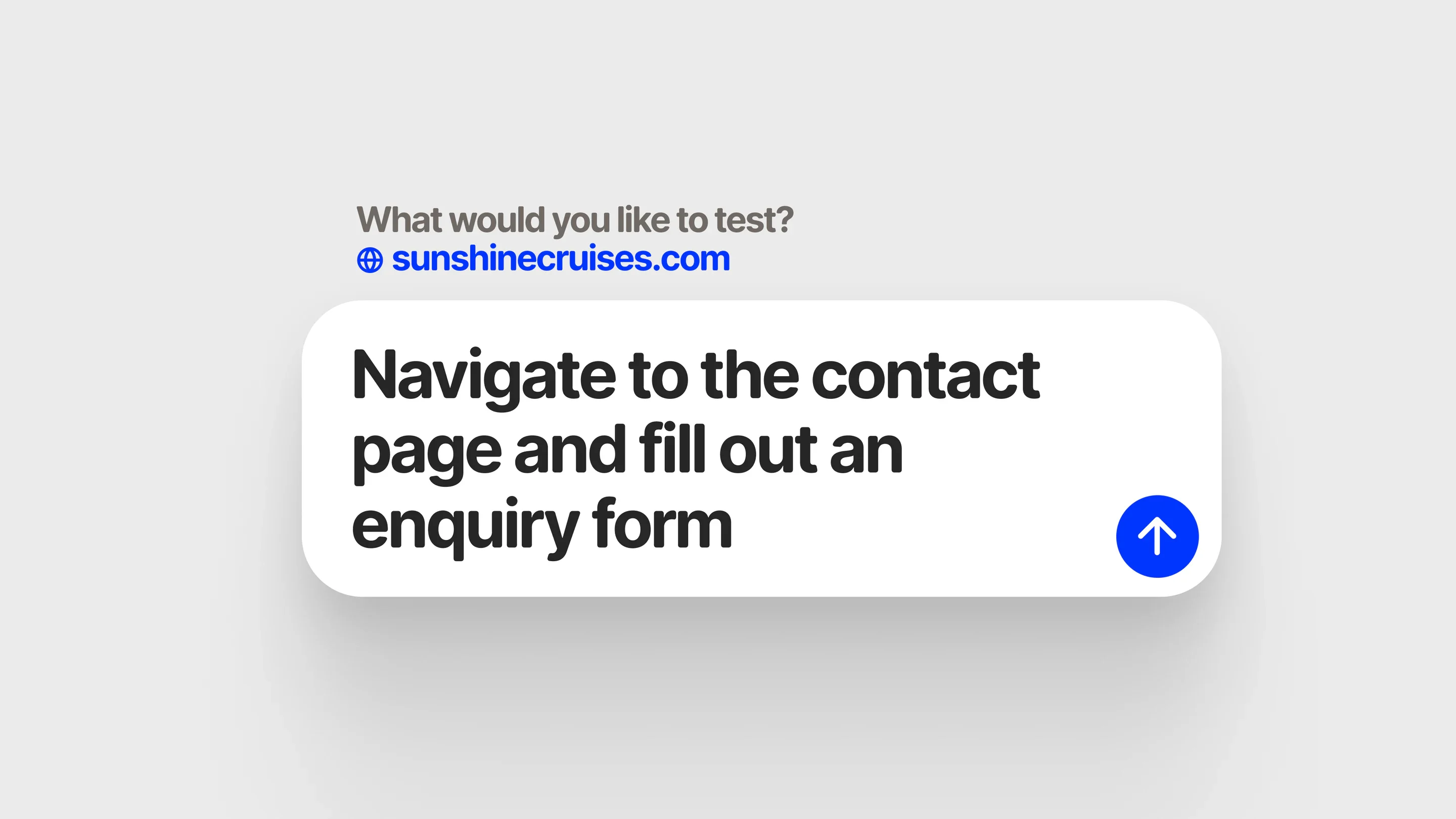
We wanted interacting with the AI to feel less like configuring a system and more like exploring a question.
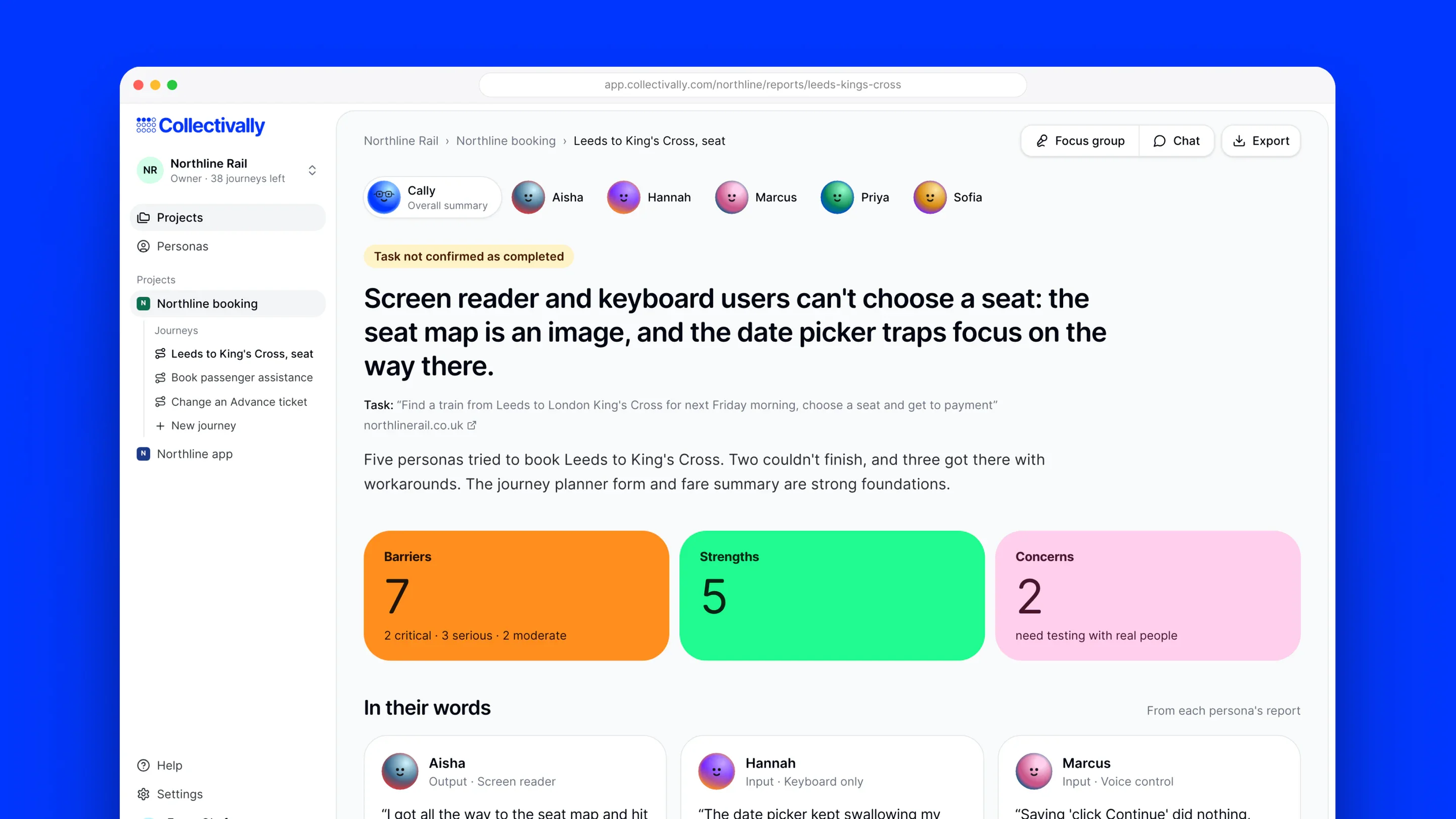
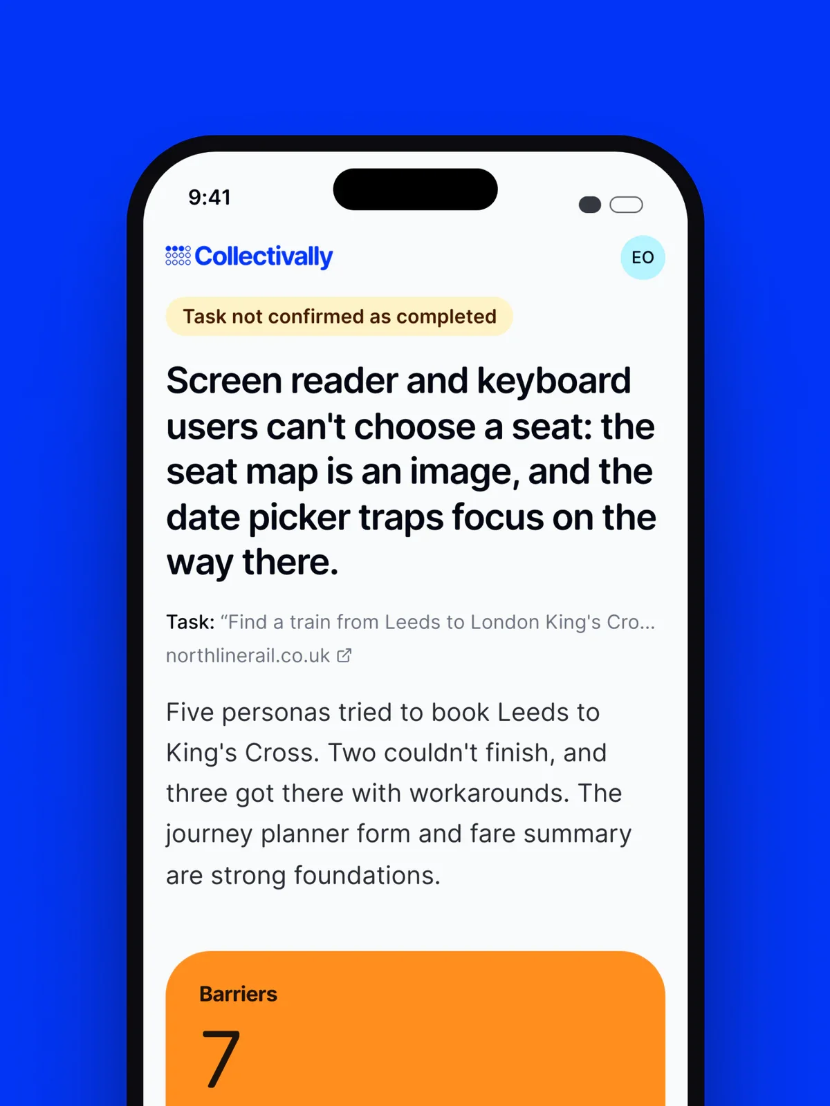
The persona visuals help establish that relationship. Rather than presenting the technology as an invisible engine behind a report, they give its different perspectives something recognisable to attach to. Names and characters create continuity as users select personas, explore journeys and read findings.
The wider identity balances two qualities. The dot grid is ordered and economical; the personas bring individuality and expression. One communicates the collective, while the other gives its different perspectives a presence.
Together, they let the brand feel systematic without becoming impersonal. The objective was familiarity, not novelty for its own sake: a distinctive visual world that people could become comfortable working within.
Turning an explanation into an experience
The website introduces the product through ordinary things people are trying to do, such as finding a jumper, choosing a course or planning a trip. An animated maze follows the personas through a digital journey, revealing where the same environment creates different barriers.
This gives the illustration and motion a practical role. They make an abstract proposition visible: the website has not changed, but the experience of using it depends on the needs of the person navigating it.
The personas become part of the explanation, rather than decoration around it. Visitors encounter the brand’s character and the product’s purpose at the same time.
One idea, carried through
For Bodkin, the project connects the different parts of our practice. We helped shape the business, develop its identity, design the experience and build the product behind it.
Throughout, the design had the same job: to make people curious about perspectives other than their own. From the meaning held in twelve dots to the character of the personas, we gave that invitation a consistent, recognisable form.