![Colophon spread from the book Ritual Technology, set entirely in Adrian Frutiger's OCR-B typeface. Columns of green, red, and blue monospaced text declare "this book is readable by both human(s) [and] machine[s]" beside a full character set, ASCII-art figures, and duotone photographs treated as data entries. A teal-tinted cat labelled GARY [RIP], a man and an upside-down dog in orange labelled TIM and LOULOU, and a blue-tinted portrait labelled DINA.](/_astro/hero.D6lxdkQ6_ZJvxUm.webp)
There is a moment in every branding project where someone asks where the QR code goes, and every designer in the room does the same small internal sigh. A black and white square, born on a factory floor in 1994, lands in the corner of something we have spent weeks crafting. Luxury fashion house or car park, same square. Same nothing.
For a while I thought the answer was a better square: a machine-readable mark that belonged to the brand, a beautiful stamp instead of an ugly one. I now think that was the wrong idea, and the right one is much older and much more exciting.
You already recognise brands the way I’m describing
Think about how you actually recognise a Burberry check, or a Marimekko print, or a tartan. Nobody scans them. You catch a fragment of scarf across a room, in bad light, half-folded, and you know instantly: recognition from any piece, at any distance, on damaged material. Everything a QR code cannot do.

Tartan goes further. A tartan is not a logo, it is a specification: a registered thread-count sequence that generates a pattern identifying a clan from any fold of cloth. Rule-based, generative, one grammar producing family variants. It is the oldest formal pattern-identity system in the world, and it is basically the thing I have been trying to invent.
And if you want proof that structured data and craft can be the same object, the Inca got there five hundred years ago. A khipu is a system of knotted cords in which knot type, position, colour, ply direction, and hierarchy encode numbers in a full decimal system, and possibly narrative too, read by trained specialists. It is a beautiful, tactile artefact whose physical grammar is the information: data as material, meaning you can hold.
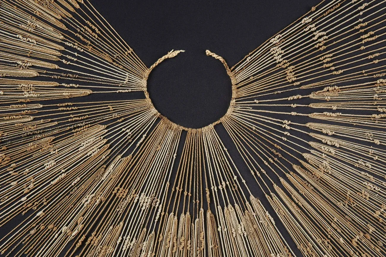
There is a dark lesson in them as well. The Spanish destroyed most khipu, the reader tradition died with the empire, and today thousands survive that we can no longer fully read. The artefacts endured, but the grammar did not, which is why anything like this has to be built on an open, published specification. A pattern language whose decoder lives in a few heads, or inside one company’s model, is a khipu waiting to happen.
Pattern is how identity has always worked when it works best. Not a mark placed on the design. The design itself.
Machines can already read this way. There’s proof in your wallet
Take out a banknote. Distributed across its artwork, hiding in plain sight inside some of the most heavily art-directed surfaces ever printed, is a sparse arrangement of five small circles called the EURion constellation. Photocopiers and imaging software detect it from partial views, at any angle, and refuse to reproduce the note. That is pervasive, crop-tolerant, machine-triggered pattern recognition, deployed globally, for decades.
And there is a stranger cousin. Colour laser printers have quietly scattered near-invisible yellow-dot patterns across every page they print for years: a machine-readable fingerprint your eye cannot see, because human vision is terrible at low-density yellow, and a camera recovers trivially.
So the mechanism is proven, and others have circled the gap from either side. Artcodes showed that machine-readable marks can be drawn beautifully, but they remain bounded marks placed on a surface. Patrik Hübner has shown how far generative, rule-based brand identities can go, but nothing reads them back. Aesthetic codes exist, and generative brands exist. Nobody has joined them.
Nobody has made the pattern mean anything. Nobody has made it someone’s.
The banknote circles say one thing: “banknote”. The printer dots were covert surveillance. Machine-legible pattern exists, but it has no identity, no openness, and no design language. That is the gap, and it is a design gap, not a technology gap.
An identity in every cell
So here is the idea I am now completely absorbed by. A brand develops a pattern grammar: a small alphabet of forms, rules for how they connect, cluster, repeat, and breathe, and characteristic rhythms of spacing, angle, and density, the way a tartan has its sett. That grammar generates everything, from business cards and packaging to posters and environments. Every surface different, every surface unmistakably family, the way strong identities have always worked for people.
But the grammar is also specific, with real rules and real proportions, which means its statistical fingerprint is measurable. A machine that knows the grammar can look at any fragment of any surface and say: this is Bodkin, this is their 2026 identity, and this particular card belongs to this particular person.
I keep coming back to DNA, and it has stopped being a metaphor. DNA is not a barcode stuck on an organism; it is in every cell, so you can sample anywhere and recover the genome. Crop the card, tear the poster, photograph a corner of the packaging across a shop: it still says who it is. No code region, no scanning, and nothing placed in any corner, ever again.
And the pattern only has to say one thing
This is the constraint that sets the whole idea free. The pattern does not need to carry a website, a payload, or data of any kind. It needs to say who I am, and the web does the rest: once a machine recognises the identity, the brand’s own domain supplies everything verified and current, what the company actually does, how it speaks, and what it authorises, in its own signed words.
The pattern is a name spoken fluently across an entire surface. The domain is the dictionary.
Print is the medium. The plates are the voices
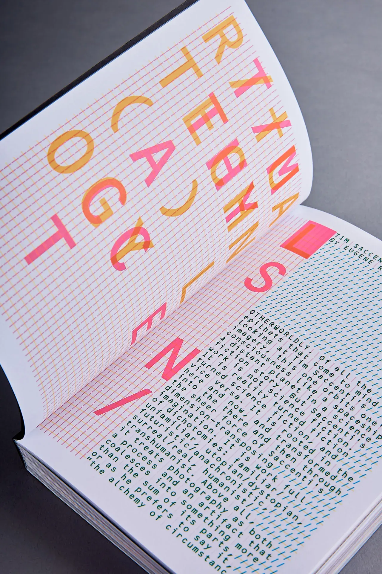
The reference I keep returning to is Studio.Build’s Ritual Technology: CMYK-derived structure, coded typography, interference patterns, and layers revealing themselves under different light. Codes as the aesthetic, not an interruption to it.
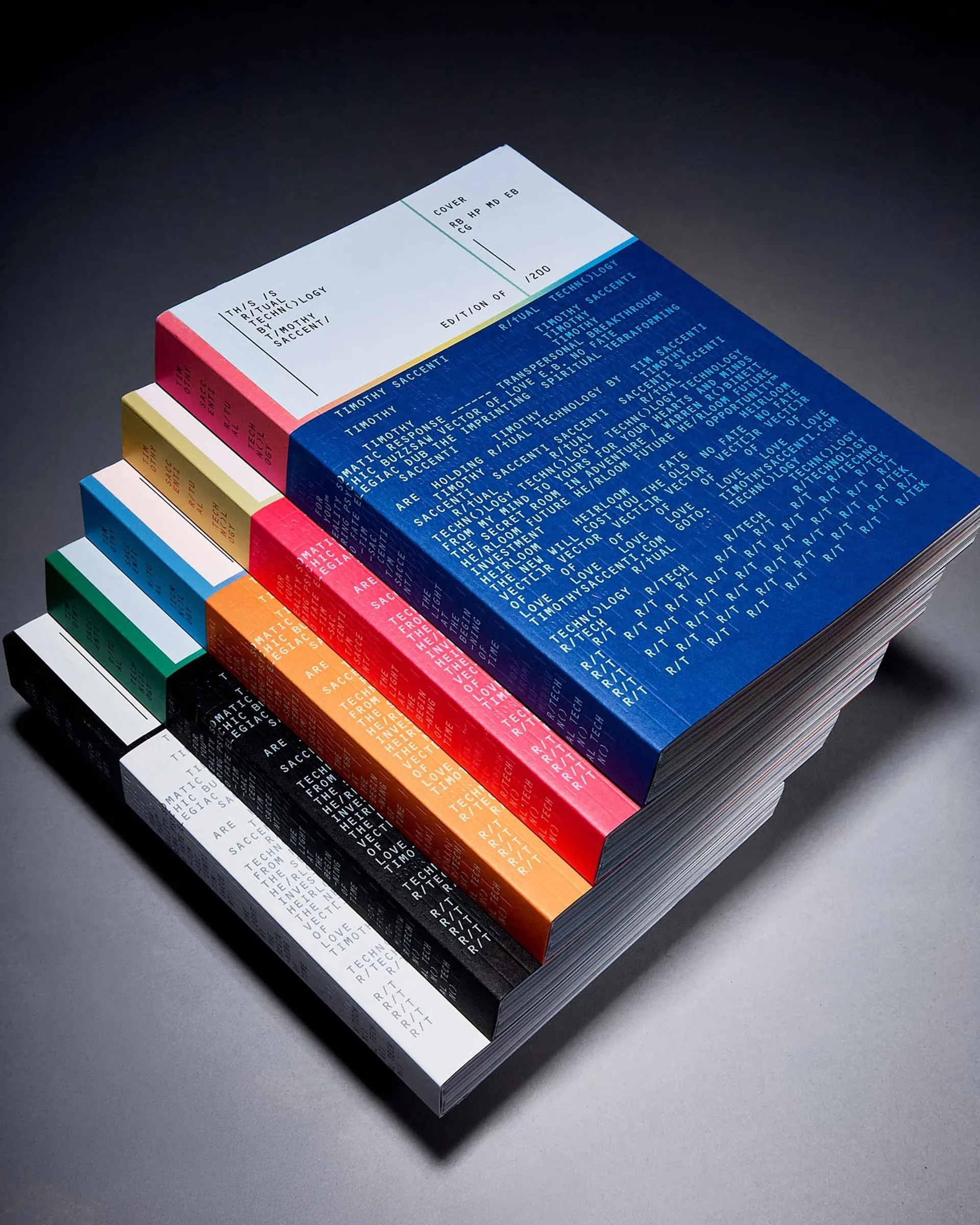
The pattern idea gives that beauty a job.
Imagine surfaces designed as separations from day one, with cyan, magenta, black, and yellow each carrying a voice of the grammar. Their overprint creates the composition people fall for, while their individual characters stay machine-separable: the master grammar in one plate, a person’s variation in another, the era of the identity in a third. The interplay of plates, the misregistration energy, the overprint colour, everything that made Ritual Technology sing, stops being evocative and becomes structural. The production behaviour is the language.
When we first shared this thinking, Studio.Build themselves described it as warp and weft: the machine layer woven through the cloth and celebrated, not hidden in a corner. Even the printer’s sinister yellow trick gets redeemed as quiet dynamic range inside a visible composition, open, documented, and readable by anyone.
What we’re doing about it
We are testing this properly at Bodkin, and the work is public. The specification, the pattern generator, the recogniser, and the test battery live in an open repository called Semantic Pattern: classical, deterministic measurement, no trained models, and honest confidence scores with the working shown. Open by design, for the khipu reason above.
The first phase is gloriously unglamorous. Build a raw grammar with zero art direction, an alphabet and rules that are ugly on purpose, then generate hundreds of surfaces from it, print them cheaply, and photograph them terribly: crops, glare, blur, weird angles, restaurant lighting, and across-the-room distance. Then measure everything. How small a fragment still identifies? Can the machine tell my card from my colleague’s, and this year’s identity from last year’s? And the question that really matters: does it ever mistake someone else’s pattern for ours?
That boundary, between how expressive the grammar can be and how confidently machines recognise it, is the actual research object. It is also the first question designers ask when they hear the idea: does machine-readability strangle the creative freedom? We do not know yet, and the plan is to map the envelope honestly, with numbers, before anyone falls in love with a composition. Then art direction goes to work inside the proven envelope, with constellations, topological ornament, and four-plate compositions. The grammar becomes Bodkin.
The demo I am chasing is one moment. Someone photographs any fragment of anything we have made, a corner of a card or a stretch of a poster, and a machine says: Bodkin, this person, this era, verified. In our own words, from our own domain. While the thing in their hand looks like nothing that has ever been scanned.
Because nothing is being scanned.
Where this goes
If it works, machine legibility becomes a design material, the way responsiveness, accessibility, and motion each began as technical afterthoughts and became things designers compose with. The physical world starts to get the machine layer it deserves: not squares in corners, but languages on surfaces, every brand speaking in its own voice to every audience that looks at it, human or otherwise.
The strongest identities have always been languages, not stamps. Perhaps the next ones will speak to people and machines at once.
I do not know if this will work yet. The false-positive problem is real, recognition is fuzzier than decoding, and print eats subtle things for breakfast. But the mechanism is on every banknote in your pocket, the cultural form is as old as tartan, and nobody has put them together.
That feels like exactly the kind of thing a design studio should be for.
If you’re a printer who loves a strange brief, a pattern designer, a computer-vision person, or someone certain this is doomed, I’d genuinely love to hear from you. The best conversations are usually with the sceptics. james@bodkin.studio