YakChat
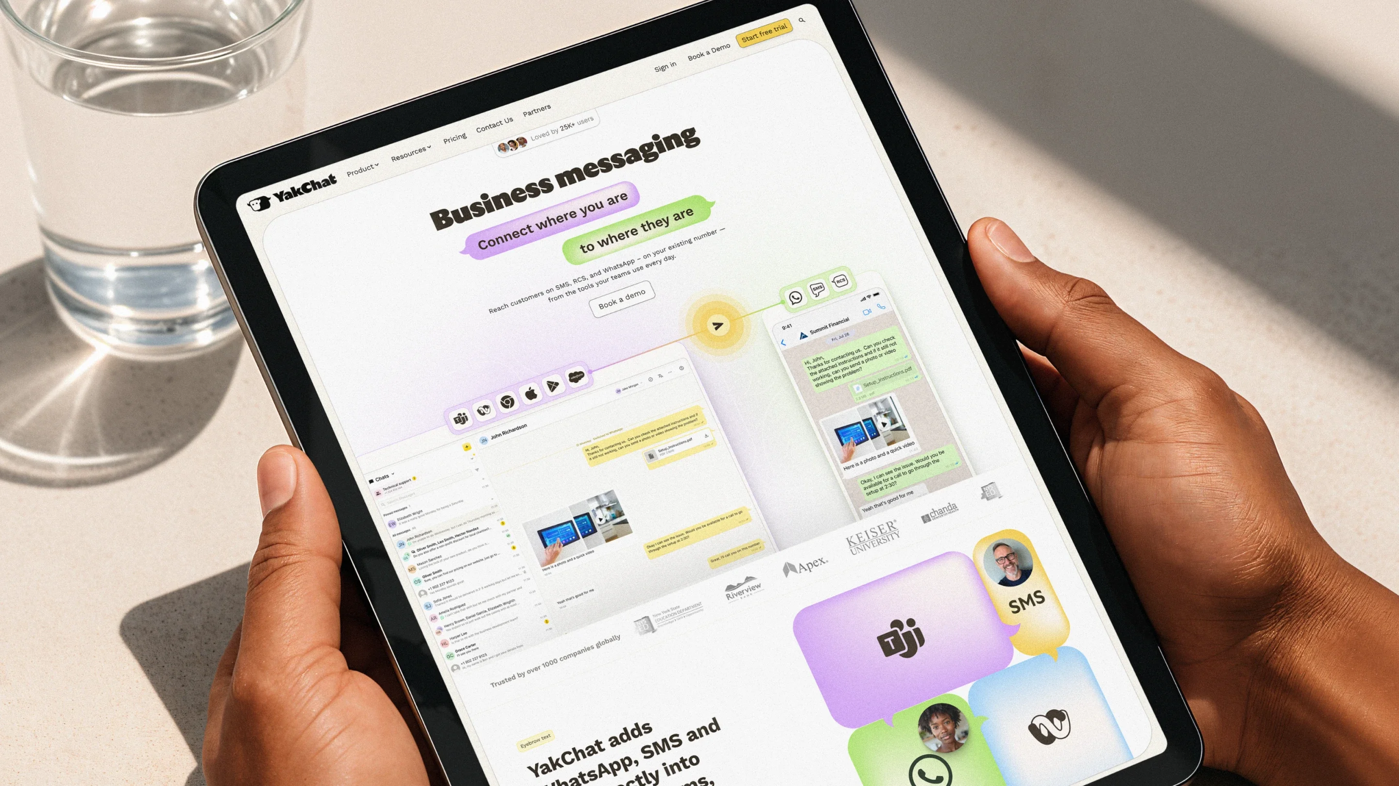
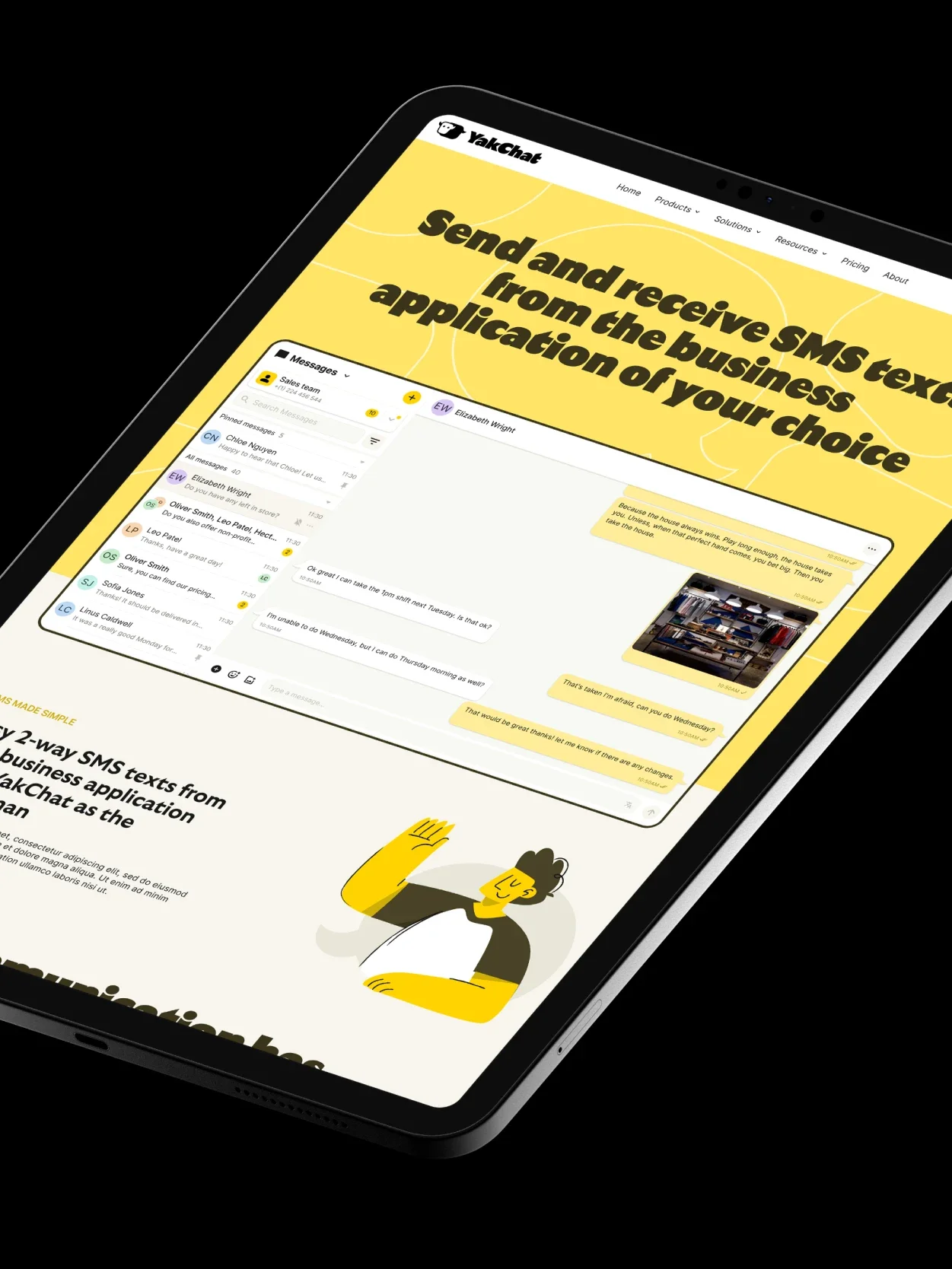
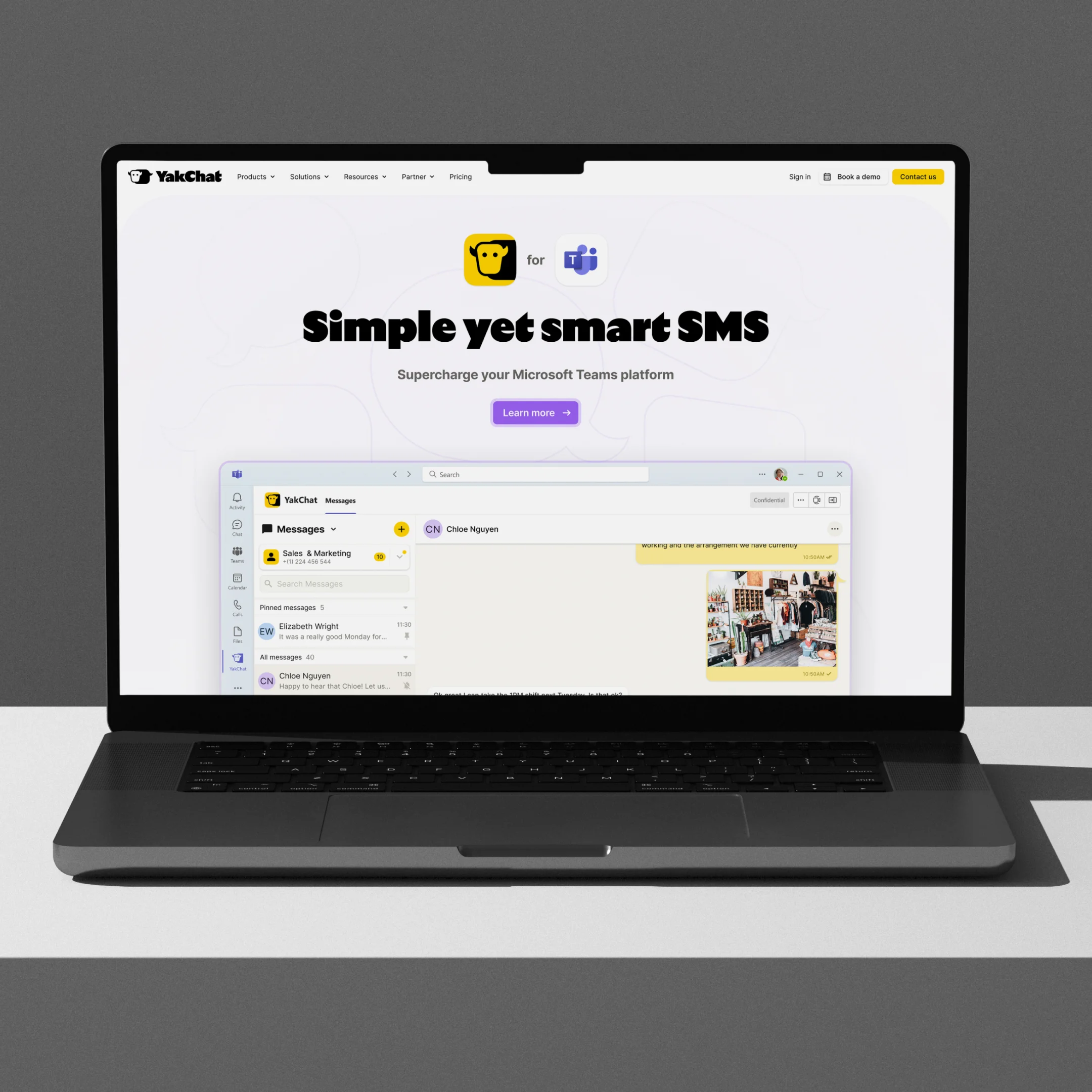
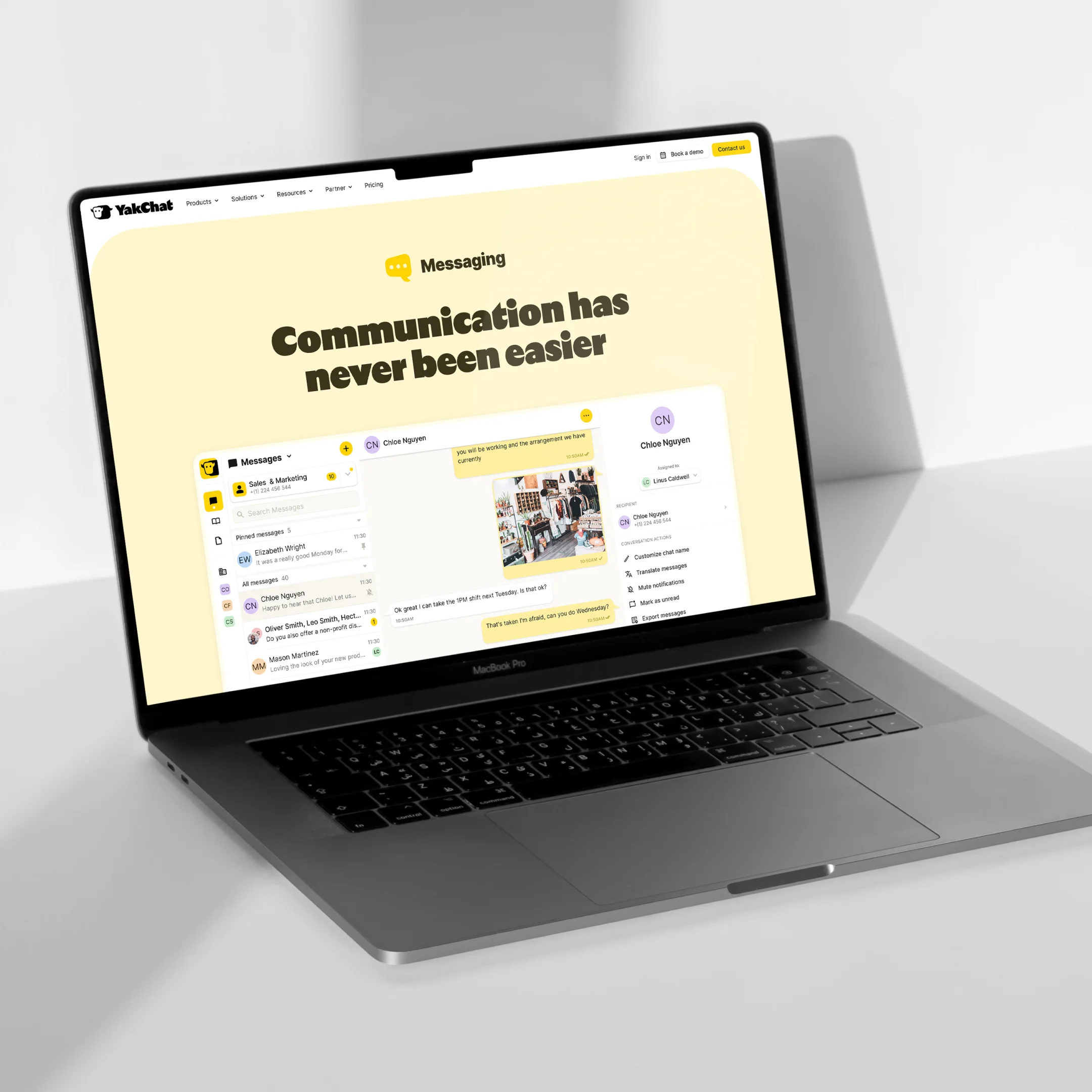
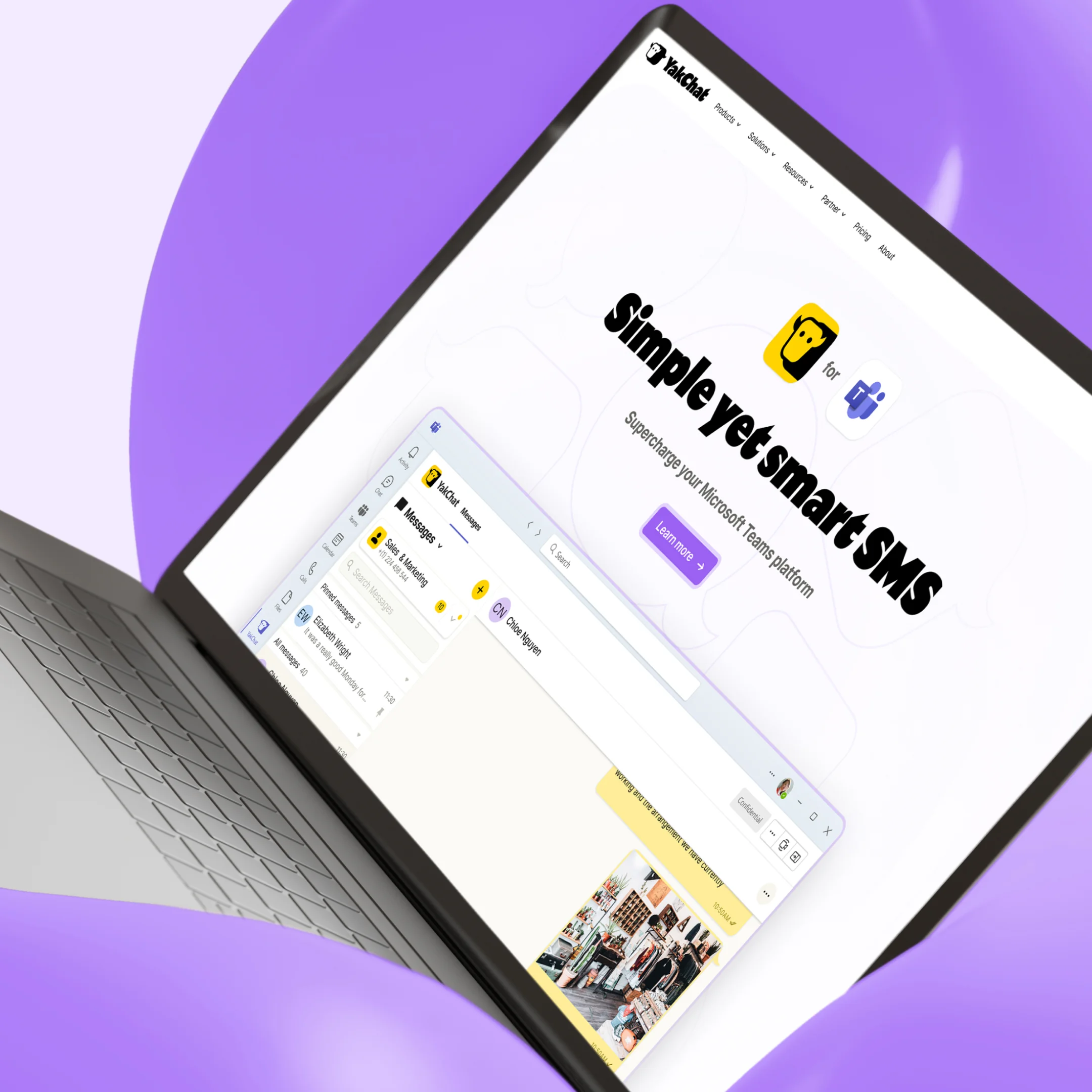
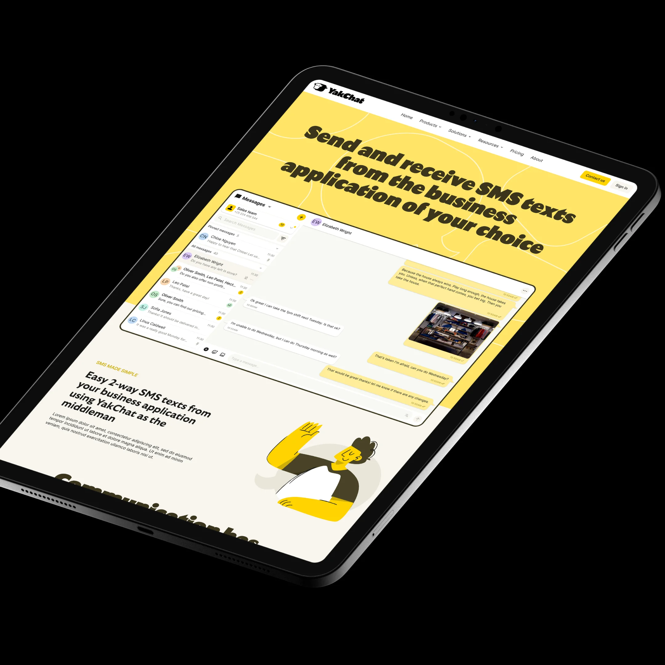
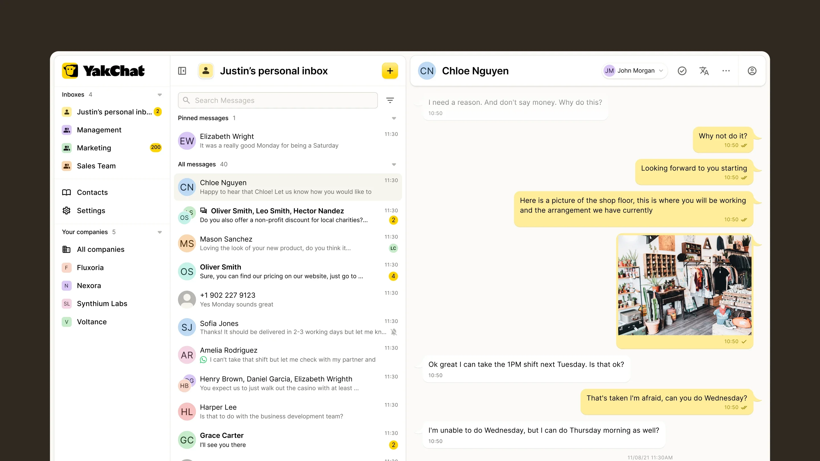
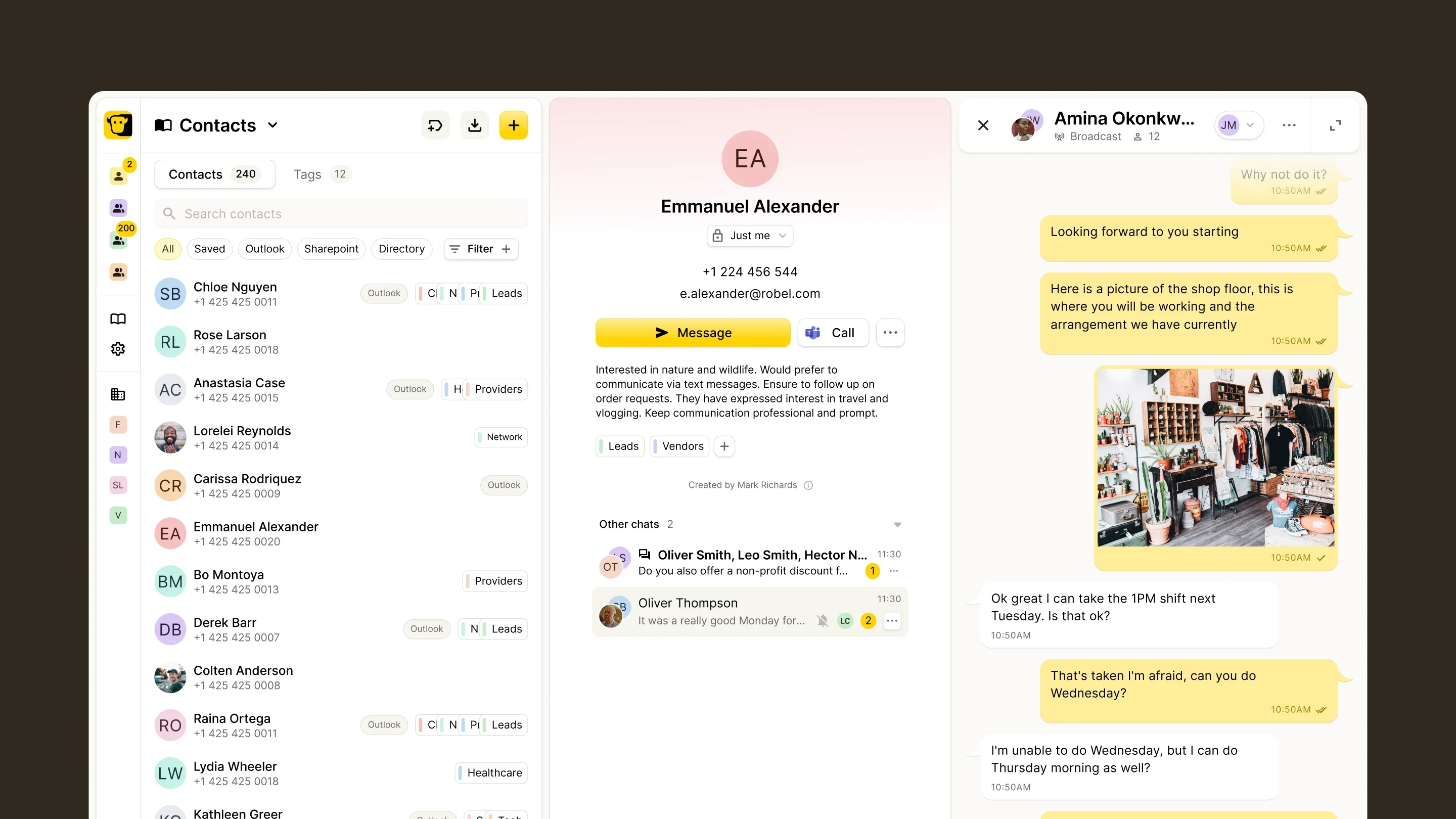
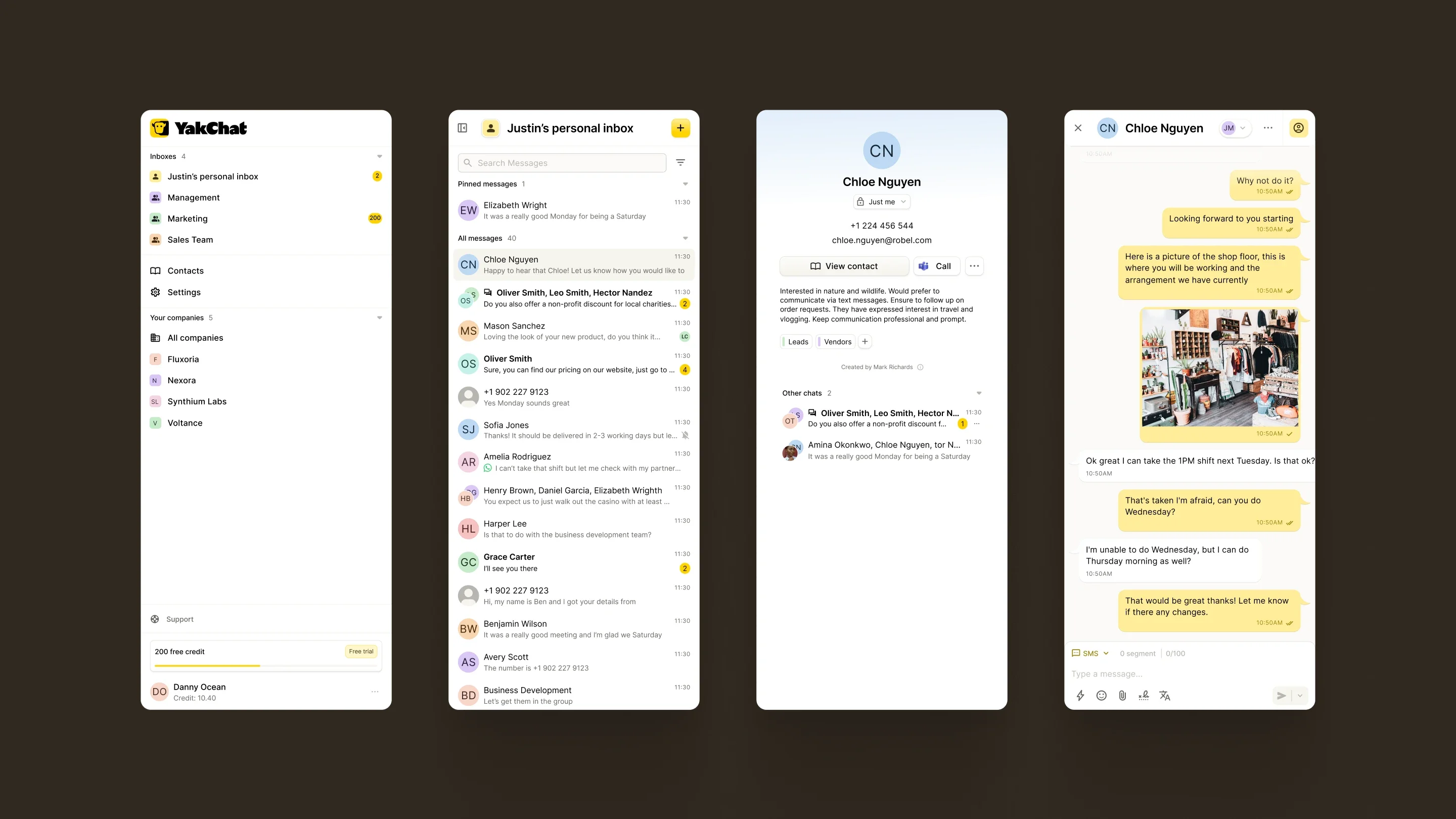
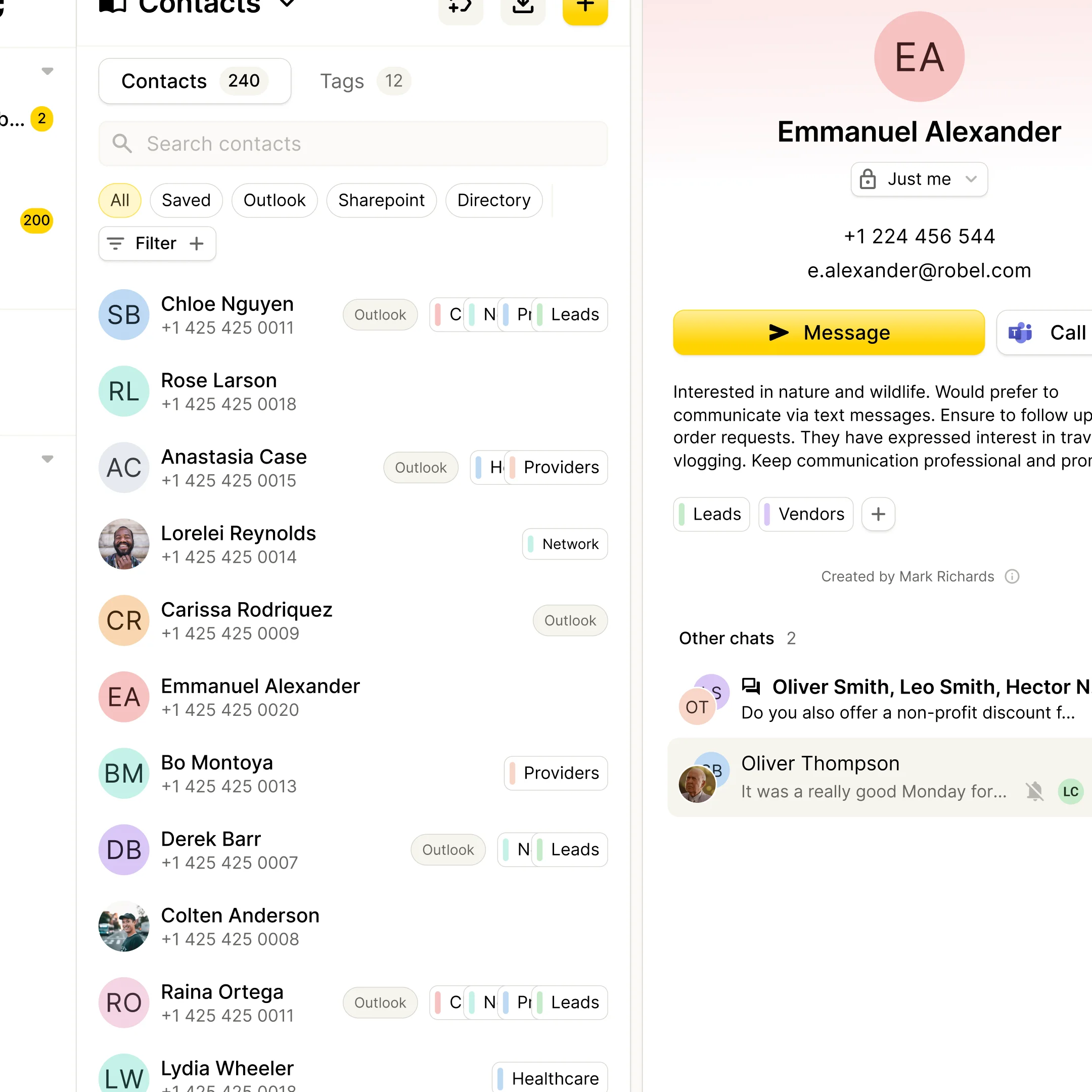
YakChat is a business messaging platform that brings two-way SMS into workplace tools such as Microsoft Teams and Webex. It helps organisations manage customer conversations without leaving the platforms they already use, extending internal collaboration tools into practical channels for external communication. We partnered with YakChat to rework the brand from the ground up and redesign the product experience across web, mobile and admin tools. The challenge was twofold: create a more distinctive identity in a crowded B2B messaging market, and bring greater clarity and usability to a complex, feature-rich product suite. The result was a complete brand system, a more intuitive product experience, and the foundations for a scalable design system used across the platform.
- Client
- YakChat
- Year
- 2023
- Role
- Brand IdentityVisual IdentityBrand GuidelinesUI/UX DesignProduct DesignWebsite DesignDesign SystemsBrand ManagementHeadless CMSReact Native App DevelopmentReact App DevelopmentComponent Library Development
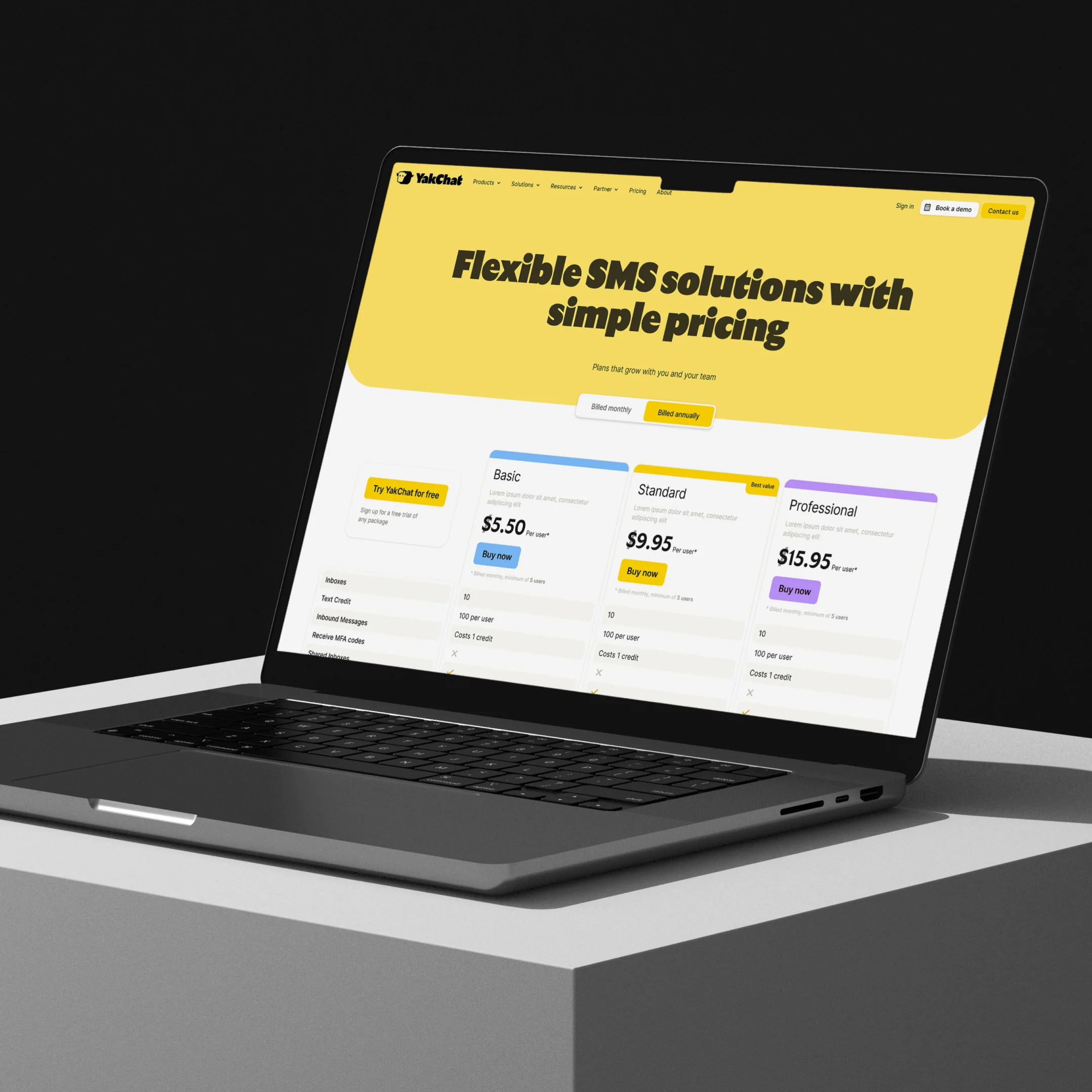
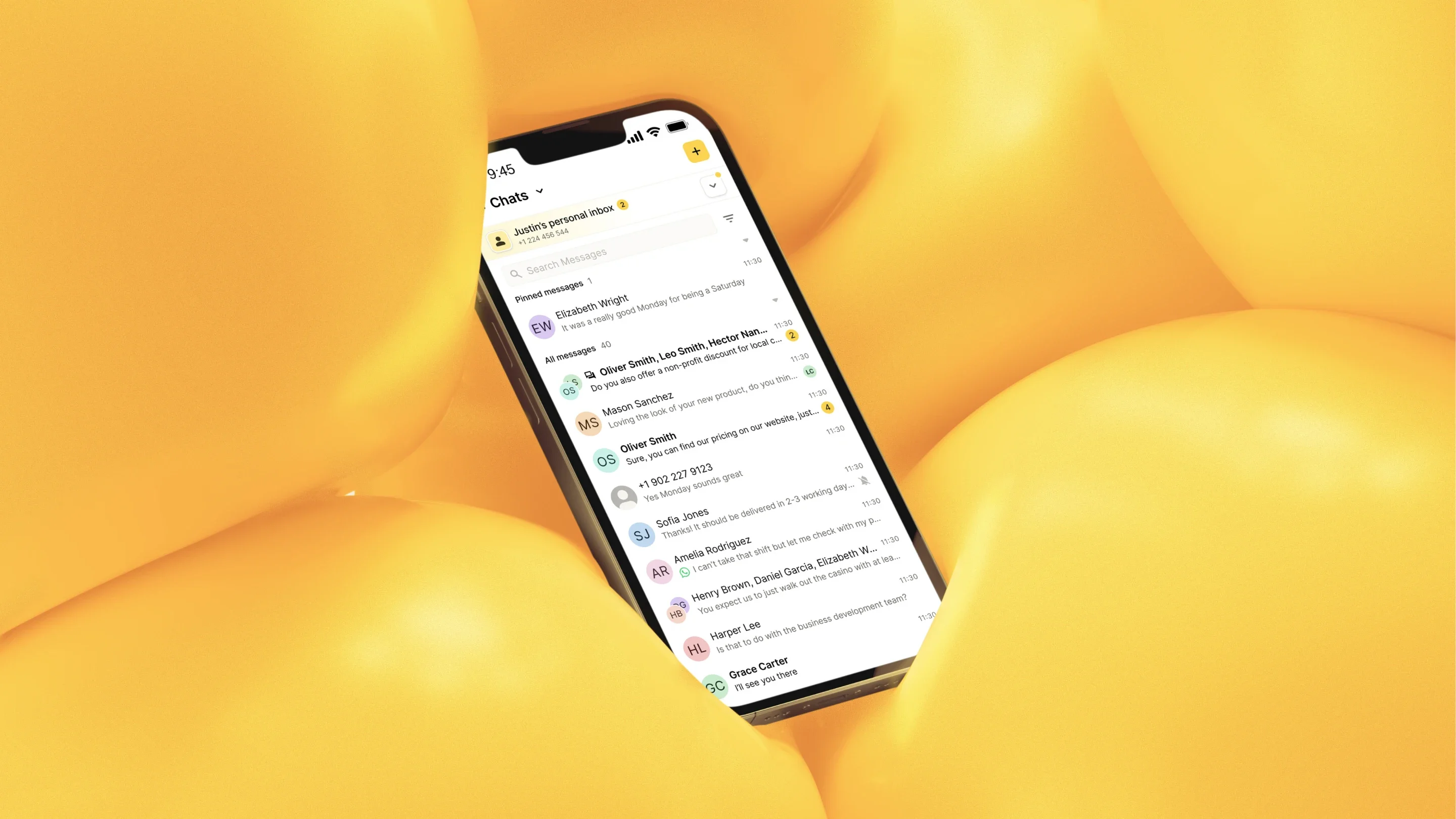
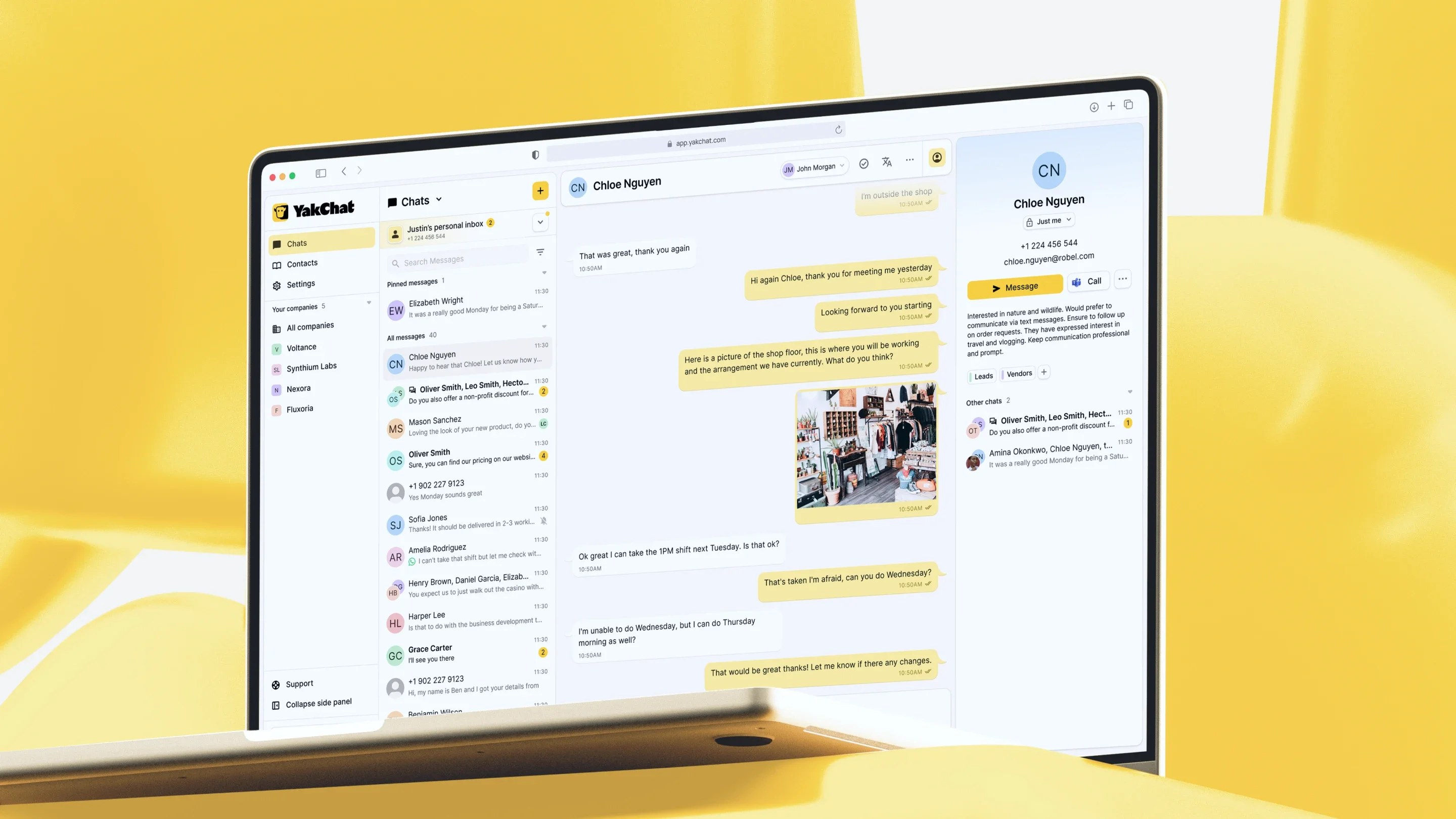
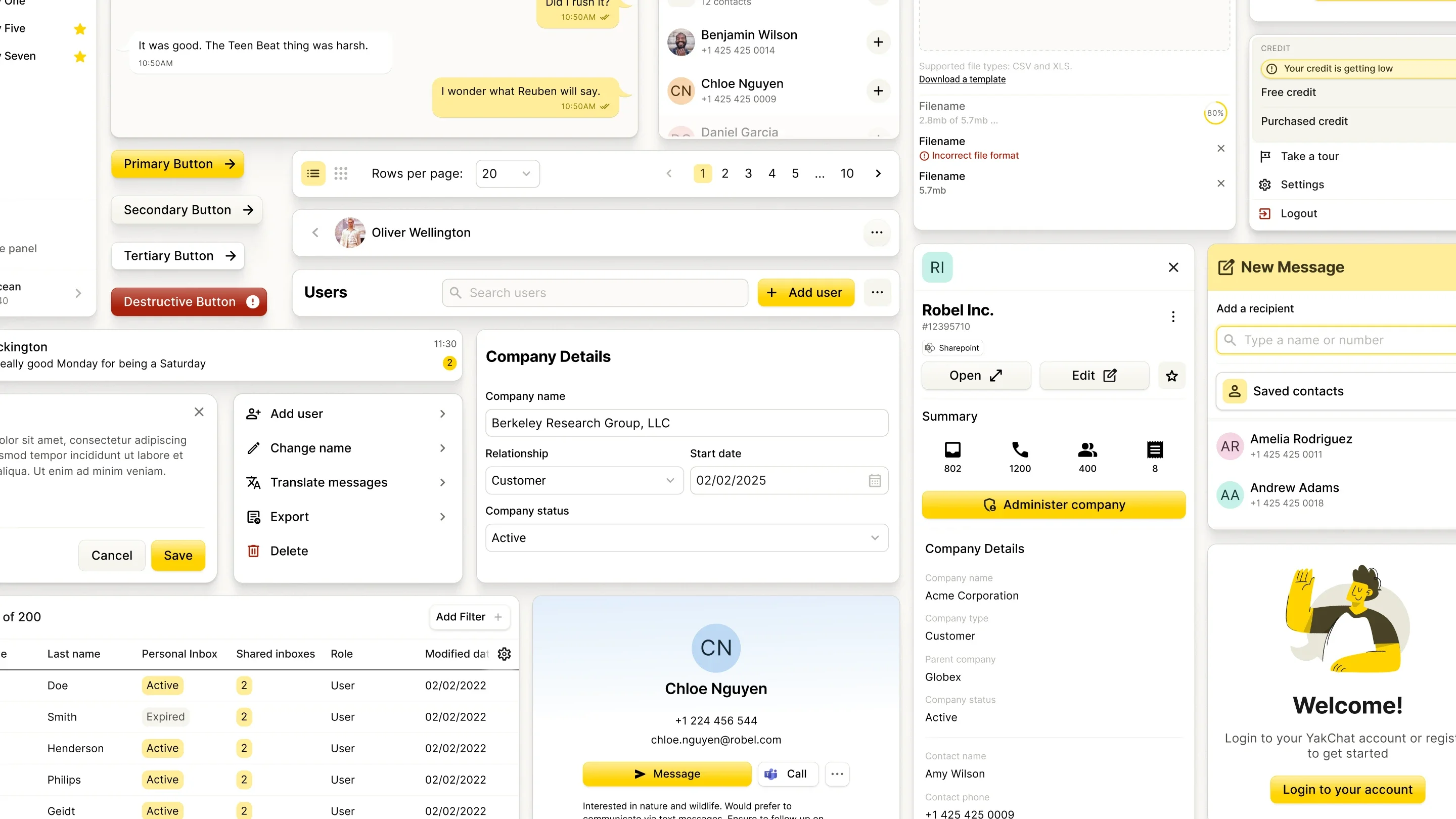
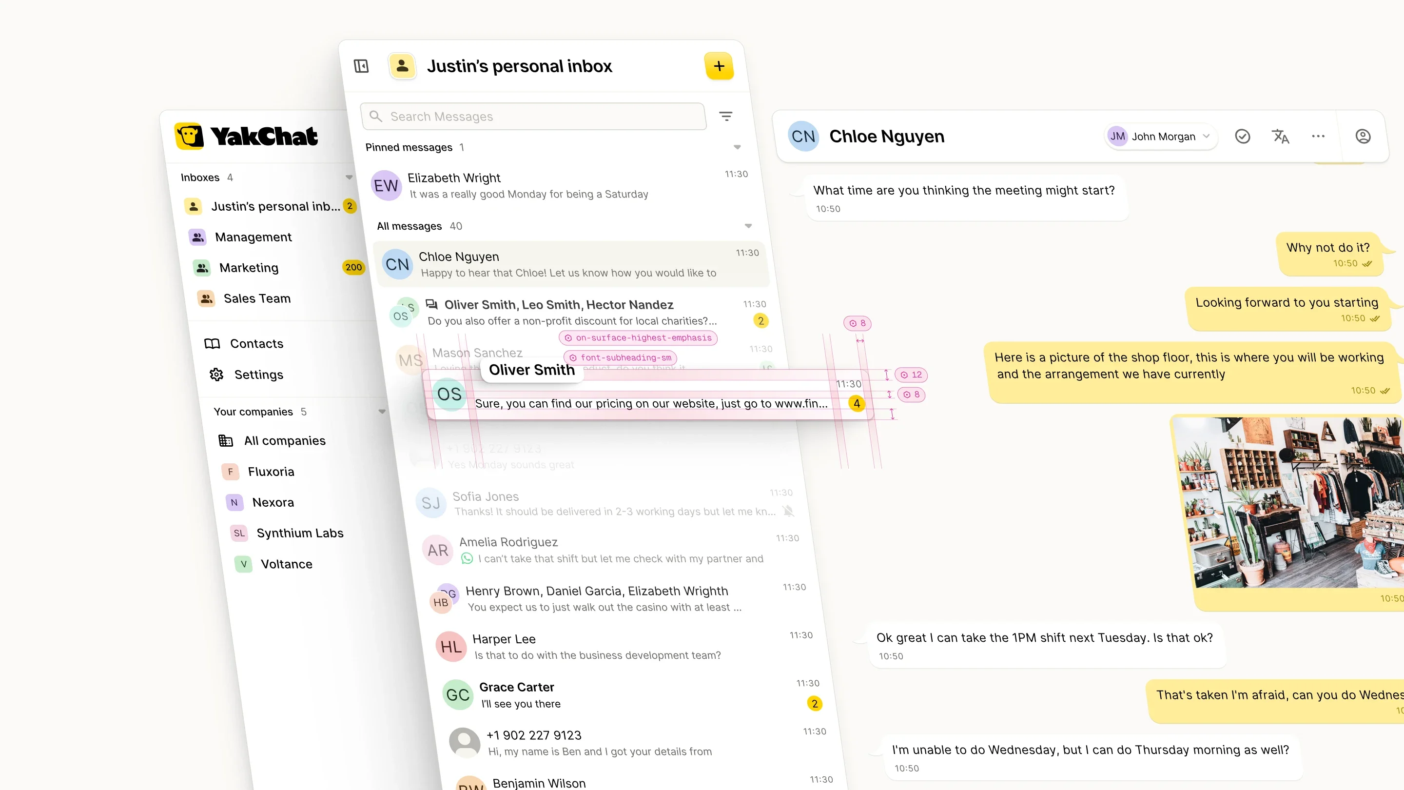
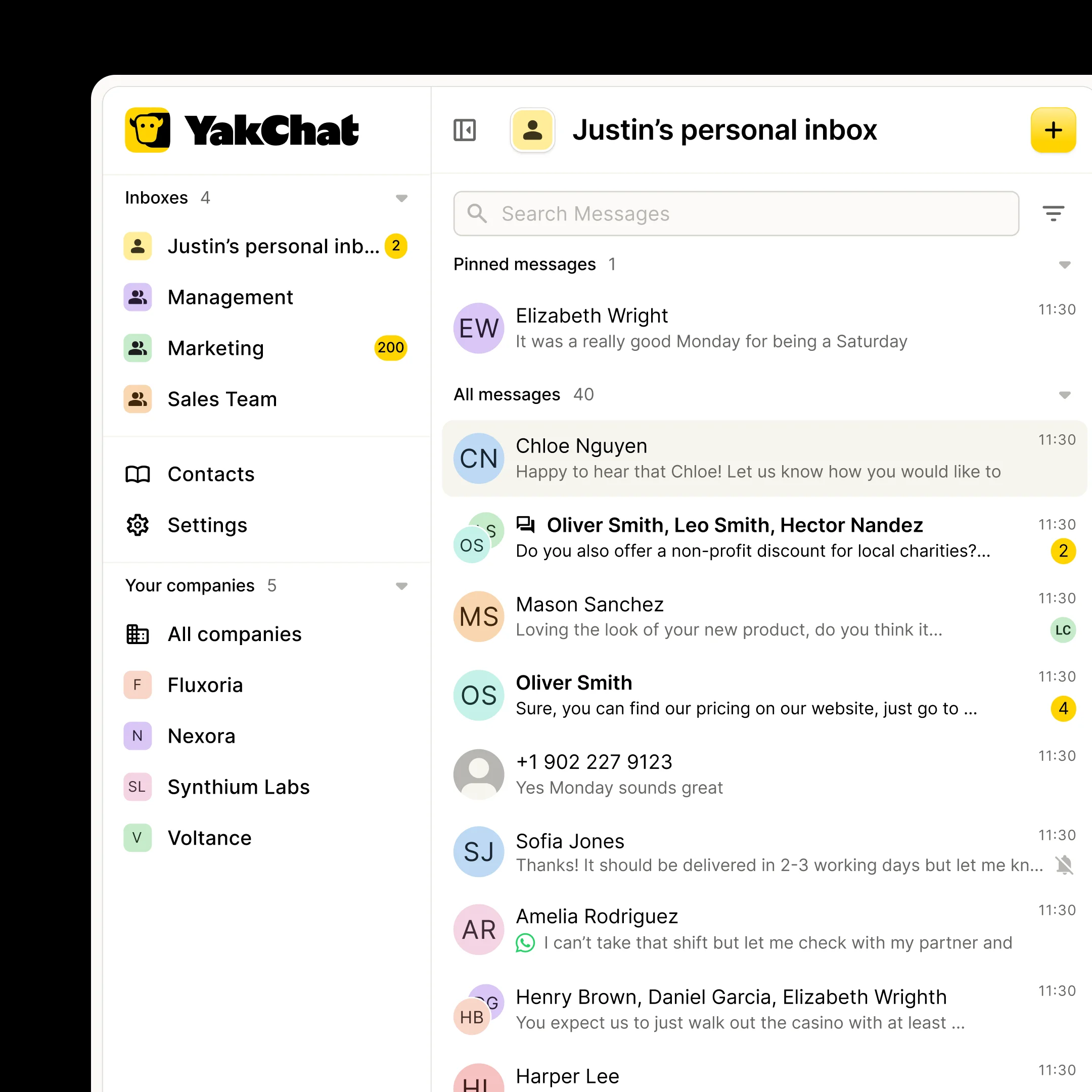
We worked with YakChat to create a brand that could stand apart in a crowded B2B messaging market while bringing more clarity to a complex product offer. Alongside the identity work, we redesigned key parts of the platform across messaging, admin and mobile applications, helping make a feature-rich product feel more intuitive, coherent and easier to use.
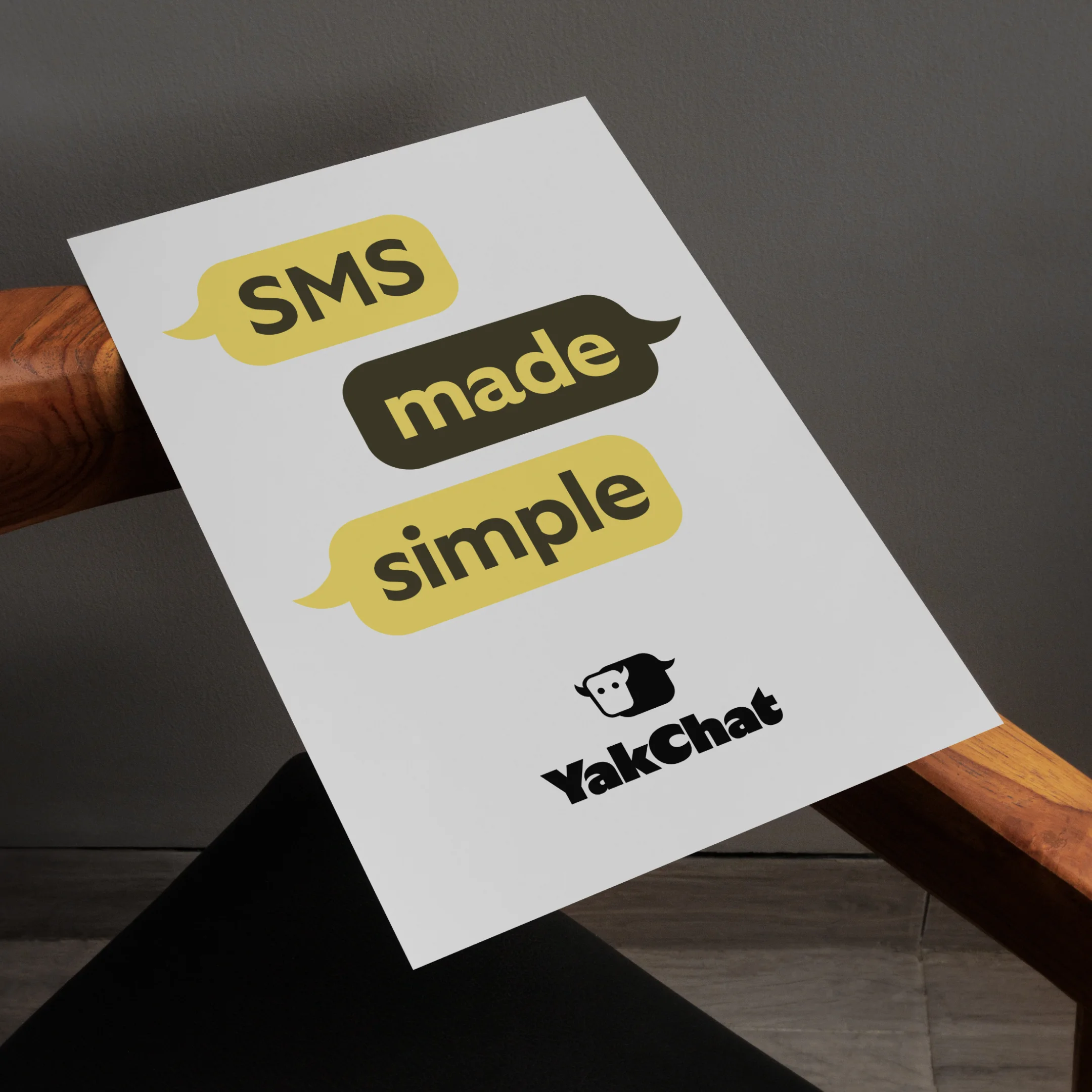
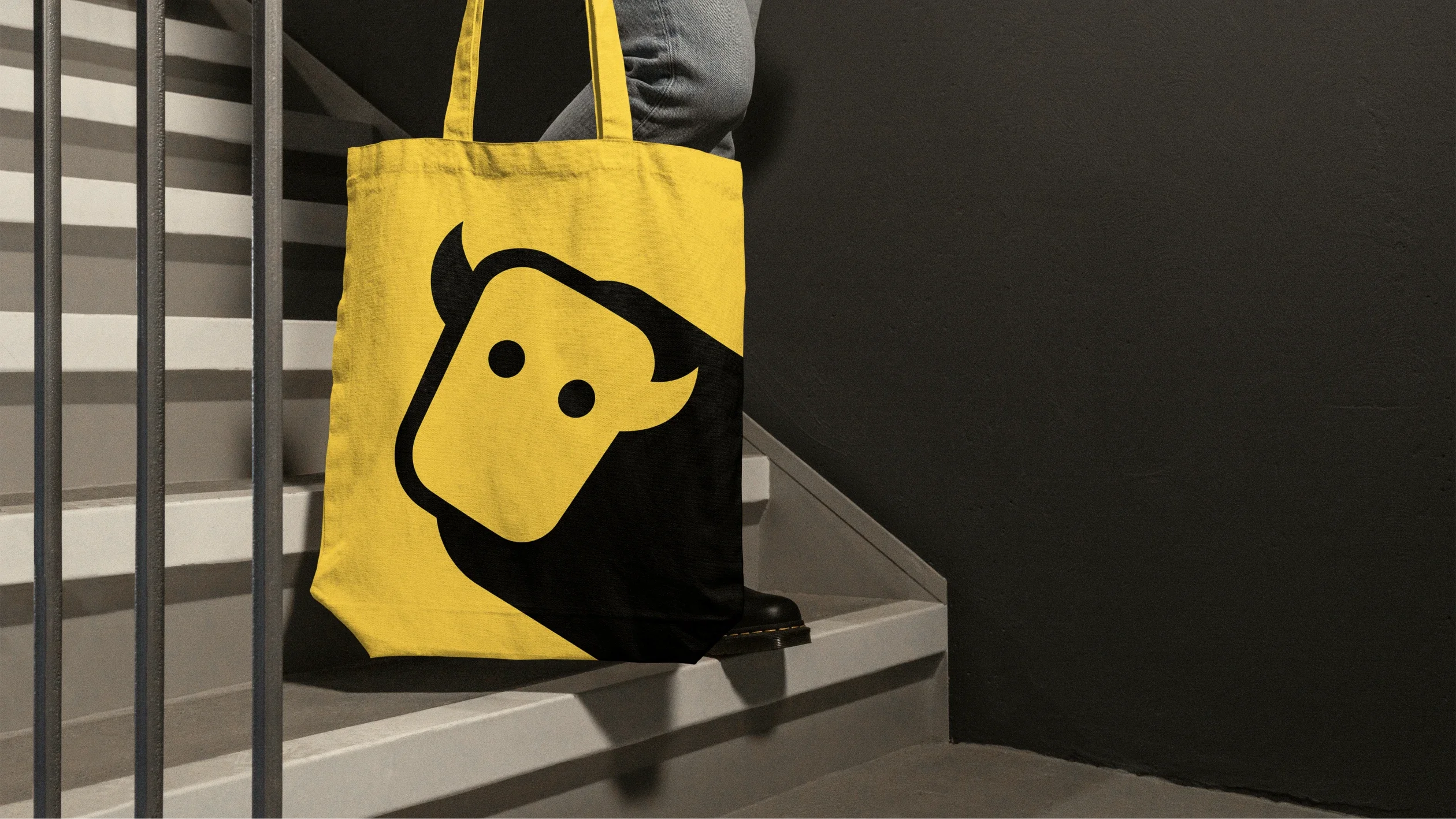
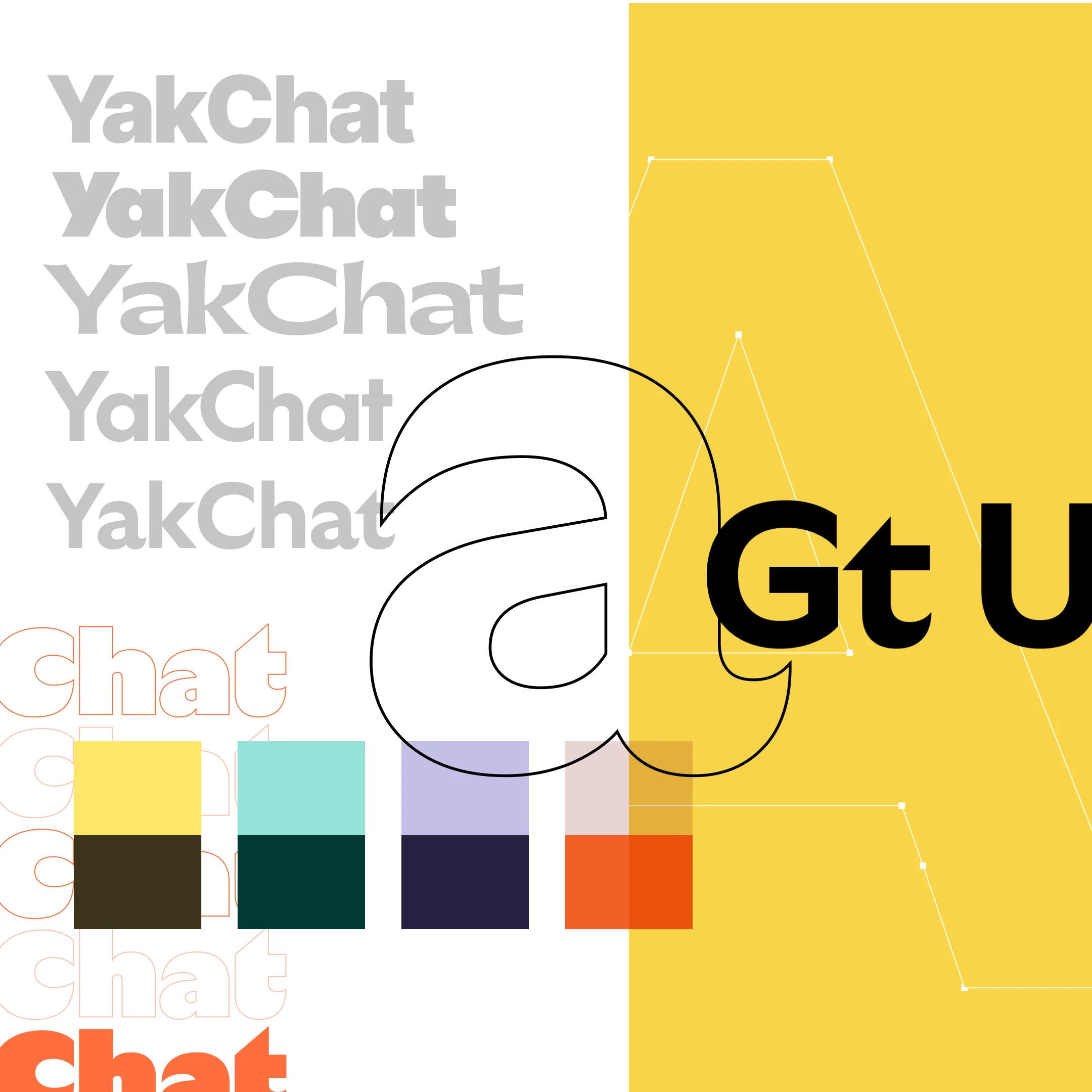
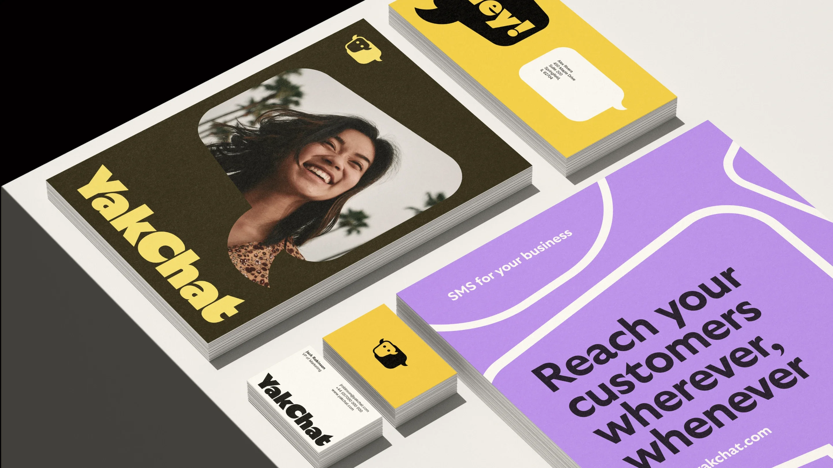
To shift the brand away from the visual conventions of the category, we deliberately avoided the familiar blues and greens used across much of the messaging space. Instead, we leaned into the character of the YakChat name itself, creating a more distinctive identity with greater personality, confidence and recall.
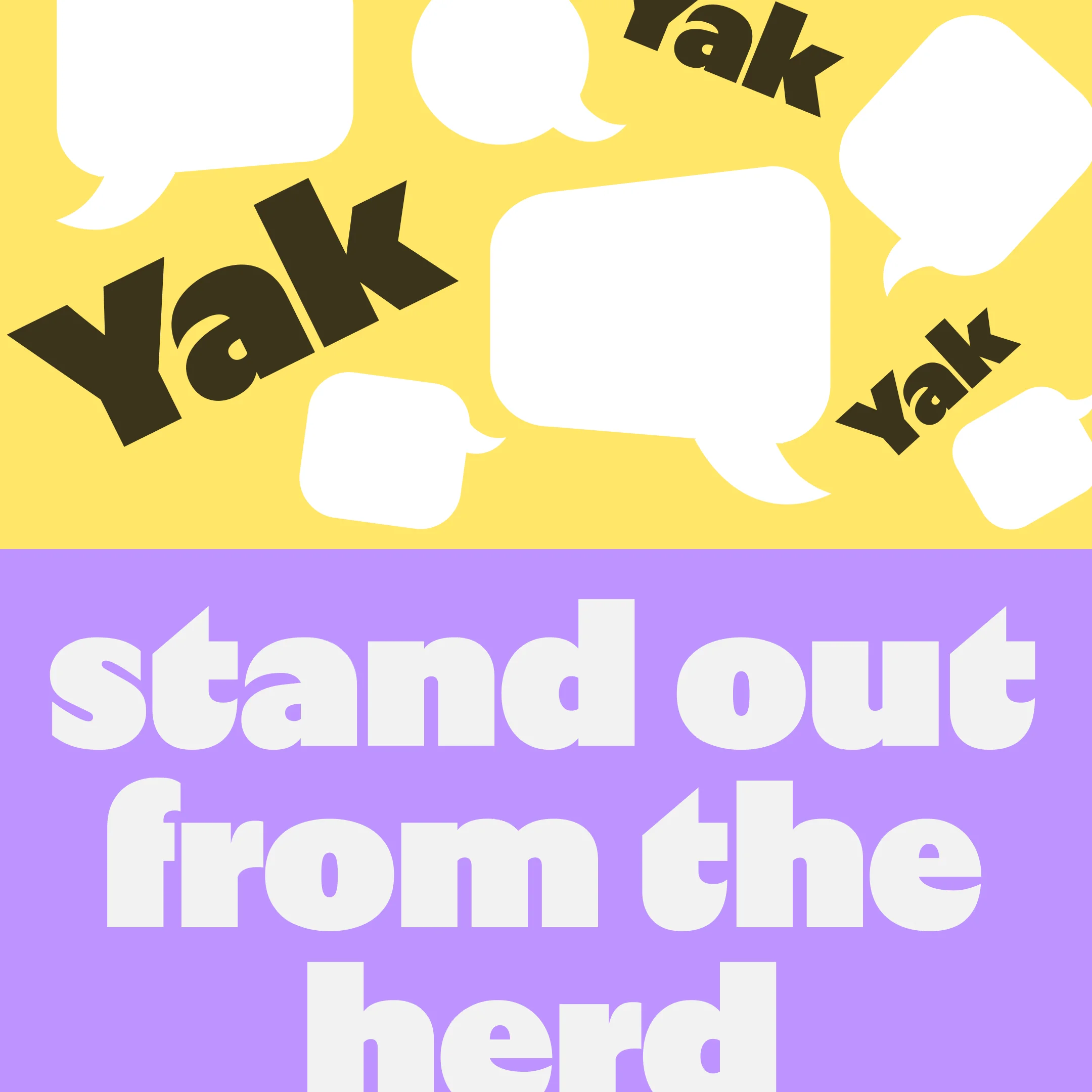
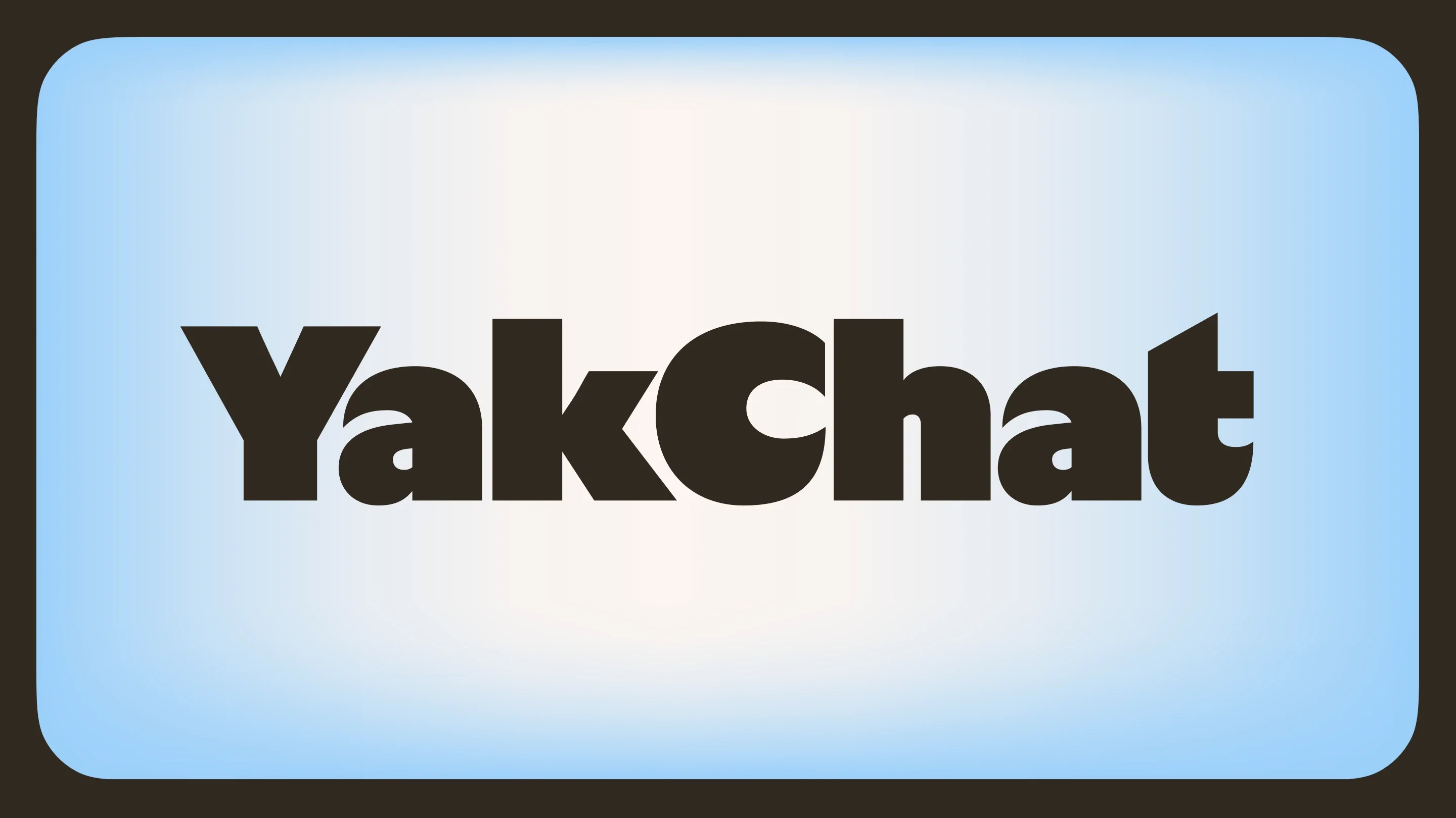
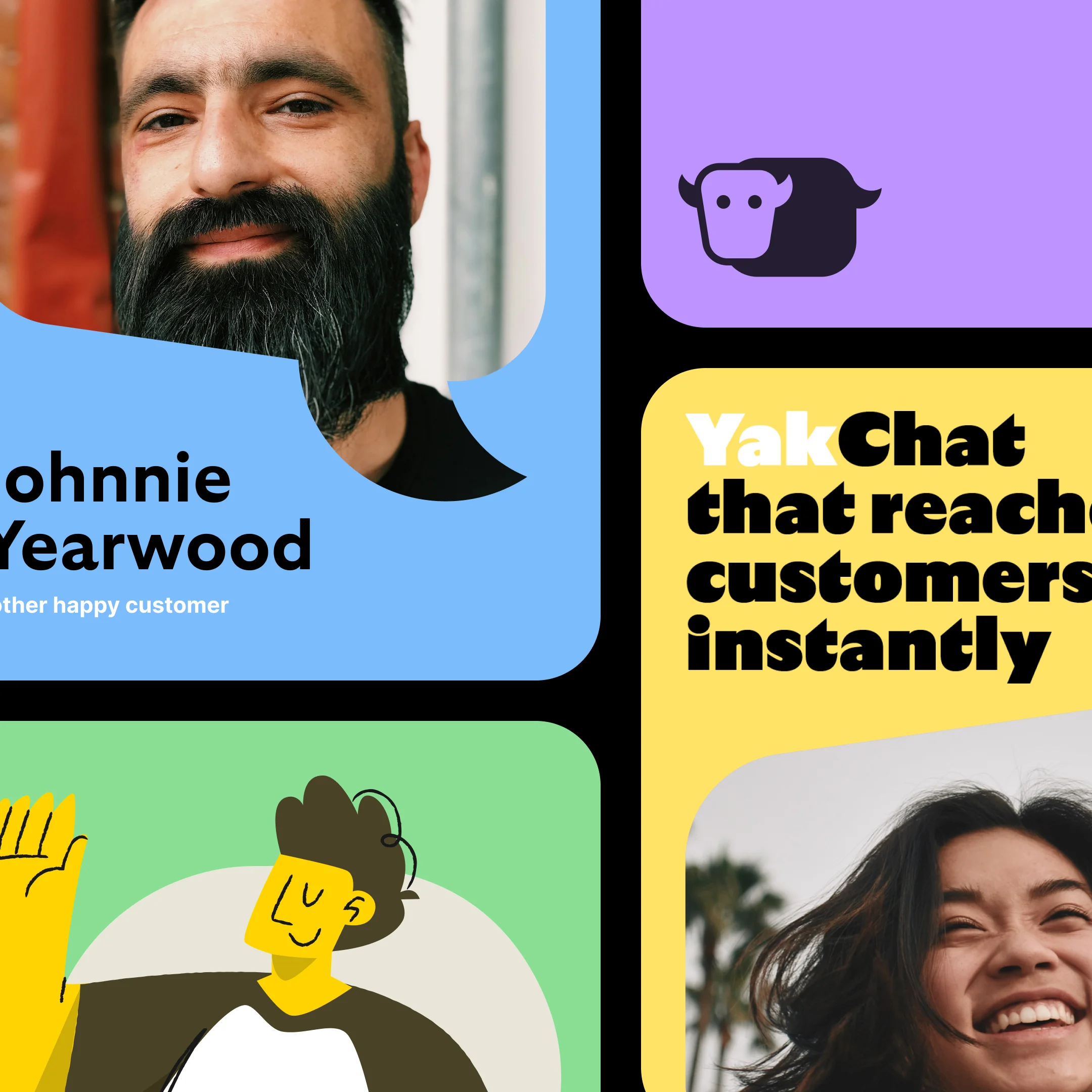
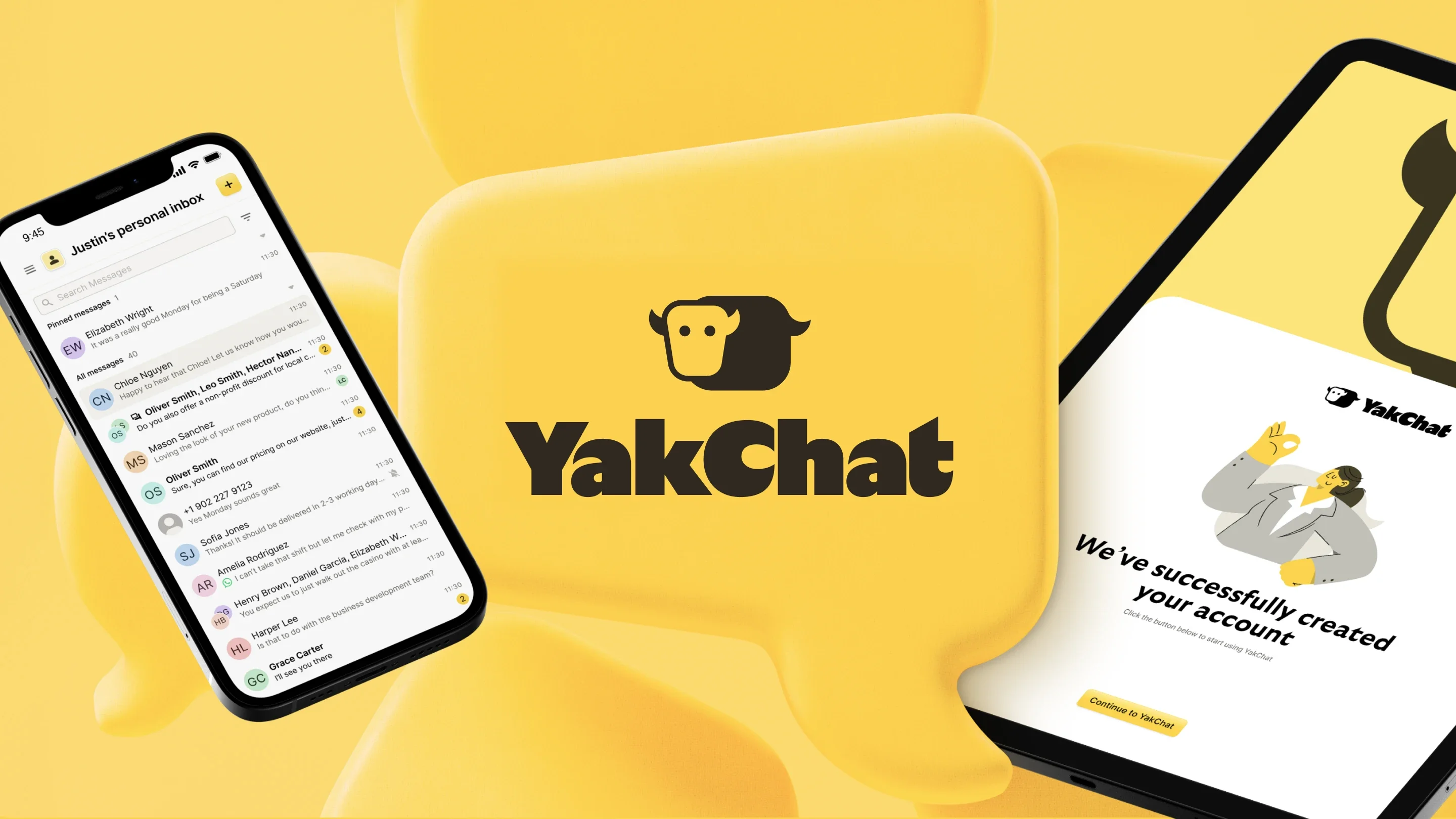
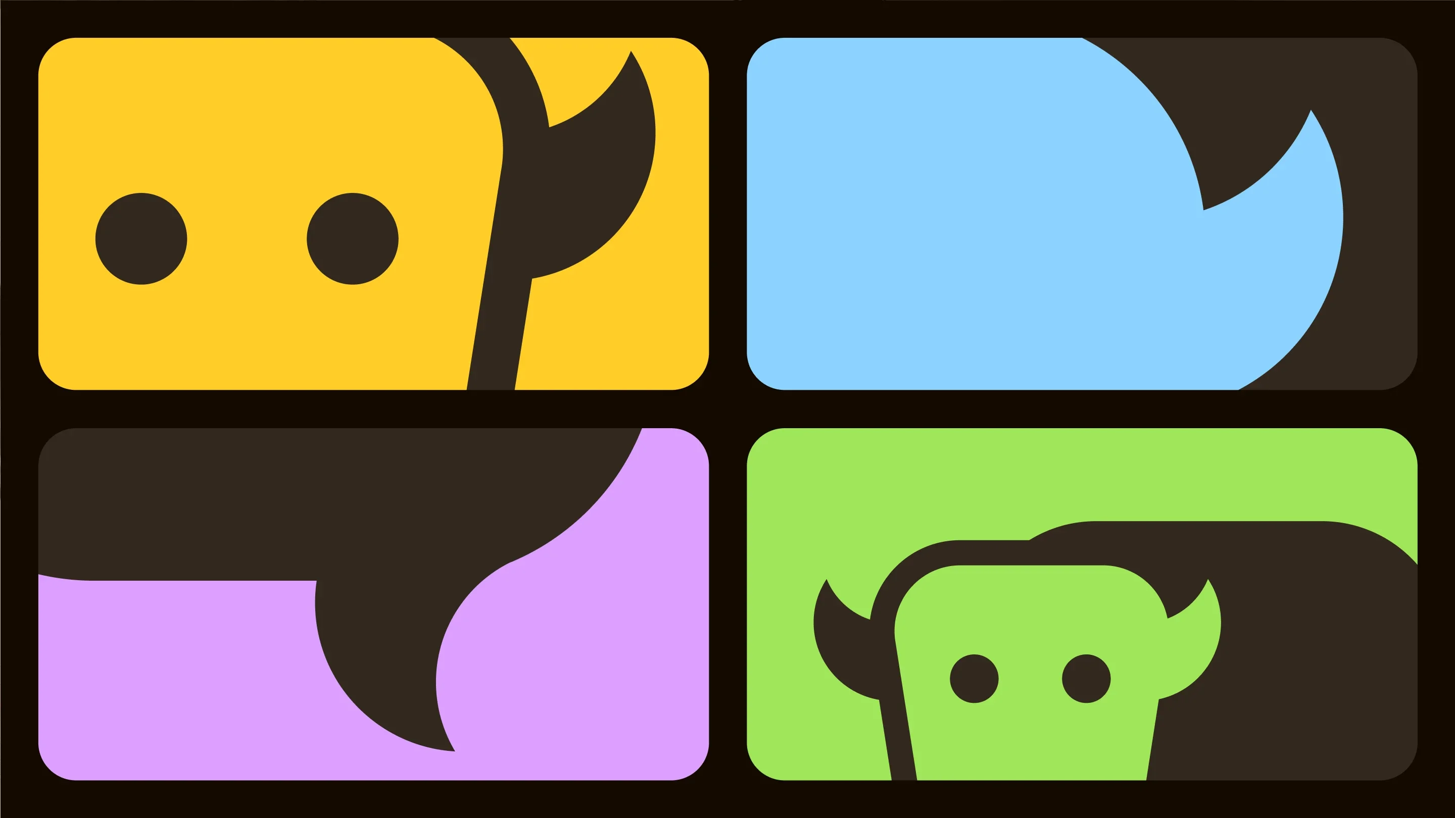
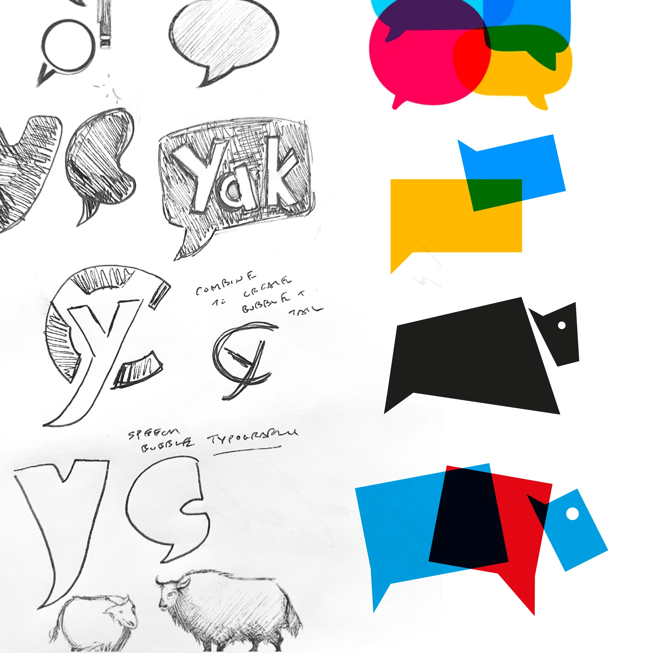
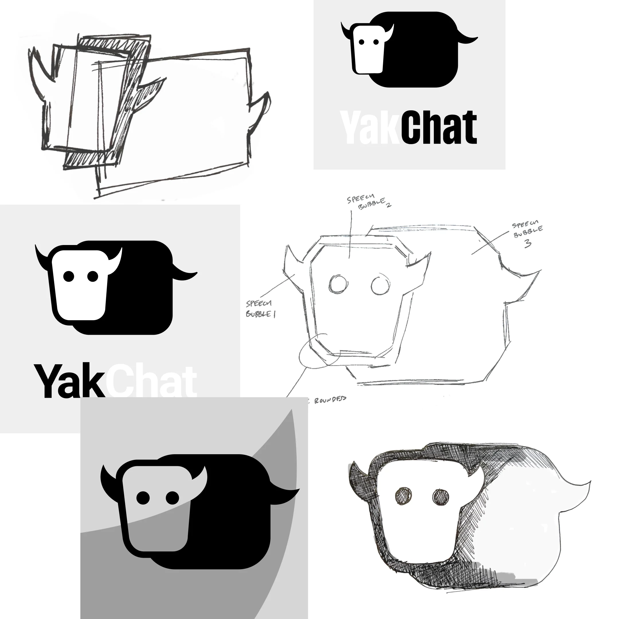
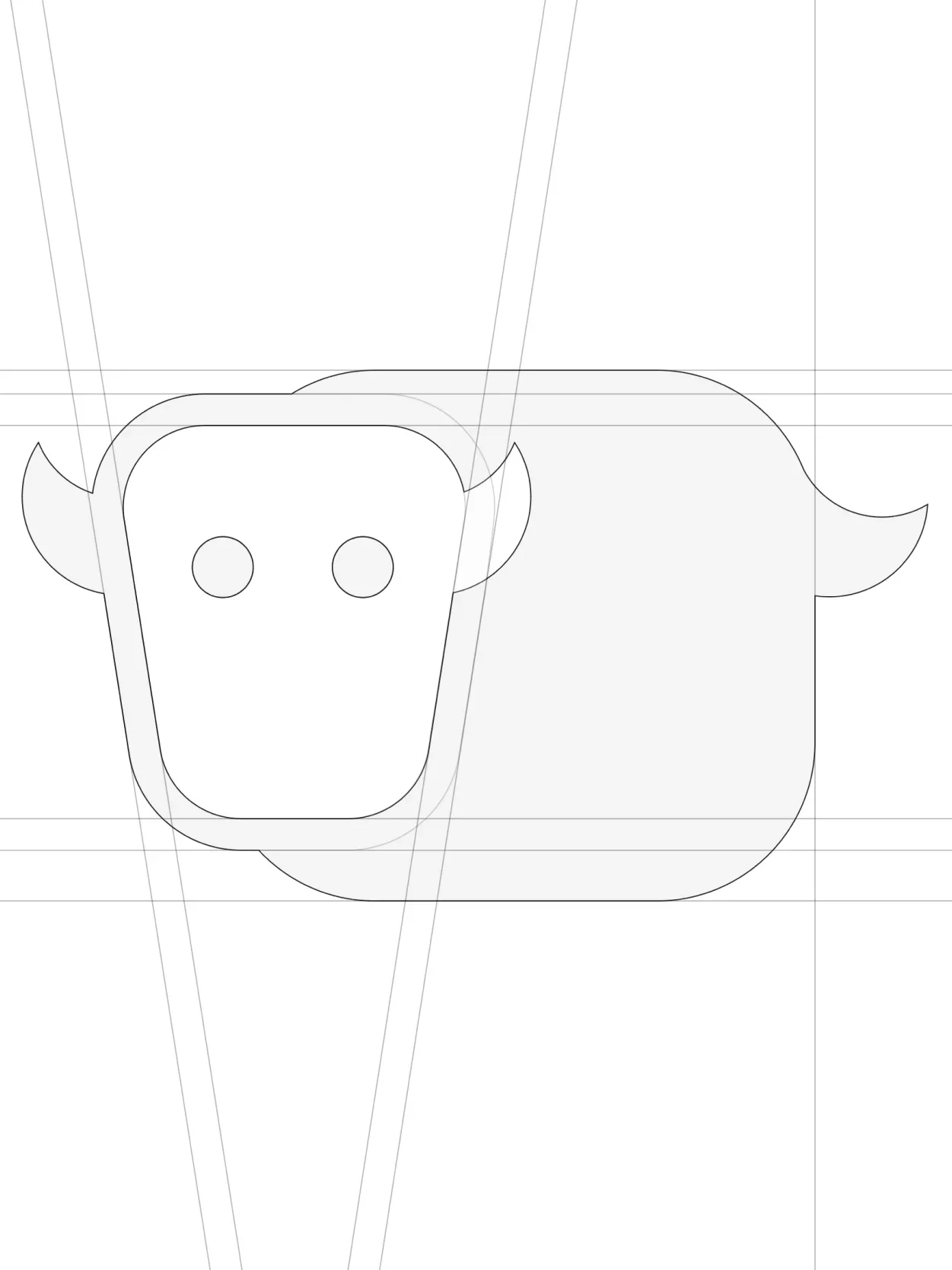
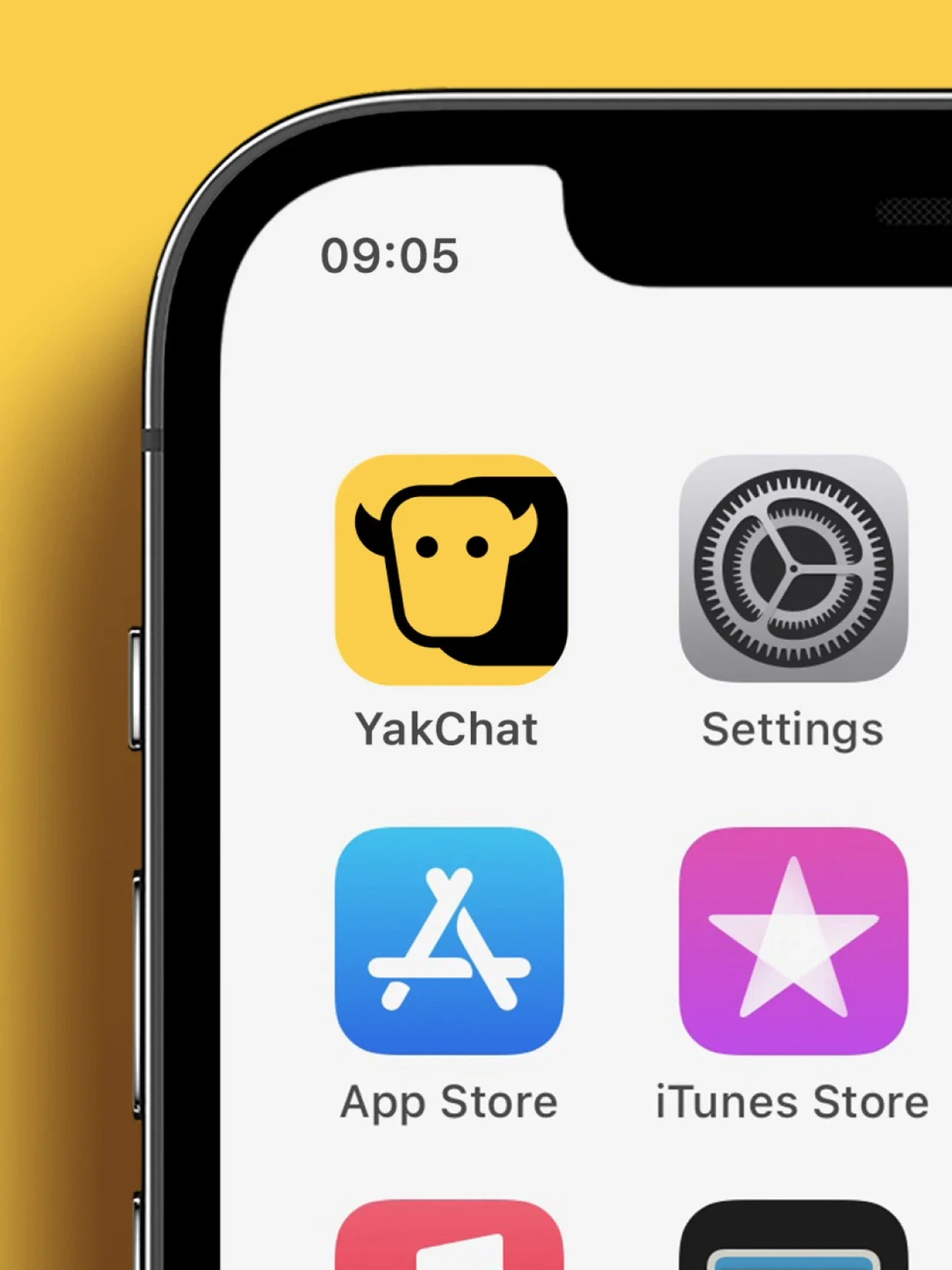
The logo was built around a simple idea: forming a yak character from three speech bubbles. The result is memorable, ownable and closely tied to the product category without feeling generic. We paired this with a bold colour palette designed to give the brand more energy and cut-through across product, web and marketing touchpoints.
For the typographic voice and wordmark, we chose GT Ultra by GrilliType. Its expressive terminals echoed the softness and shape language of the icon, helping extend the speech bubble motif across the wider identity without overplaying it.
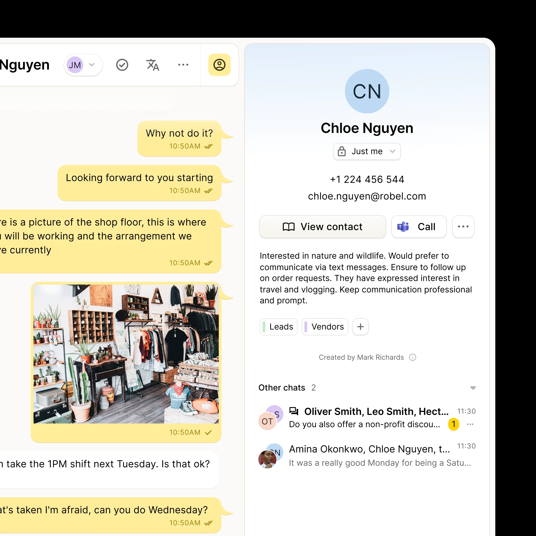
Across the product, our focus was on creating a clearer and more intuitive user experience through prototyping, research and iterative interface design. We translated that work into The Yak Design System: a set of shared principles, patterns and core components that brought consistency across the platform. From there, we worked closely with the development team to help take the product to launch and beyond, including building the YakChat iOS and Android apps and contributing to the component library used across the wider product ecosystem.