MediaViz
MediaViz came to us to create a brand identity that better reflected the intelligence, speed and flexibility of its AI-powered image analysis platform. The business helps stock image libraries and visual content platforms make large collections easier to search, organise and understand by generating structured, confidence-weighted metadata. Central to the proposition was a simple idea: helping AI interpret images with more of the nuance a human would naturally notice. Our challenge was to express that sophistication in a way that felt clear, useful and human. Rather than leaning into cold, generic AI cues, we built the identity around two familiar references: the camera roll, with its grids, thumbnails and selection states, and the human eye, as a symbol of perception and recognition. This led to a distinctive pixel-based visual system and a logomark that combines an "M" and "V" within a single grid.
- Client
- MediaViz
- Year
- 2025
- Role
- Brand StrategyIdentity DesignLogo DesignArt DirectionVisual SystemBrand Guidelines
Our concept drew on two familiar references: the camera roll and the human eye. The grid of thumbnails, the logic of image selection and the modular structure of visual organisation all informed the identity system, while the eye introduced a more human idea of perception. Together, those references helped express MediaViz’s ambition to make AI image analysis feel more intuitive, nuanced and useful.


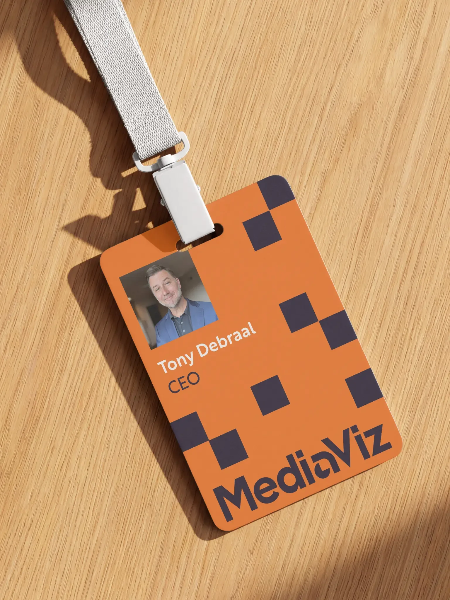
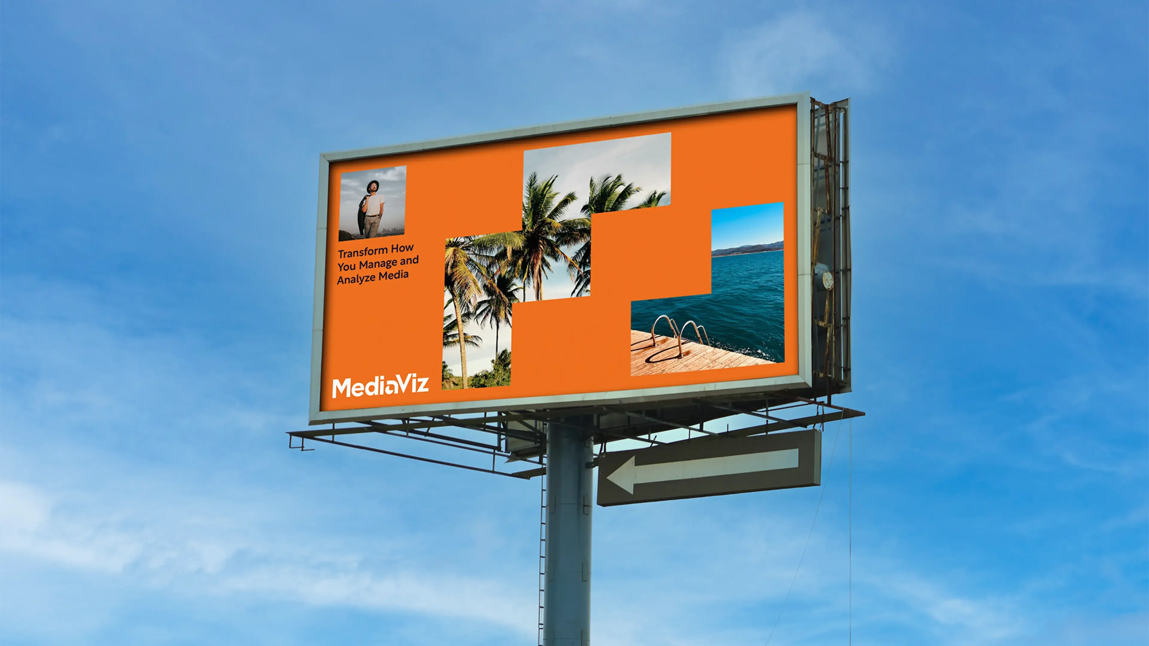
From there, we developed a visual system built around grids, pixels and selection states, with the eye motif appearing throughout as a simple shorthand for recognition and image understanding. At the centre of the identity is a logomark constructed from a modular grid, subtly forming both an "M" and a "V". The result feels ownable and intelligent while remaining clear, simple and highly legible.