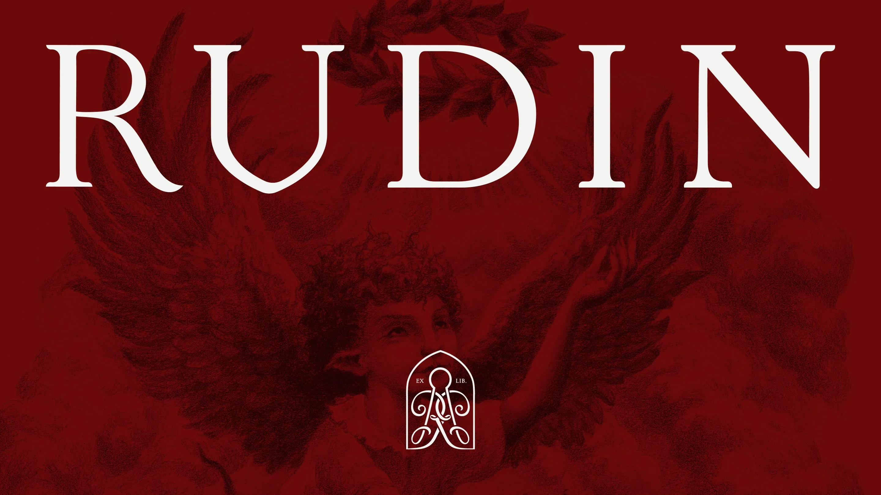
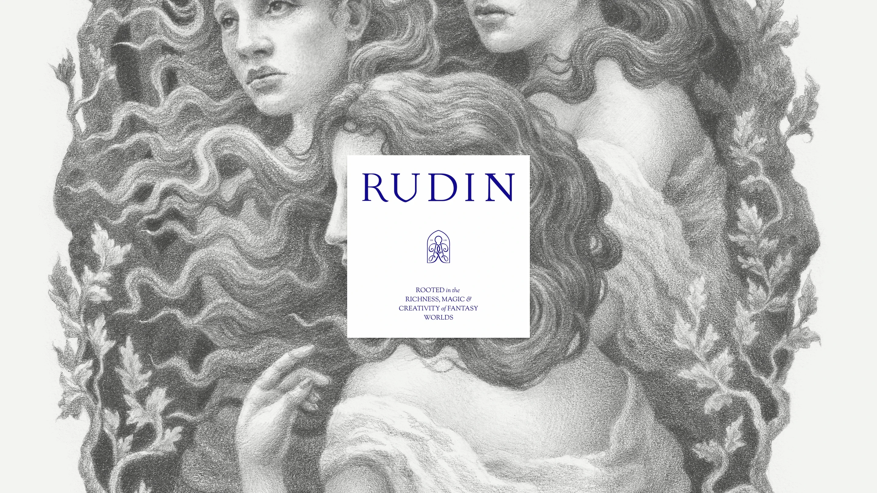
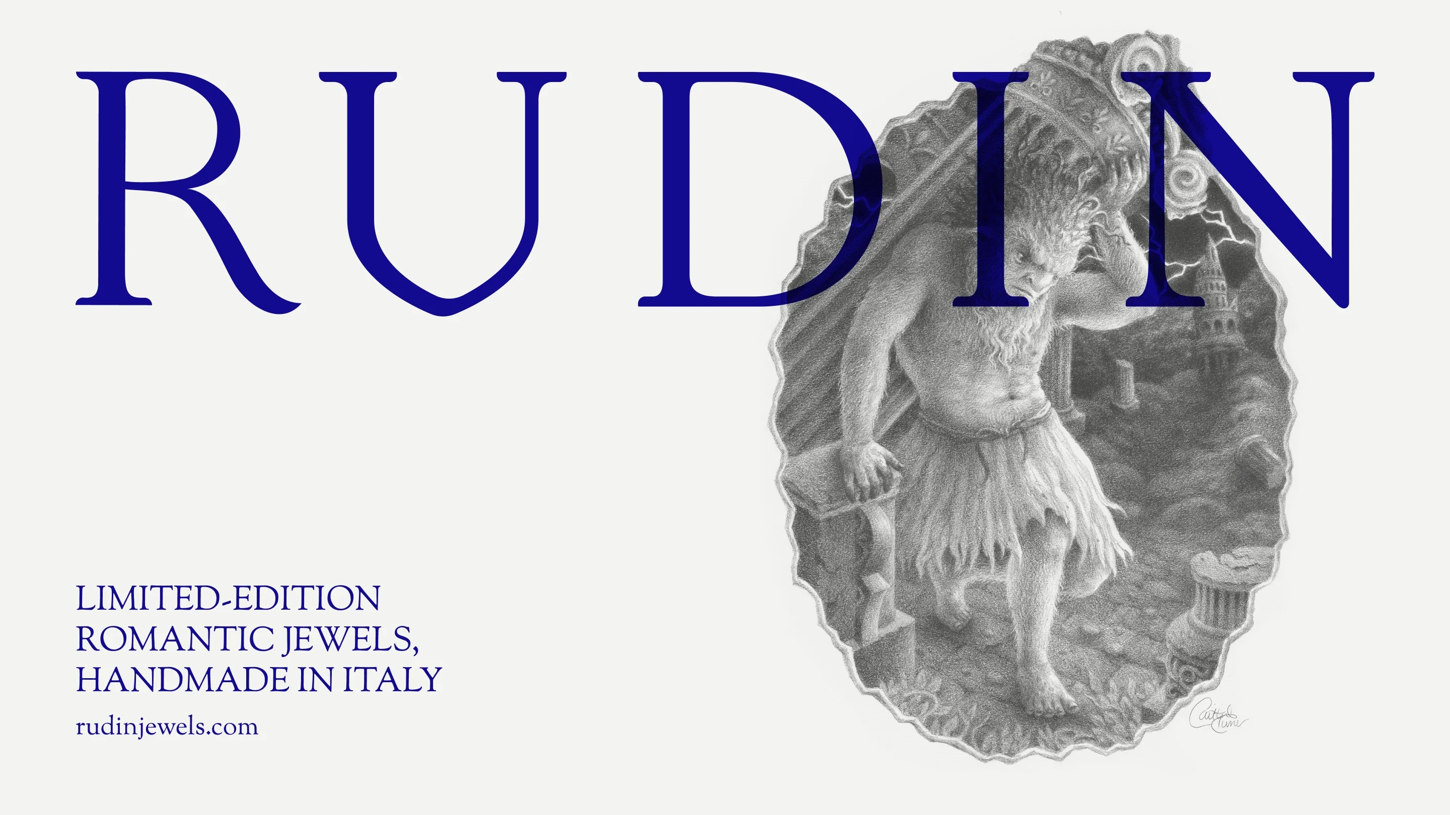
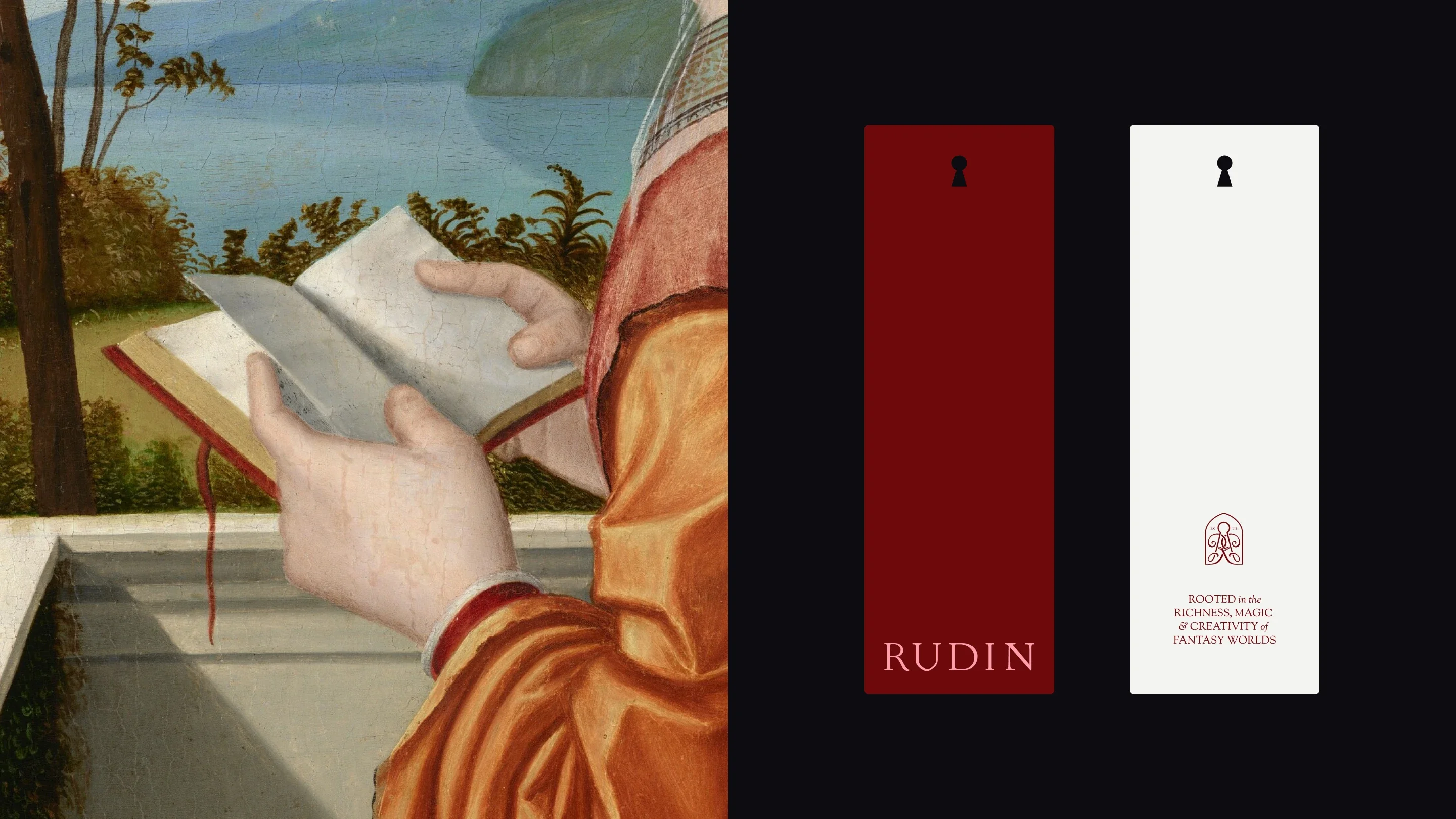
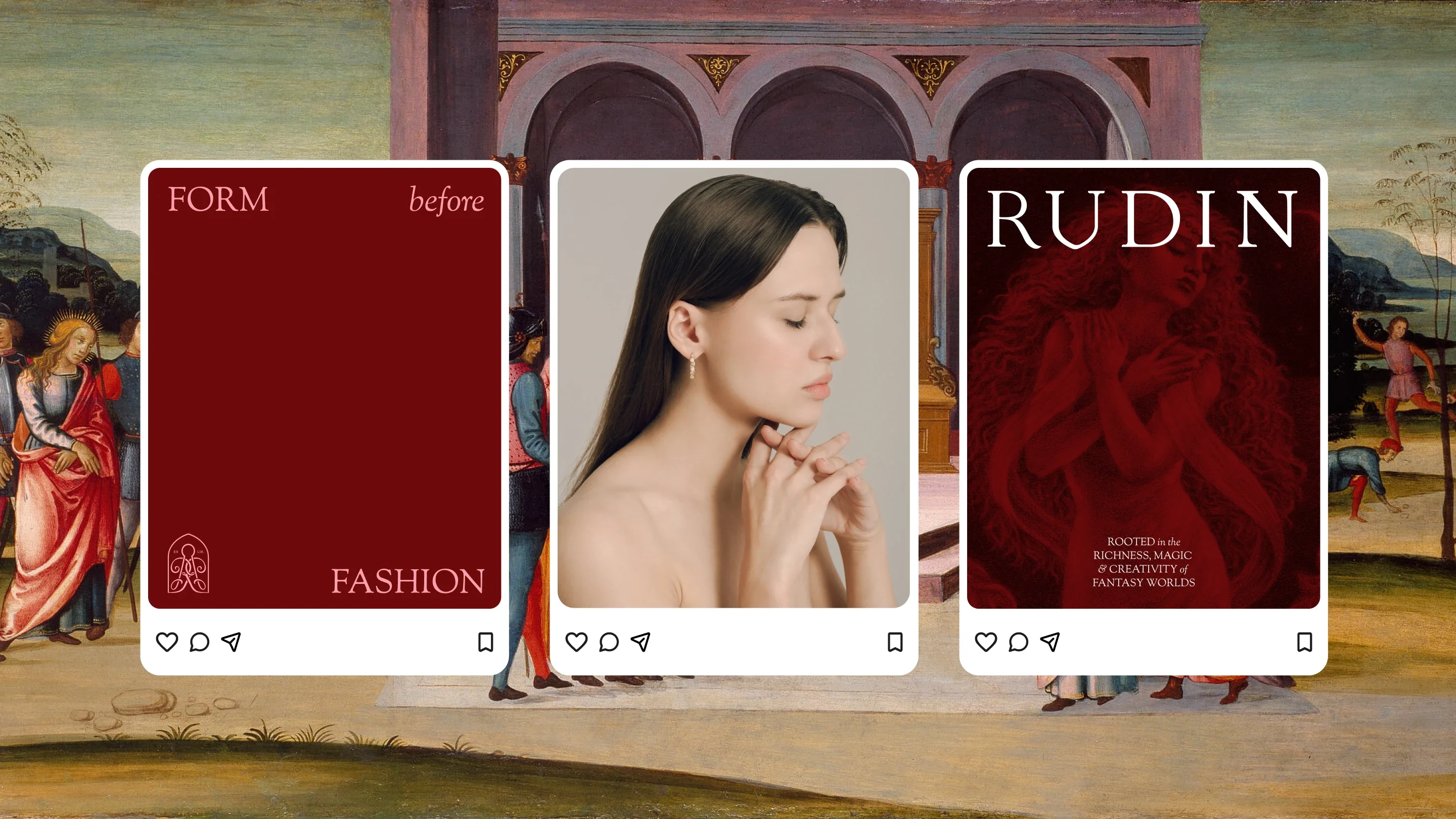
Rudin
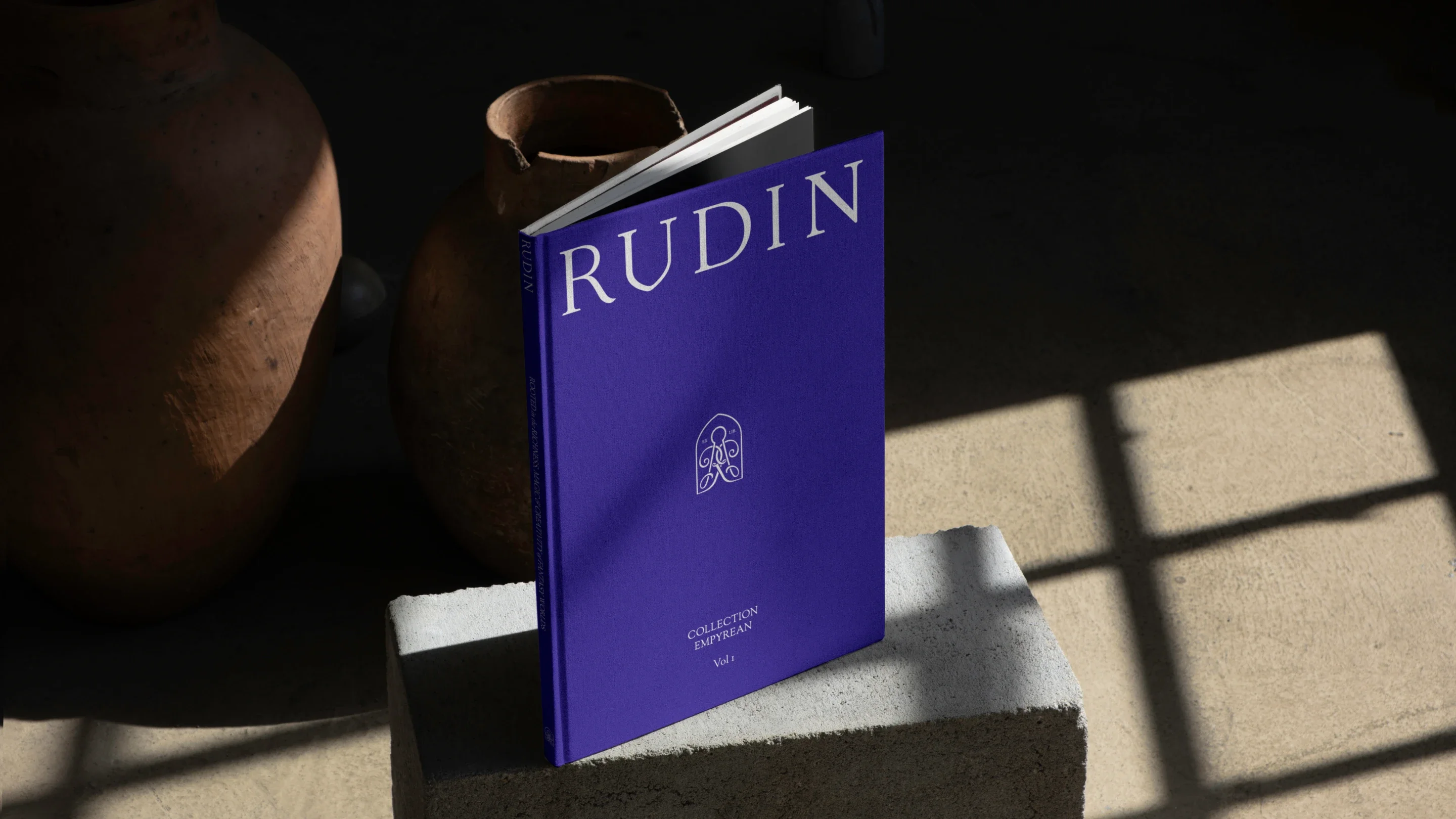
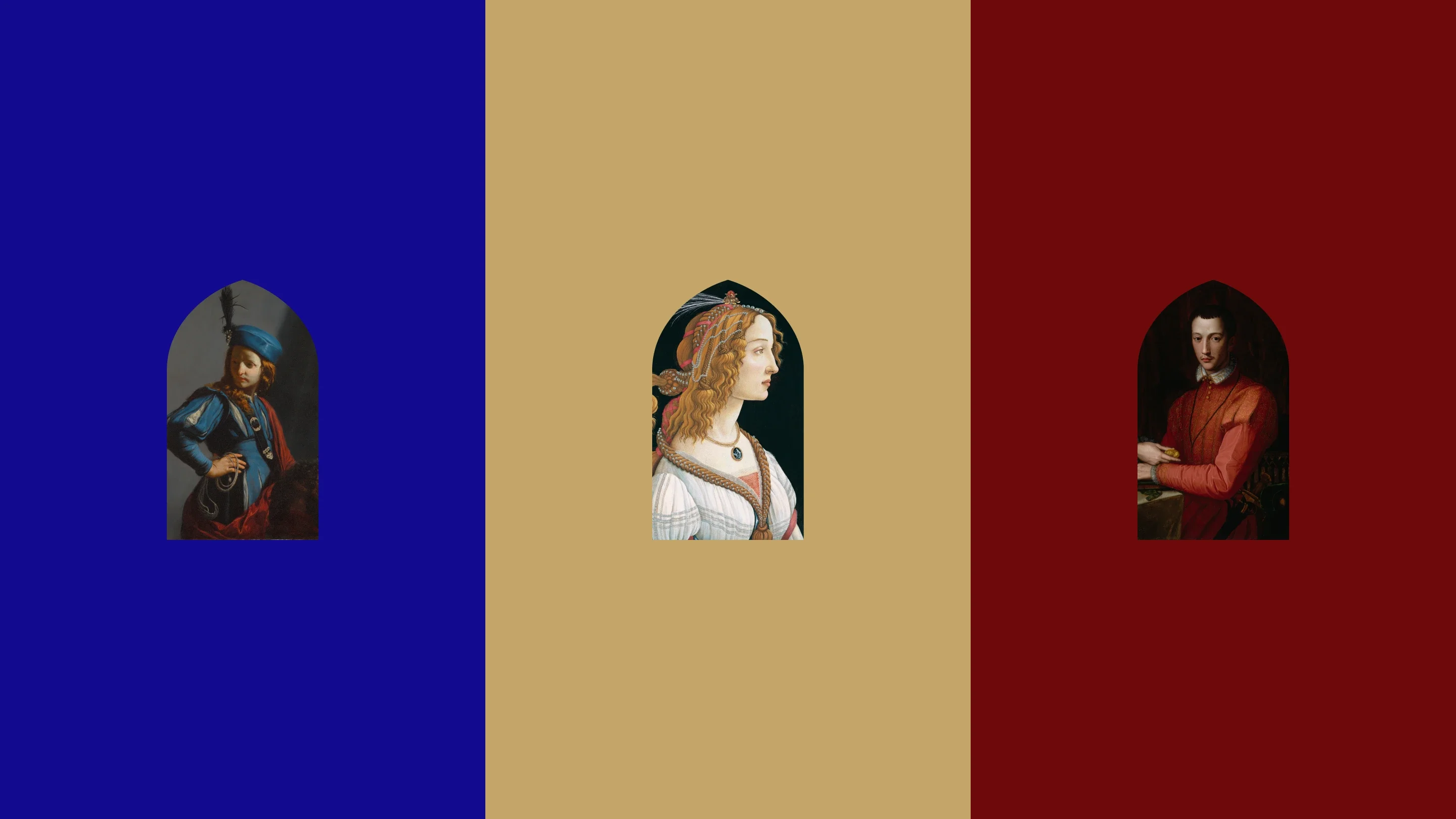
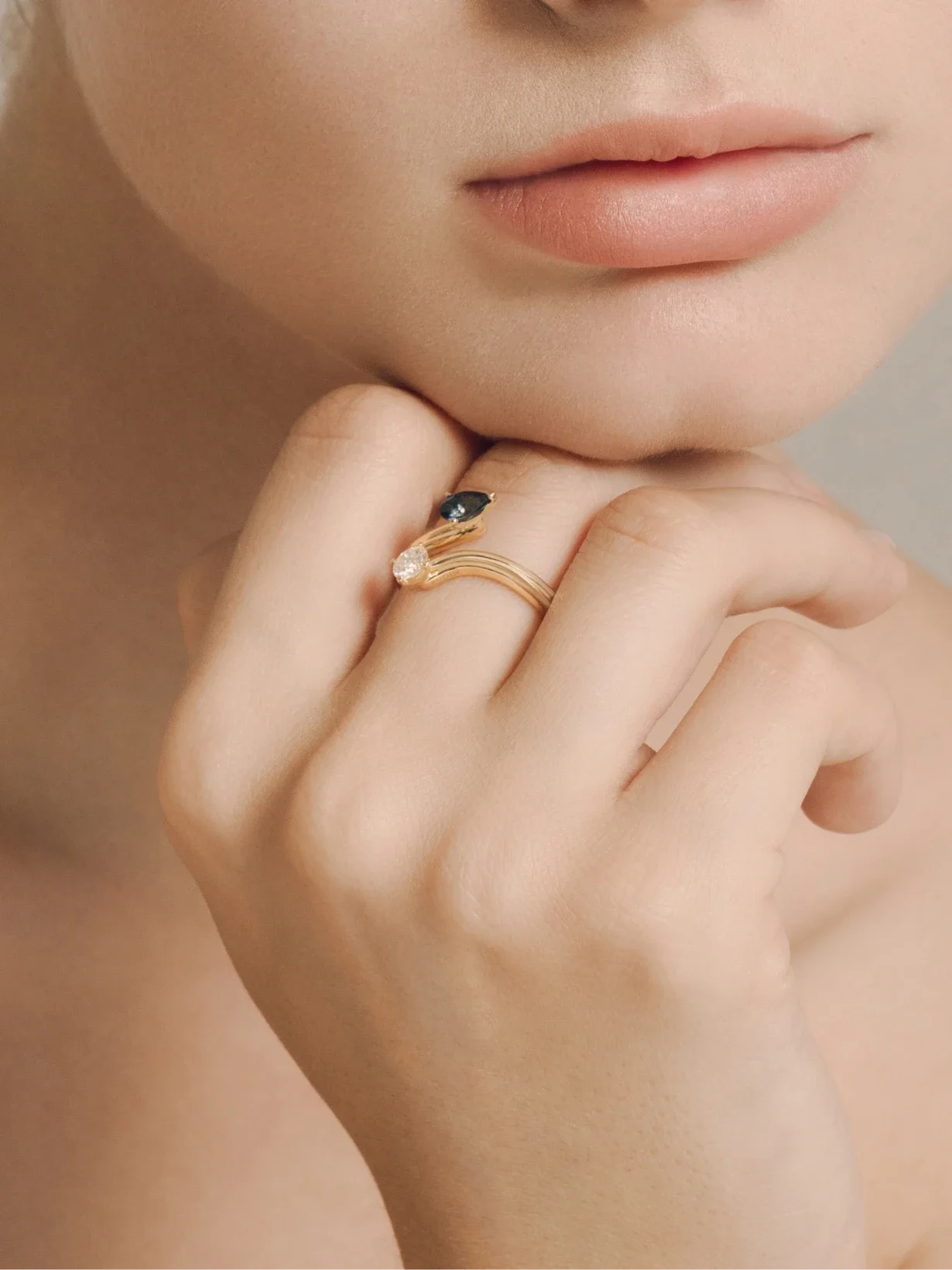
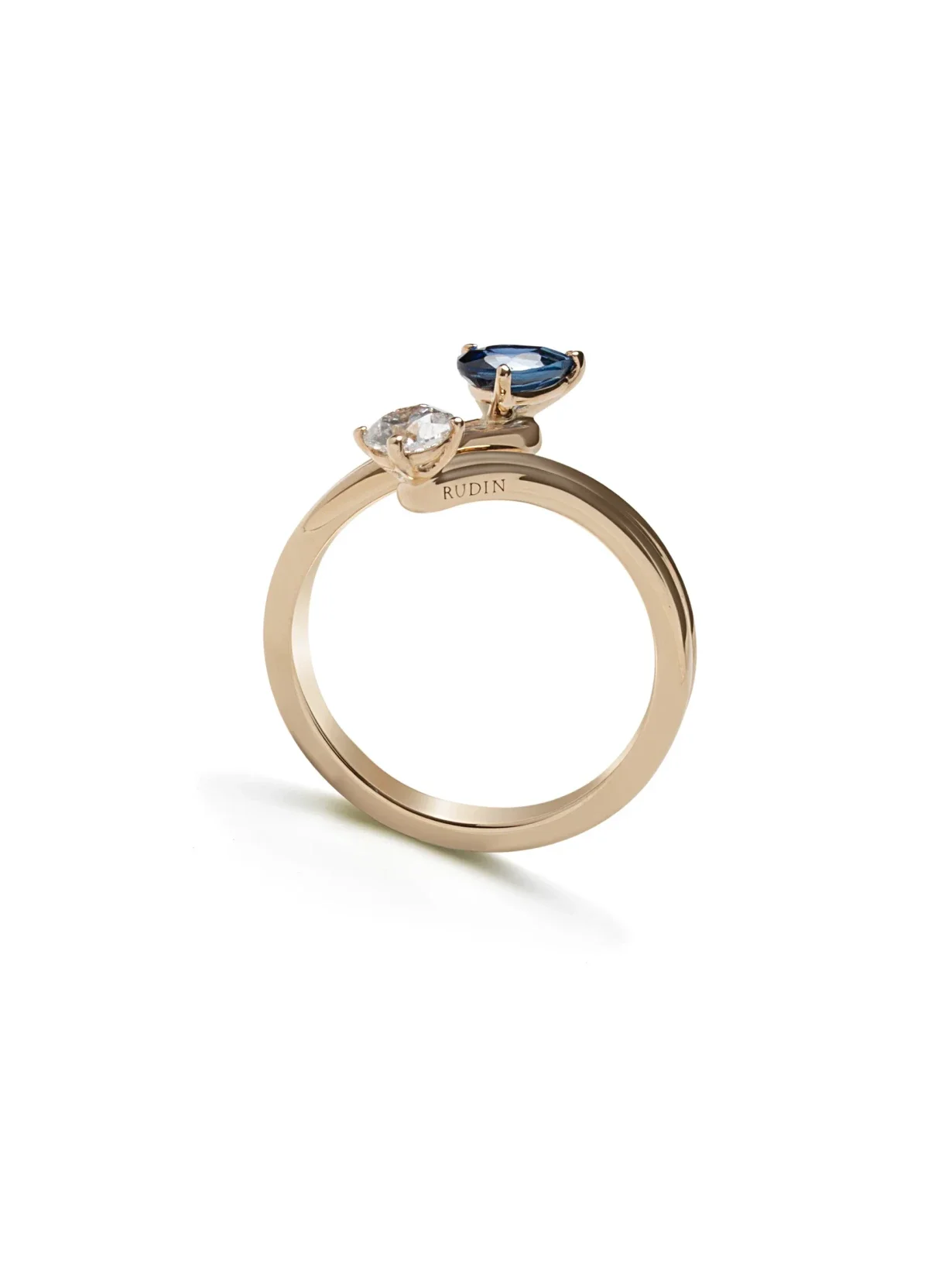
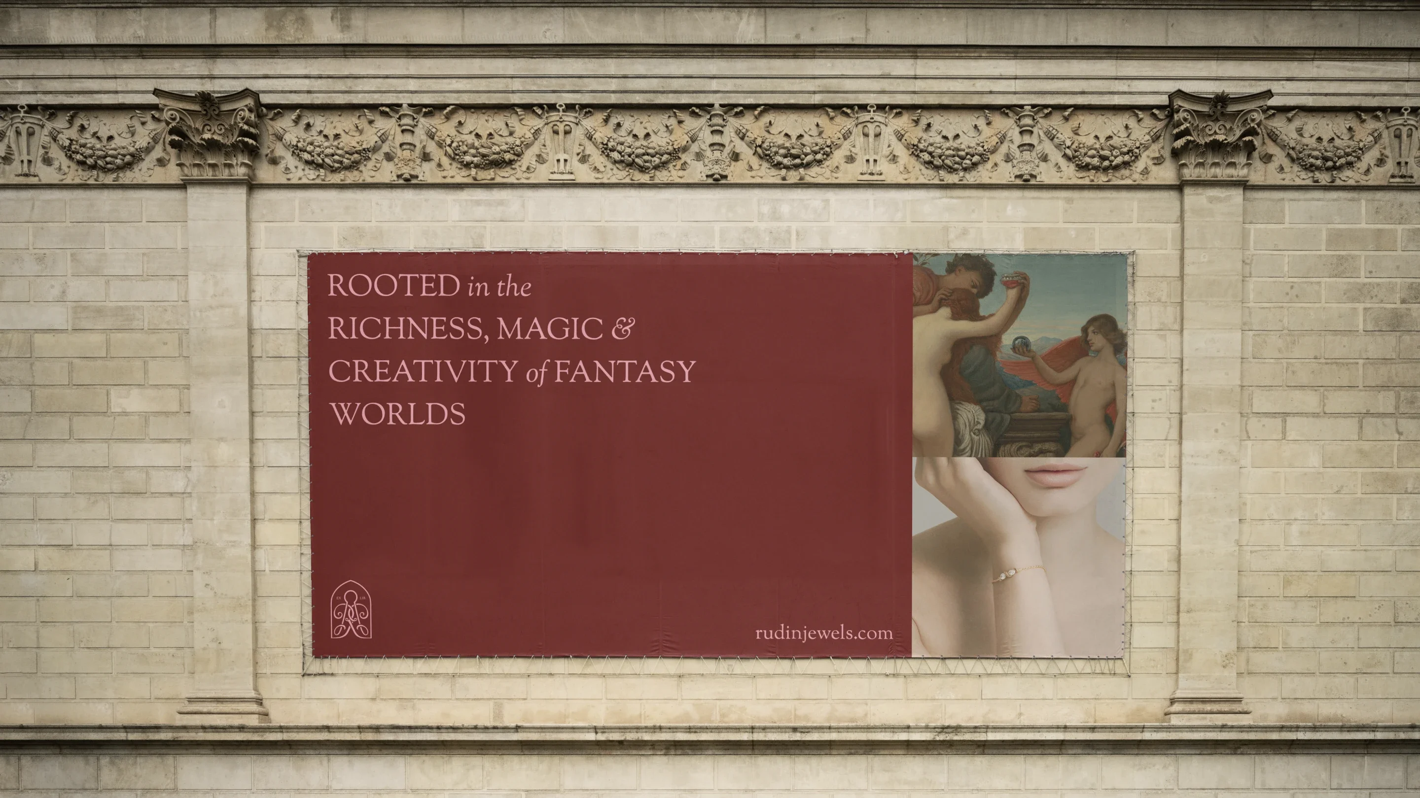
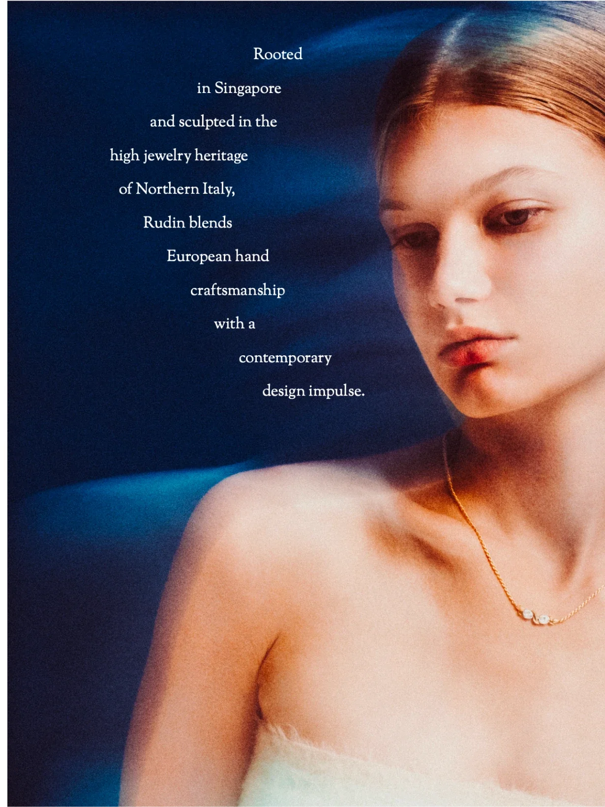
Rudin is a fine jewellery brand shaped by craft, symbolism and a rich sense of atmosphere. We developed a complete identity for the brand, spanning logo design, packaging, printed collateral, art direction and digital presence. The aim was to create a visual world that felt romantic, refined and deeply considered without slipping into cliché. Drawing on references from mythology, ornament, archive material and the rituals of jewellery itself, we built a brand language that gives Rudin a distinctive position in the luxury jewellery space: one that feels both timeless and individual.
- Client
- Rudin
- Year
- 2024
- Role
- Brand IdentityVisual IdentityPackaging DesignPrint DesignWebsite DesignArt DirectionIllustration
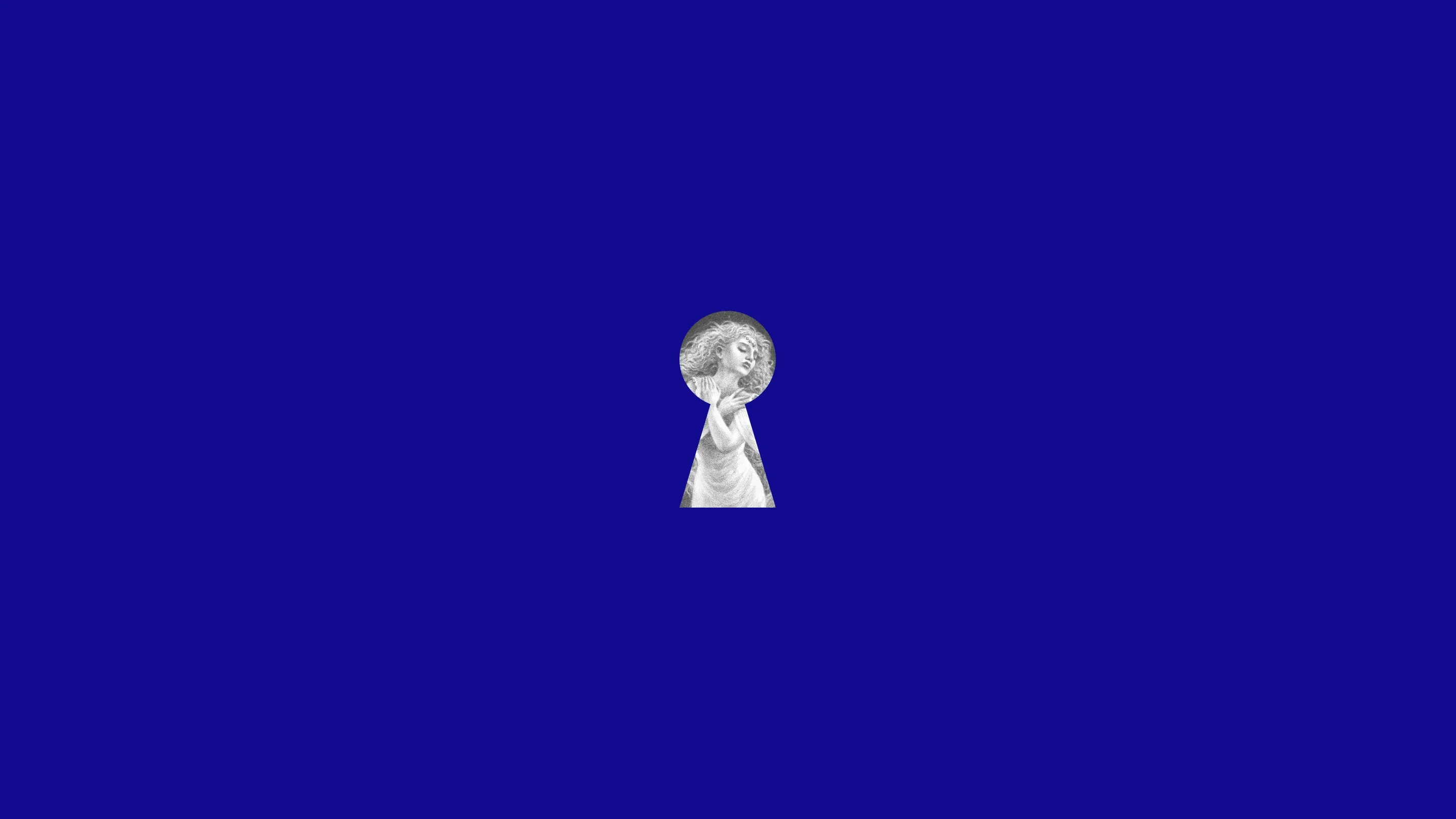
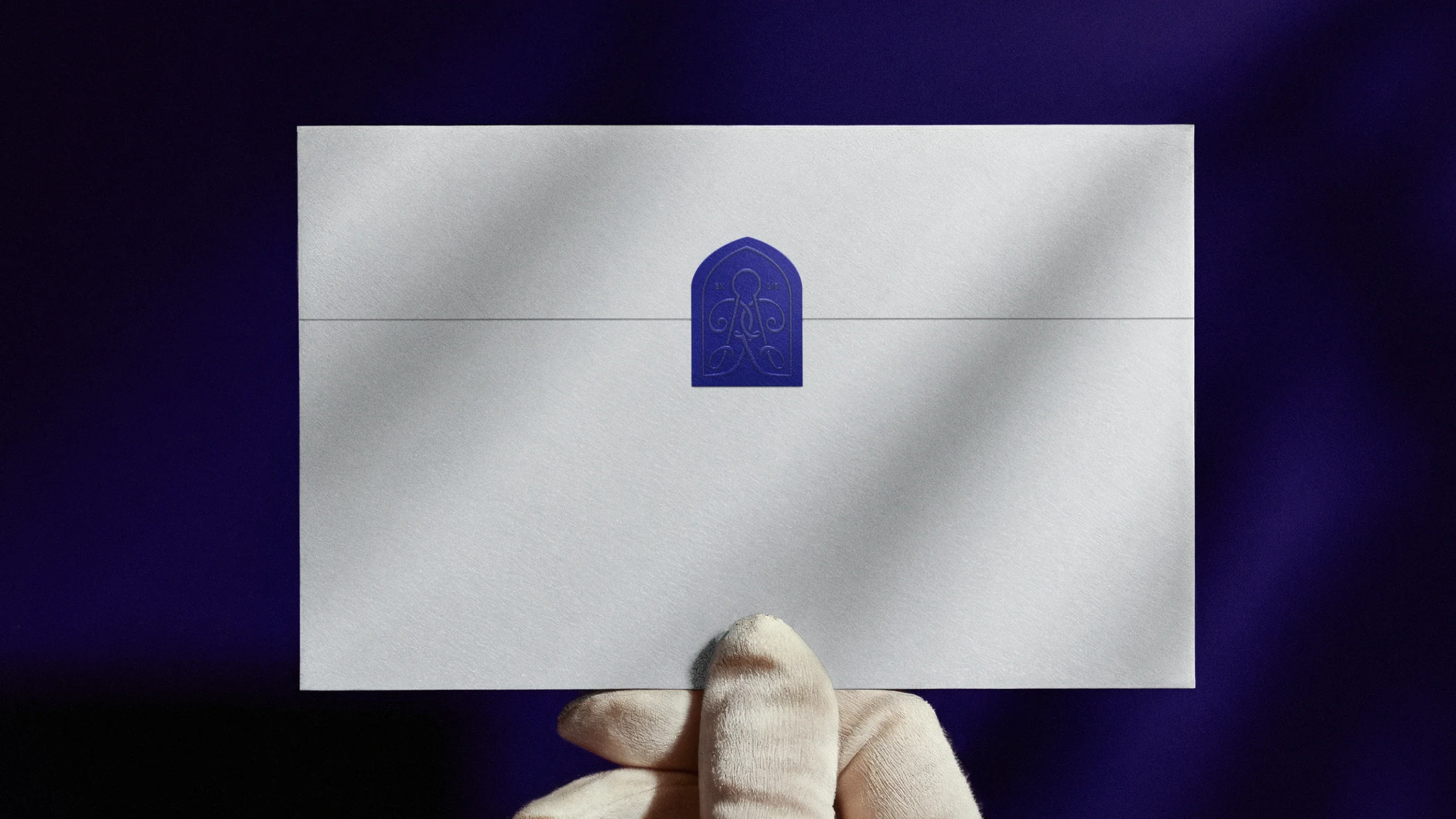
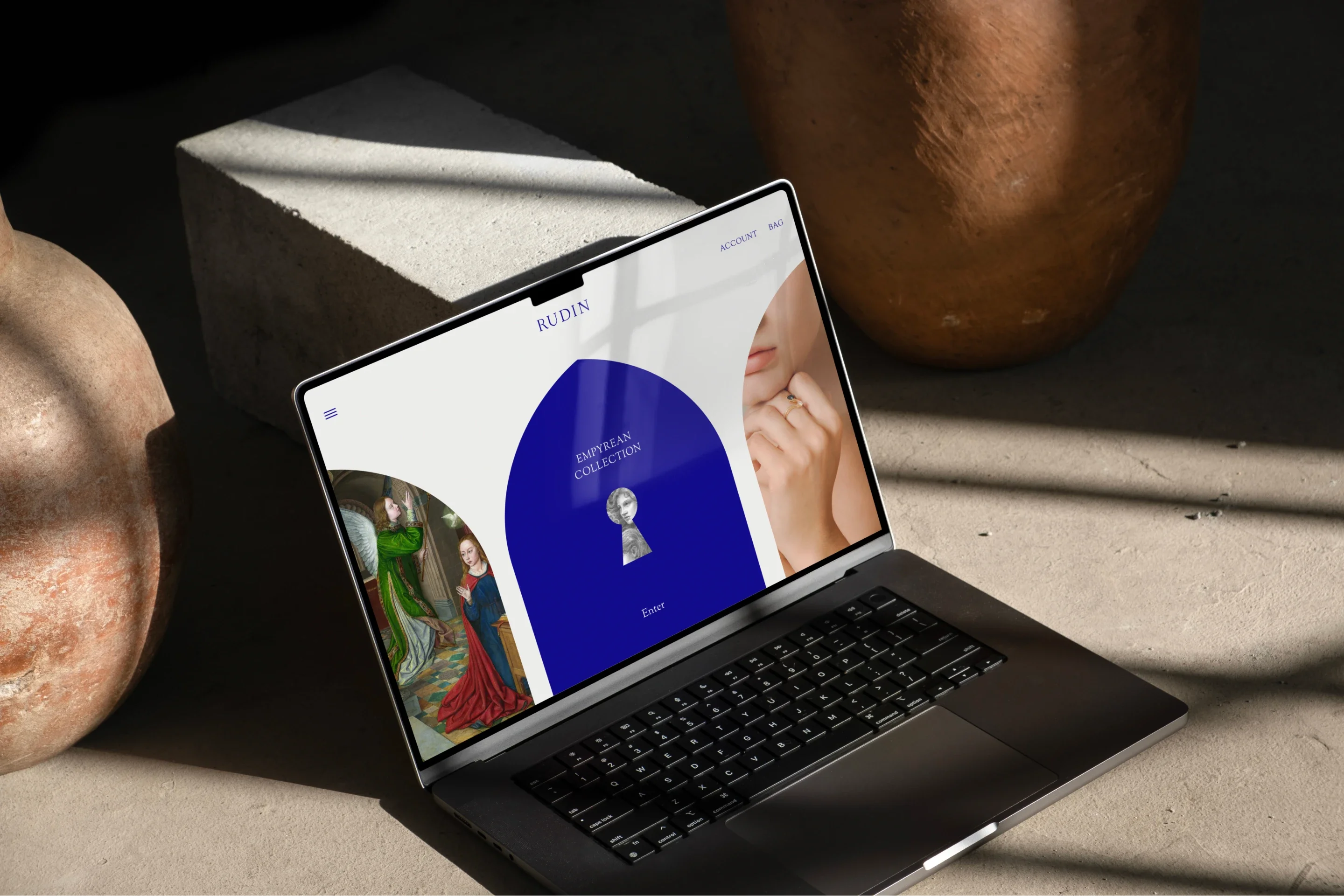
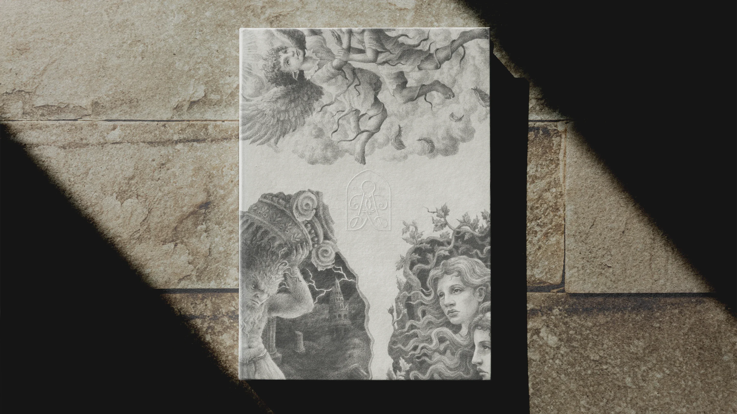
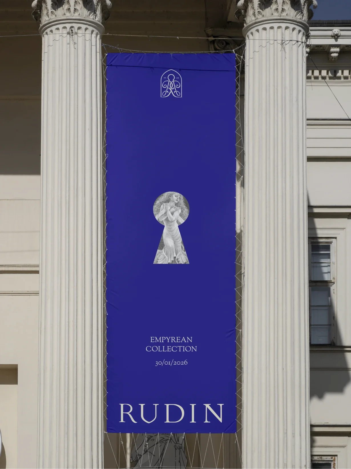
The keyhole motif became a central part of the identity, acting as a symbol of discovery, intimacy and personal value. It gave the brand a distinctive device that could move fluidly across packaging, print and digital applications while reinforcing the idea of jewellery as something to be revealed, collected and kept close.
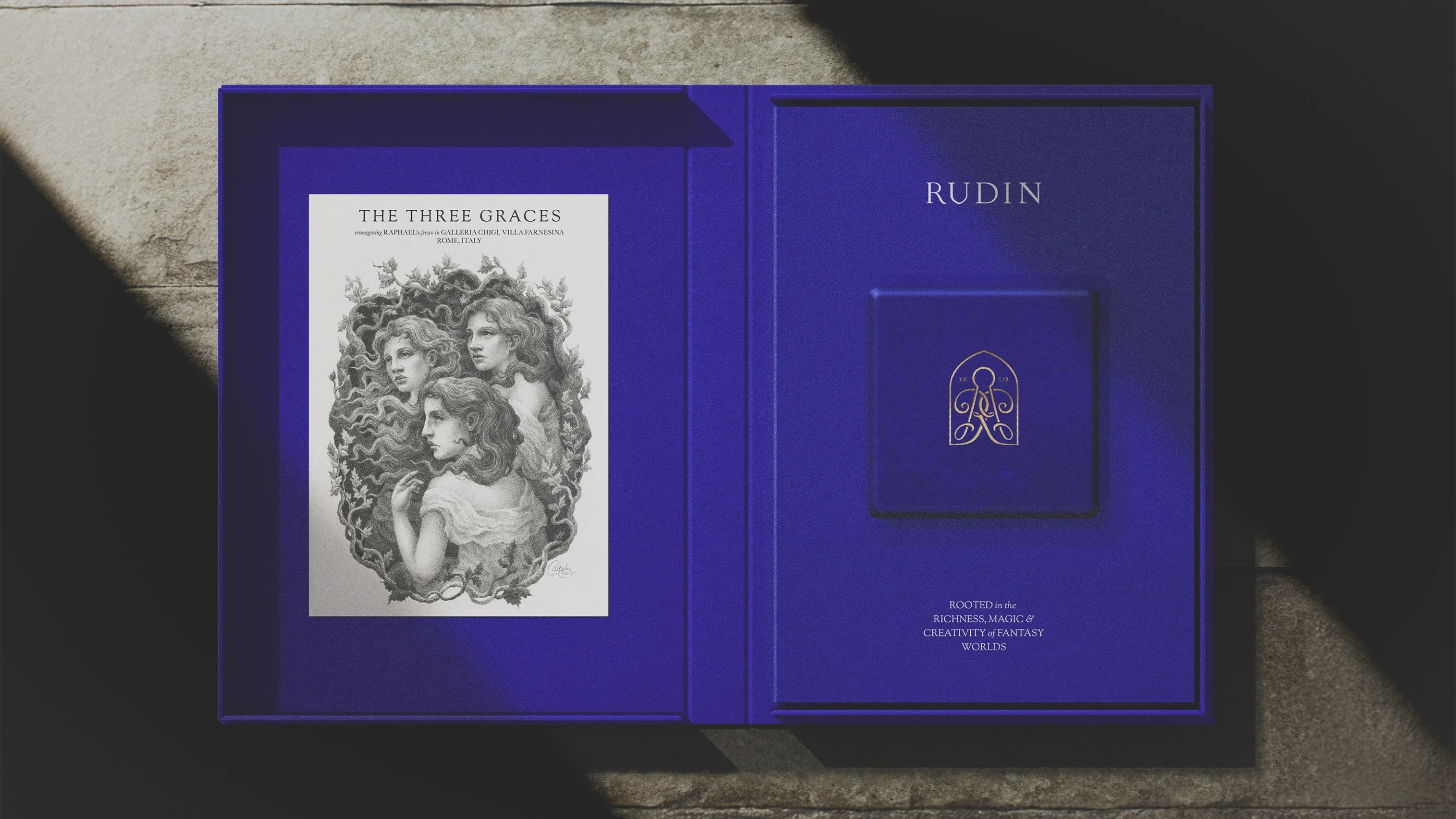
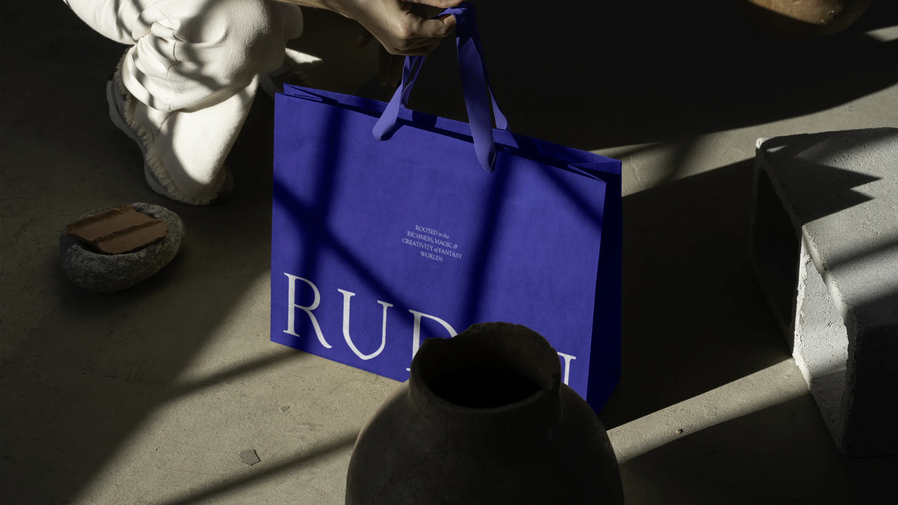
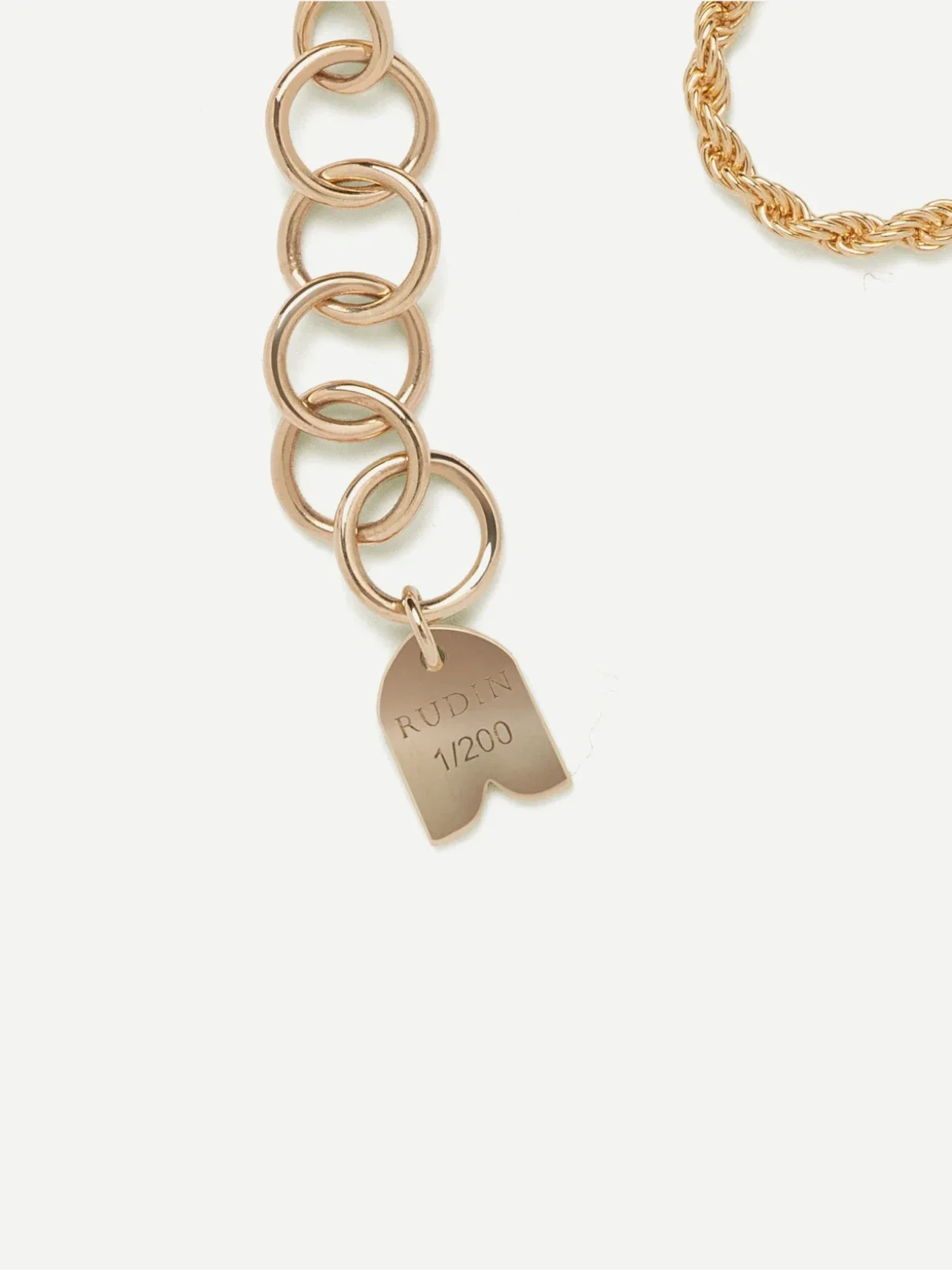
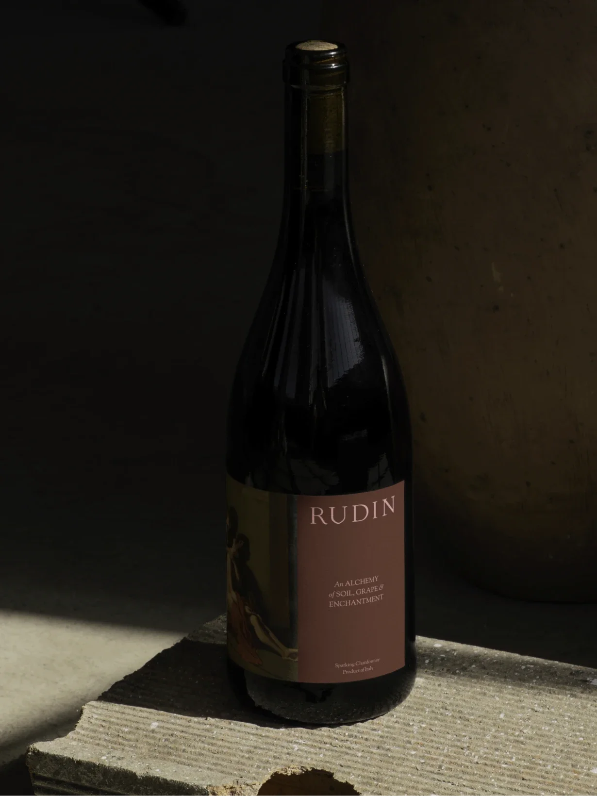
Every packaging detail was carefully considered, from material choice to structure and opening sequence. The aim was to create an unboxing experience that felt as deliberate and finely made as the jewellery itself, adding weight and ceremony to the moment of purchase.
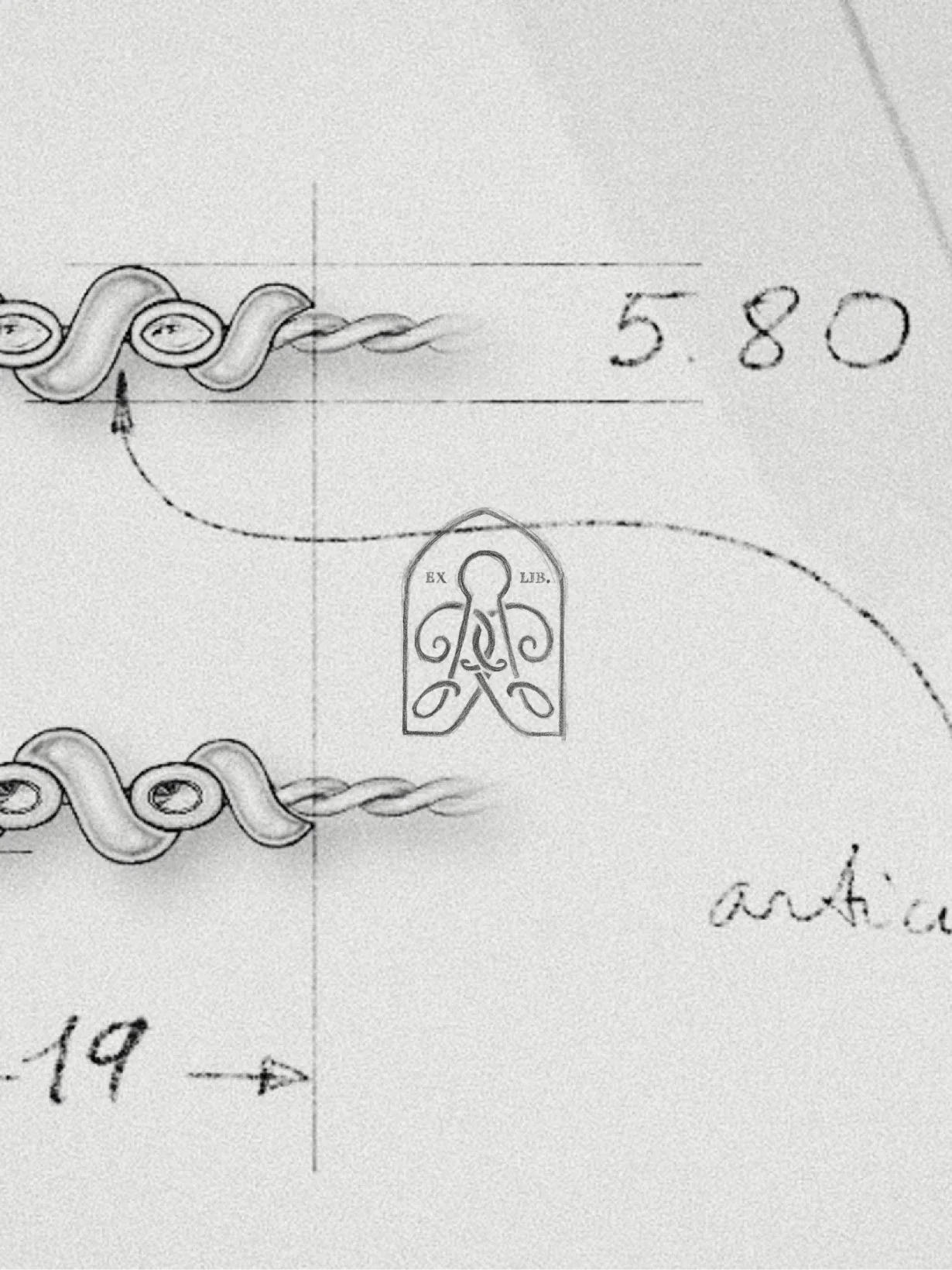
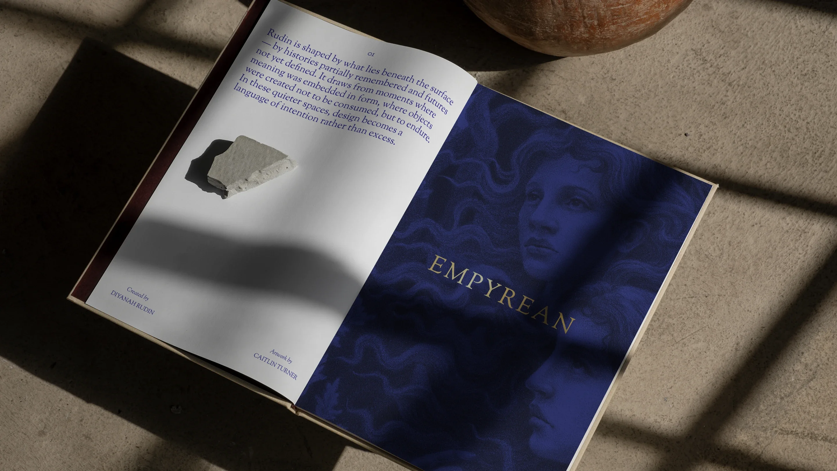
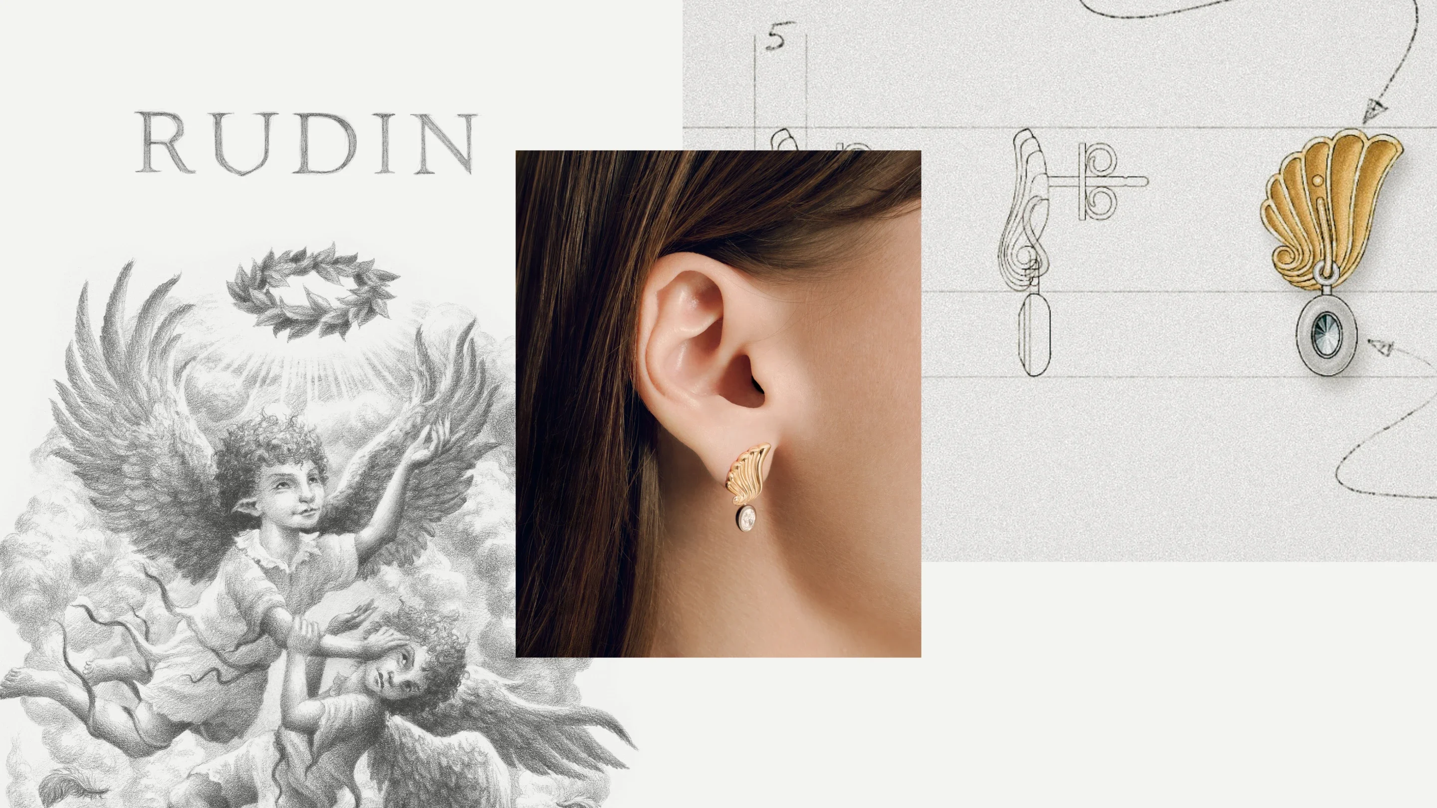
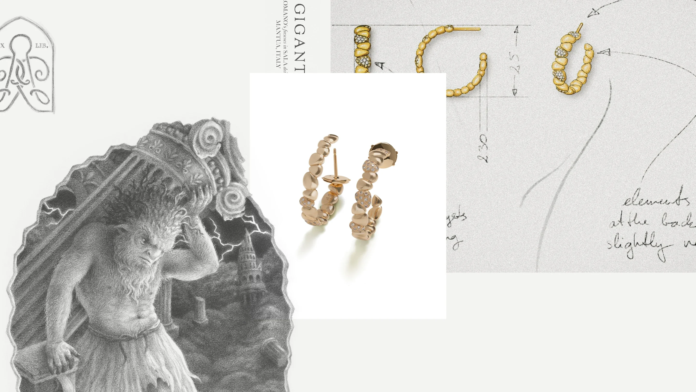
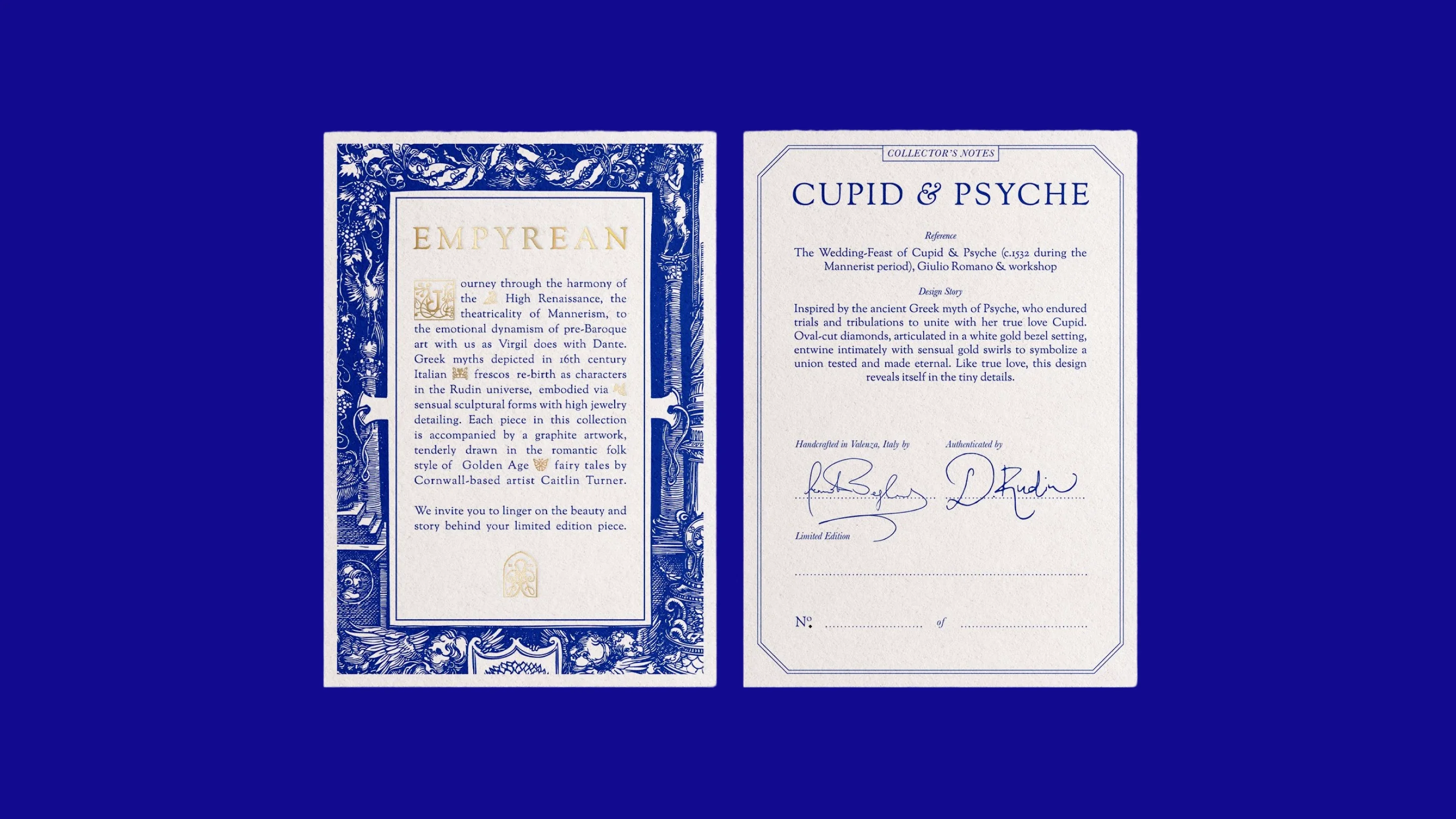
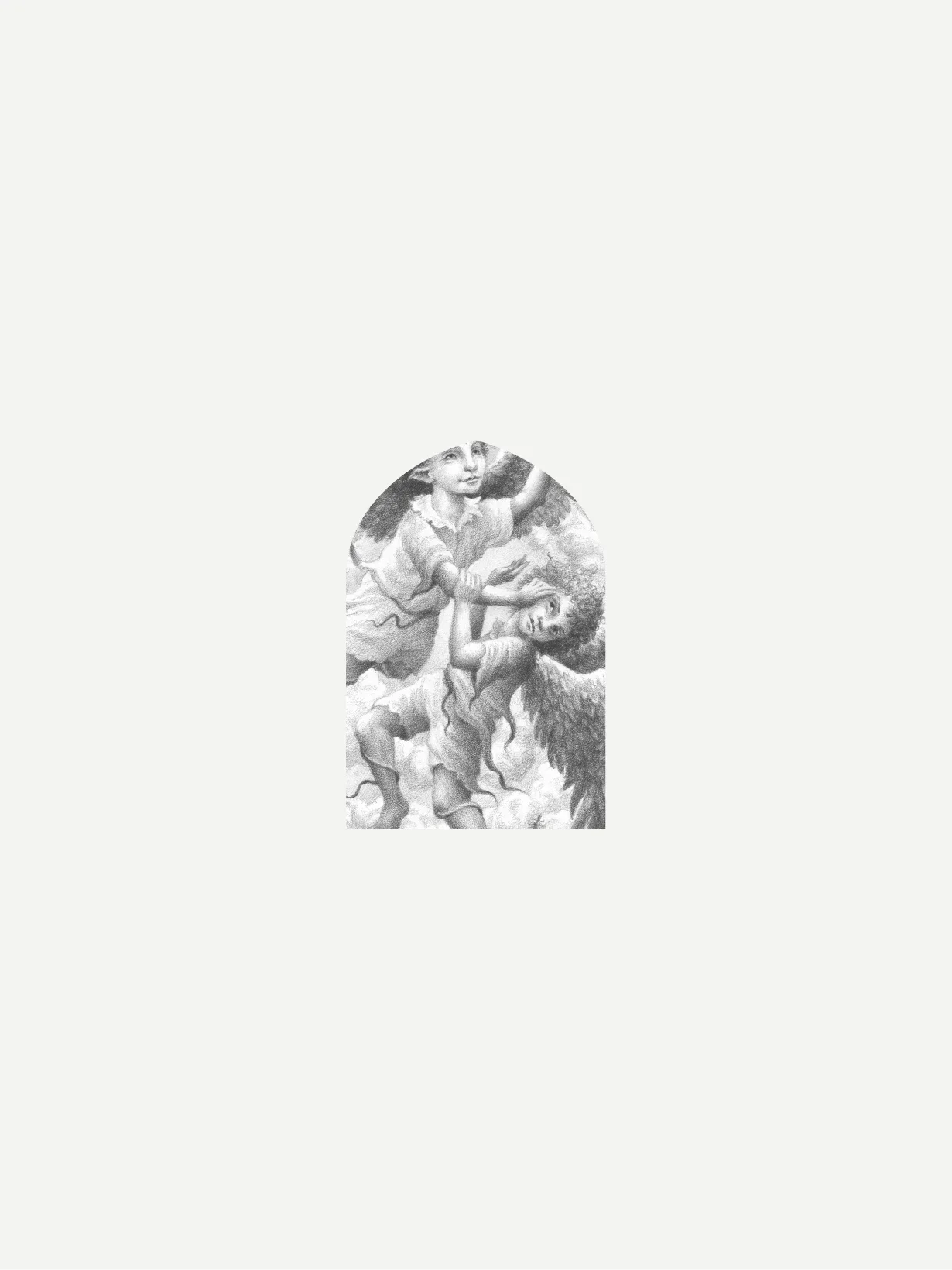
Hand-drawn sketches and bespoke illustration run throughout the brand, grounding the visual language in a sense of craft and authorship. Together with the more classical references, they give Rudin an identity that feels distinctive, layered and difficult to mistake for anyone else.
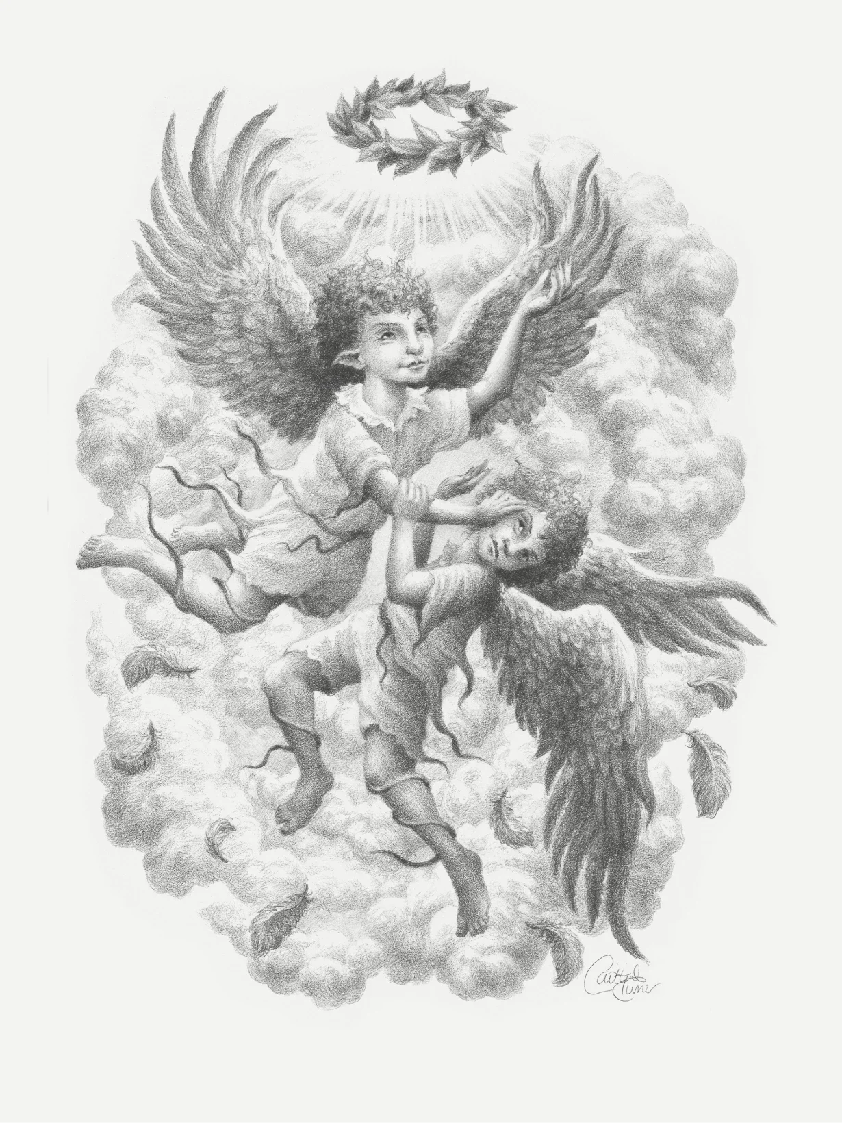
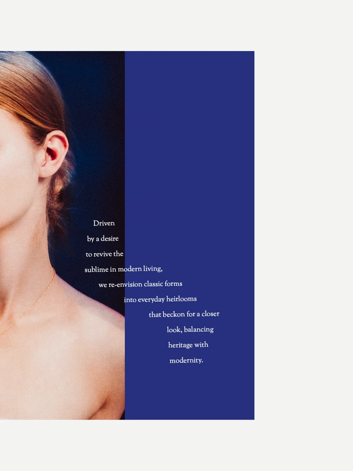
Concrete poetry and typographic experimentation introduced a sharper, more contemporary counterpoint to the heritage-inspired elements of the brand. That balance helped prevent the identity from feeling nostalgic, giving Rudin a tone that feels both timeless and culturally aware.